| Image |
Comment |
| 04/22/2012 08:33:03 AM |
|
 Photographer found comment helpful. Photographer found comment helpful. |
| 04/22/2012 08:31:37 AM |
|
| Photographer found comment helpful. |
| 04/22/2012 08:29:03 AM |
Flying Purple People Eaterby MelonMusketeerComment: Lovely idea and great colors (of course with this subject). I do wonder however if the picture might have looked better if the camera was aimed slightly higher, removing the large (almost) empty area at the bottom of the image. |
| Photographer found comment helpful. |
| 04/22/2012 08:27:11 AM |
Hollowby sammie2925Comment: The chosen focus keeps me wondering what the idea was behind the shallow DOF... |
| Photographer found comment helpful. |
| 04/22/2012 07:52:17 AM |
Hiding In Plain Siteby patchesComment: Great reflection & symmetry, took me a little time to decipher what I was actually seeing. I do get the feeling that a little more contrasts might have improved the image however. Message edited by author 2012-04-25 01:38:57. |
| Photographer found comment helpful. |
| 04/22/2012 07:49:04 AM |
A Better Angleby daniellebutsickComment: I like the idea, but I get the feeling that there might have been an even better angle available. The inside details in the lower left distract a little, leading me to look at the opposite top right, where I miss the corner of the window. |
| Photographer found comment helpful. |
| 04/22/2012 07:44:38 AM |
Up Over and Throughby dtremainComment: Nicely timed shot. The people on the bridge are even nicely spread out. I do get the feeling bringing the highlights down a little might improve the overall picture. |
| Photographer found comment helpful. |
| 04/22/2012 07:42:26 AM |
Itty Bitty Droolerby littlemavComment: I would have liked a little less highlights on the subject (i.e. the itty bitty drooler) to get a little bit more contrast between baby and background |
| Photographer found comment helpful. |
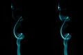
| 04/04/2012 05:45:13 PM |
Smoke & Mirrorsby nstevens85Comment: I love the fact that my first thought was "wait a minute, the left one looks to much like the right one?" ... until I saw the "mirrors" in the title. |
| Photographer found comment helpful. |
| 04/04/2012 05:44:00 PM |
Double Lineby FinnadineComment: Simple, elegant, great idea. For my taste, the depth of field could have been a little less shallow: allowing the focus to reach the left and right sides of the yellow lines, instead of getting blurry where the yellow lines start. But that's only after looking at the photo for a little while that I start to notice that :-) |
| Photographer found comment helpful. |
Home -
Challenges -
Community -
League -
Photos -
Cameras -
Lenses -
Learn -
Help -
Terms of Use -
Privacy -
Top ^
DPChallenge, and website content and design, Copyright © 2001-2025 Challenging Technologies, LLC.
All digital photo copyrights belong to the photographers and may not be used without permission.
Current Server Time: 12/20/2025 04:15:56 PM EST.