| Image |
Comment |
| 03/11/2006 06:55:43 PM |
Dawnby MichaelCComment: One of my ribbon picks -- wonderful exposure to capture the scene outside (I'm not usually a fan of taking a photo of a photographer but you've made it works really well) |
 Photographer found comment helpful. Photographer found comment helpful. |
| 03/04/2006 08:27:07 PM |
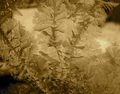
Window Bouquetby dphillipsComment: Hello Donna -- Greetings from the Critique Club.
I see you enjoy impressionism. This photo is a study in light and fractured bits that make up the whole (similar in that way). Congrats on the honor of the "favorite"
I socred this one above average as I think you've captured a unique view - an abstract in two-tones. I agree with another commenters -- adjusting the levels my have improved the light play. As for the color tones - a blue would have sent a stronger "icy" message. The warmer tones leaves the image ambiguous (flower/ice crystals) and therefore more is asked of the viewer.
As for the lower ranking (although 5.11 is nothing to cry about) I can only speculate that since the focus is soft, the image abstract, and no color to direct the eye, one might see this as a photograph with no main subject.
Please pm me if you have any questions. I enjoyed looking through your entries and hope to see more in the future.
Regards,
Theresa |
| Photographer found comment helpful. |
| 03/03/2006 07:18:15 AM |
Objectsby ssanComment: One of my ribbon picks for this challenge... creative still life with dimension and good eye for arrangement of elements. I, too, was surprised you finished back in the pack. |
| Photographer found comment helpful. |
| 03/02/2006 12:04:51 PM |
...old memoriesby Lil_OneComment: Hello Abbey and Welcome to DP Challenge. I'm so thrilled to send you greetings from the Critique Club.
I like your pick of tones (rosey pink/black) for this picture. I feel it gives a vintage/old feel and that matches your title. You selected a good photo to turn into two-tones (not every photo works well when converted) because you have very dark, very light areas and your subject is pulled out from the background because of that.
I think your background (the house) works against your casual portrait of your uncle. It is busy and competes for my attention but doesn't add any interest to the photo. It has the lightest areas in it and those draw my eye to them. Sometimes with a bit of moving around your subject (or asking your subject to move) works. It is one of the things to think about as you set up the photo and I often forget because I'm so focused on my main subject.
Please pm me if you have any questions. Keep shooting, keep entering the contest, and comment on other people's photos. It's the best way to improve your skills.
Regards,
Theresa |
| Photographer found comment helpful. |
| 03/02/2006 10:49:20 AM |
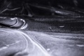
Cold as iceby SkynetComment: Hello Ivar and Greetings from the Critique Club!
Congratulations on your first contest entry. Seems you have some fans on your approach based on the comments during the challenge.
I like the colors/tones you selected. They add to the cold, barren feel of your subject/title.
I gave this a relatively lower score as the abstract quality didn't hold my attention. The light/dark line falls about half way splitting the image and makes the composition a bit static. Cutting out the bottom blurry area works a bit better here.
Please pm me if you have any questions.
Regards,
Theresa |
| Photographer found comment helpful. |
| 03/02/2006 10:39:20 AM |
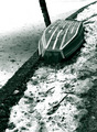
waiting for the springby gocComment: Hello Goran and Greetings from the Critique Club!
Congratulations on reaching one of your goals with this photo entry. I was one of the "5" votes so I thought it was a solid entry. I am partial to abandoned boats and like the aplication of two-tones here.
You have two excellent critiques given after the contest so I'm not sure I can add anything. The green tones work well (enhancing the nautical feel). I do agree on the debris and the pole (in general the clutter that surrounds the major elements). The dilemma I face in these types of settings is that the potential is great (upside down boat, desolate against the barren ground) but no matter how you move around/frame the shot you've always got the other stuff in the frame. Being a basic editting challenge, there's no way to get rid of it.
A really tight crop might be worth playing around with here. If you draw the top and left border just where the pole intersects the boat (cutting the pole out entirely) and draw the bottom about 1/3 third higher -- does that eliminate some of the distracting elements and keep the essence of your image?
If you have any questions or comments, please pm me.
Lookng forward to more of your challenge entries.
Regards,
Theresa |
| Photographer found comment helpful. |
| 03/02/2006 10:25:03 AM |
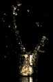
Engagementby DjabordjaborComment: Hello Magnus -- Greetings from the Critique Club ---
Congratulations on your first challenge entry. I see it has been selected as a favorite already!
Seems that those folks that commented on the photo liked it very much but, in general folks gave it average (5) scores.
The splash fills the frame and makes all areas interesting. Your use of light makes the contents look like gold (or some metalic element) and that adds an extra interest. The reflection is also a well-done element.
The glass and liquid are slightly out of focus. This works well for the "pillows" so that you can't tell what they are but not for the major elements. Although this was basic editting (so cloning was a no-no) I'd like to see less speckles of liquid to add importance to the major splashes.
For added "drama" I'd try moving the elements off center (perhaps lower left) by adding an asymetrical black border to the right and top. Not sure if that would help but a non-central composition might hold my interest longer.
I hope this is just the begining of your entries in the challenge.
Warm regards,
Theresa |
| Photographer found comment helpful. |
| 03/01/2006 08:00:55 AM |
Sweet Innocenseby cools98Comment: congrats on a fine photo and great finish. this was one of my ribbon picks for the challenge... thought you captured just the essence of the subject, her expression perfect, the hi key treatment added to the soft dreamlike feel. |
| Photographer found comment helpful. |
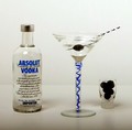
| 02/04/2006 06:11:53 AM |
Blueberry Cosmoby ecameronComment: try putting your elements into a different arrangement -- they look like they're in a "line up", less equi-distant, vary spacing between them. Your lighting is too flat/dim to bring out the depth of the elements. |
| Photographer found comment helpful. |
| 02/03/2006 10:48:40 AM |
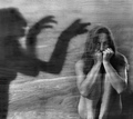
Fear Of Your Own Shadowby JudiComment: one of my ribbon picks -- the model's expression,pose, and b&w treatment work really well. Like the wood grain, too. The shadow itself is a bit odd -- pose wise and detracts a tiny bit. |
| Photographer found comment helpful. |
Home -
Challenges -
Community -
League -
Photos -
Cameras -
Lenses -
Learn -
Help -
Terms of Use -
Privacy -
Top ^
DPChallenge, and website content and design, Copyright © 2001-2025 Challenging Technologies, LLC.
All digital photo copyrights belong to the photographers and may not be used without permission.
Current Server Time: 08/10/2025 05:47:57 PM EDT.