| Image |
Comment |
| 07/02/2004 07:53:18 AM |
New Hope Bridgeby graphicfunkComment: I drive across this one almost every day -- always thought about where I shoot it from... :)
I think you've got about the best angle. I think it's missing a focal point (as composed the abutment (?) becomes the focal pont but it's too far away to be very interesting and too bland in color to add much to the shot. |
 Photographer found comment helpful. Photographer found comment helpful. |
| 07/02/2004 07:42:59 AM |
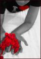
I Love Petalsby RoosterComment: Hi Rooster
Greetings from the Critique Club...
I rated this image fairly high in the challenge. There's a lot to like. For the sake of balance I'll look for "what might make it better" but the image stands strong as is.
I agree with another of your commenters that the composition is the strength here. Many aspects serve to strengthen - the contrasty b&w, the red petals spilling out of the frame balanced by the subject's face spilling out at the top. The odd glowing red of the petals, arms, and hands contrasts nicely with the "standard" look of the torso and chin. I never met a diagonal I didn't like (to quote a fellow-dpcer)
For the red-heart... I see that it helps pull my eye thru the composition (the face would do that on its own) and ties into the meaning of the petals. Would the shot be better without it colored? I don't think so. Is it much better with it? No. The "I" is more distracting because it clicks me into reading instead of feeling.
On the tight cropping - I think it works in all but one area. The right arm could be a bit more in the frame. I really like the tension caused by the cropping at the bottom and top.
I hope this was helpful. Please pm me with any questions or comments.
Regards,
Theresa |
| Photographer found comment helpful. |
| 07/01/2004 09:00:23 PM |
|
| Photographer found comment helpful. |
| 07/01/2004 08:01:49 PM |
Born to Stand Outby moviemanComment: Hi David,
Greetings from the Critique Club...
I'm not sure I can add to what's already been said but I'll offer my support for some of the comments you've already received.
Your use of color and the "through binoculars" style make this an interesting shot. Your getting the subject in crisper focus than any of the folks around her and the dead center of the subject adds to the composition. Her headband is the only standout color which makes me study the shot all the more. I agree with the "falamingo" effect as a detractor. Losing her head and foot to the black framing gives a candid/voyeristic (?spelling) quality and makes me want to know more of the story. Wjy is she dressed differently from most of the others? Where is she heading?
You've included just the right amount of other elements in this shot. The extra folks simply exist to contrast to the main subject. You've got a good eye for b&w (looking over the other shots you've entered) and I look forward to more of your entries.
Thanks for sharing your work
If you have any questions on my comments, please pm me.
Regards,
Theresa
|
| Photographer found comment helpful. |
| 06/26/2004 12:41:50 PM |
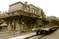
Historic Bethlehemby jmleliiComment: Hi Jeremy,
Greetings from the Critique Club...
This is the second entry of yours I've had the pleasure to study and comment on.
I agree with your other commenters -- the sepia tones (and the absence of any elements that would give away the year) has this feeling like an old photo.
I think your photo suffered a bit from the "train" being more of a distracting rather than enhancing element - it's not very photogenic or interesting as presented. While it's a technically good shot it doesn't have a particularly strong composition -- more of a documentary/journalistic feel. (I can see it printed and displayed in the local luncheonette as a representation of a time gone by.)
Please PM me if you have any questions or comments.
Regards, (from nearby Yardley)
Theresa |
| Photographer found comment helpful. |
| 06/25/2004 04:19:48 PM |
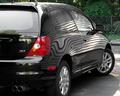
AbStrAct CiVicby ladpupmoeComment: Hi Peggy,
Greetings from the Critique Club...
You have a way with lines! Your Parallel Lines shots is one of my favorites. This shot shows that same keen eye. Looking over some of your shots, I am impressed with the number of challenges you've entered!
I agree with what's been said below - this shot has a great shot within it. The desat car has the red pop out. The wavy bits on the right rear quarter panel and window along with the tail light and wheel would be enough to tell all it's a car while keeping out the more "ordinary" parts of the frame.
Looking forward to more of your entries in future challenges. PM me if you have any questions on my comments.
Regards,
Theresa |
| Photographer found comment helpful. |
| 06/25/2004 02:26:23 PM |
High Speed Truckingby artvetComment: Hi Artur,
Greetings from the Critique Club...
I think your score is all about it not being a Plane, Train, Automobile. Can't help you our there as I agree on the theme disconnect. Instead, I'll direct my attention to the picture without reguard for the theme -- it has a lot of things that I like about it.
Looking at the rest of your portfolio I'm struck by your bold/interesting use of color. This shot shows your preference (your abstract shot is in my "favorites" and is a great example of your style) for working the color into the composition in an integral way.
This shot has a shock of yellow that demands attention. The Blue (top) and red (bottom) framing the truck and they scream right along with it to present a primary color balance. There isn't too much calming in this shot, by design, and that gives it energy. I would like even more blur and wonder how the shot would look without a little less of the trailer.
I hope this was helpful. Please pm me if you have any questions on my thoughts.
Regards,
Theresa |
| Photographer found comment helpful. |
| 06/24/2004 09:29:59 PM |
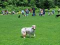
"See Spot. See Spot Run. See Spot Network"by basia03Comment: these are such great dogs!. very unusual coat -- looks like a blue meryl but with a red face. how did you get him not to herd the other dogs? :) would like to be closer the the main subject and the background dogs |
| Photographer found comment helpful. |
| 06/24/2004 09:26:40 PM |
|
| Photographer found comment helpful. |
| 06/24/2004 09:25:38 PM |
|
| Photographer found comment helpful. |
Home -
Challenges -
Community -
League -
Photos -
Cameras -
Lenses -
Learn -
Help -
Terms of Use -
Privacy -
Top ^
DPChallenge, and website content and design, Copyright © 2001-2025 Challenging Technologies, LLC.
All digital photo copyrights belong to the photographers and may not be used without permission.
Current Server Time: 08/21/2025 10:40:14 AM EDT.