| Image |
Comment |
| 08/22/2004 11:56:48 PM |
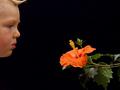
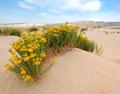
Botany: The study of plants.by aKiwiComment: Best I have seen.
Technical 3/3 (must have been tricky to light both subjects well!)
Artistic 3/3
Thematic Fit 3/3
Emotional Impact 1/1
10/10 |
 Photographer found comment helpful. Photographer found comment helpful. |
| 08/22/2004 11:11:21 PM |
|
| Photographer found comment helpful. |
| 08/22/2004 10:54:19 PM |
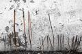
Wiltby dustin03Comment: Interesting subject and abstract composition. I like the reddish stems against the rough B&W wall. Imagine is very soft & grainy, and the black (soil?) foreground doesn't contribute so I would consider cropping. |
| Photographer found comment helpful. |
| 08/22/2004 10:50:16 PM |
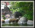
My Garden of Edenby SandyPComment: Lovely complementary shapes. I find it this a very busy image though, with the waterfall(s) competing with the foliage and rocks for attention. And yet, the first thing I noticed was the border!... a more subtle one, that doesn't draw attention away from the photo, would be better I think. |
| Photographer found comment helpful. |
| 08/22/2004 10:43:54 PM |
|
| Photographer found comment helpful. |
| 07/18/2004 08:11:59 AM |
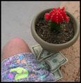
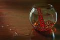
Who left the lid off the jar ?by ConcreteDonkeyComment: Technically suberb. Very strong composition.
Others capture the theme better in my view. That could just be me, in that I respond better to people than to snails in the context of such an abstract as freedom.
Technical: 3/3
Creative: 3/3
Conveys the Theme: 2/3
Je Ne Sais Quoi:0/1
8/10
|
| Photographer found comment helpful. |
| 07/17/2004 11:42:58 AM |
I'm Free !!!by ColeyComment: Glorious colours. Nicely composed. Effectively conveys the sense of freedom.
Technical: 2.5/3 - shadows are a little dark; could be sharper
Creative: 2.5/3
Conveys the Theme: 2.5/3
Je Ne Sais Quoi:0.5/1
8/10 |
| Photographer found comment helpful. |
| 07/17/2004 11:27:58 AM |
.by David.CComment: This competition's most creatively expressive illustration of the theme. A couple of the other entries affect me more strongly, but overall this is near the top for me.
Technical 2.5 - good tonal range, could be a little sharper, a little less grainy
Creative 2.5 - basic but strong composition
Conveys the Theme 3/3 - beautifully
Je Ne Sais Quoi 0/1
8/10 |
| Photographer found comment helpful. |
| 07/17/2004 11:26:52 AM |
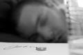
She's Goneby moviemanComment: One of my favourites of the competition. Similar idea to my own submission, although done with a lot more subtlety and grace. The handwritten "John" is a really nice touch! Somewhat greater DoF might have been better, since everything but the rings is a little tricky to discern. And I don't think the glass adds anything to the impact - cropping everything to the right of his mouth could make it stronger. In any case, well done.
Technical 2.5/3
Creative 2.5/3
Conveys the Theme 3/3
Je Ne Sais Quoi 1/1
9/10
|
| Photographer found comment helpful. |
| 07/17/2004 11:25:47 AM |
A Daring Escape by scalvertComment: Simple, creative, funny. Well done.
Technical: 2.5/3 - crisp, well controlled DoF, a little dark
Creative: 2.5/3
Conveys the Theme: 3/3
Je Ne Sais Quoi: 0/1
8/10 |
| Photographer found comment helpful. |
Home -
Challenges -
Community -
League -
Photos -
Cameras -
Lenses -
Learn -
Help -
Terms of Use -
Privacy -
Top ^
DPChallenge, and website content and design, Copyright © 2001-2025 Challenging Technologies, LLC.
All digital photo copyrights belong to the photographers and may not be used without permission.
Current Server Time: 08/18/2025 06:05:36 AM EDT.