|
|
|
Showing 411 - 420 of ~664 |
| Image |
Comment |
| 12/30/2004 11:42:07 PM | Christmas Treeby PascalComment: Hello from the Critique Club :)
Well, you obviously did well in this one - you placed in the top 26th percentile and it's your highest scoring image yet. I'll try to add a few comments/opinions that may (or may not) have improved it.
First of all, good choice of subject. This is certainly classy, as well as impressive. I think dartompkins hit a point that might be part of a bigger idea as well. The lamp to the right of the tree certainly is a bit distracting. But even moreso, I think the entire scene is. In addition, the tree has so many lights and they almost seem to blend together here... this is a picture that I would've loved to see up close and personal - a frame filler. Or at least get rid of some of the surroundings - it's dark enough that they don't distract as much as they possibly could, but would still like to see as much of this tree and as detailed as possible. Hope that helps, and happy holidays! |  Photographer found comment helpful. Photographer found comment helpful. |
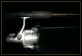
| 12/29/2004 07:08:45 PM | Trolling for DPC Votesby orussellComment: great idea, but i feel like the horizontal orientation is somewhat static in nature (despite the revolving reel). perhaps a diaganol orientation would have been more interesting. | | Photographer found comment helpful. |
| 12/29/2004 06:21:55 PM | The Perfect Machineby TerramarComment: great interpretation. edges look a little hard (looks like you essentially cut the background out from around the calf). also, not sure i like the leg overlap of the borders. i think this is a great idea, love the detail around the shoe and the idea to isolate the leg - just a couple of things that keep it from that 'perfect' level. good work. | | Photographer found comment helpful. |
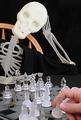
| 12/29/2004 06:16:41 PM | STILL his turn! (Indecision)by BeetleComment: This one comes courtesy of the Critique Club :)
In a way, it's a little weird to critique an image that placed 77 out of 106, yet still received a solid 5.6684 (which, for reference sake, would have placed you 15 out of 108 in the challenge that this mimics).
When I compare it to the original (which may not be the best way to judge it technically, but probably the best way for this challenge), I notice the perspective is slightly different. Yours places slightly more emphasis on the skeleton (at its eye level) as opposed to the indecisive move itself (the original at the 'eye level' of the chess board). The image, while sharp, does not bring the eyes to rest as well - perhaps due to the extreme opposite locations in the image of the two places of interest (far bottom right for the hand, far upper left for the head).
The black clothing also tends to blend in with the table and background, which may or may not create a sense of confusion. Obviously, the voters liked this image and you would've done much better had you not been up against the extremely stiff competition in this challenge. Hope my comments help - just tried to find some things that may shed some light here. Let me know if you have any thoughts/questions. :) Message edited by author 2004-12-30 01:41:22. | | Photographer found comment helpful. |
| 12/29/2004 05:51:19 PM | [no] Angelby redmoonComment: This critique comes courtesy of the Critique Club:
Whatever you lost here in points on technical elements, you certainly seem to have gained back in humor. Like many images, you received a much higher score from commenters than non-commenters, so it may sometimes be hard to look at them and understand why you didn't receive a 7.810 overall score.
I think that my thoughts on this essentially parallel those of jpochard - it is a good idea, but if the technical aspects were pulled off slightly better, it could've received a boost to this already solid score. The sky is a little unnatural/overburnt for my particular taste, and it does look a little grainy. Obviously, considering the figurine, you weren't going for an exact replication - but I sky more similar to the original could have produced an even higher score. Just my take on a possible way that this may have scored even higher that it did. Either way, it's obvious that you evoked an overall positive response from DPC. | | Photographer found comment helpful. |
| 12/29/2004 07:04:12 AM | Pianissimo Encore [Soft Focus, Yellow Ribbon]by dipaulkComment: This critique comes courtesy of the Critique Club :)
It may be a bit hard for me to give you much to work on here, since I considered this one of the top 10 in the challenge (and you were up against some stiff competition!). You definitely gave the image a good amount of soft focus - it's there, but not too much. The colors/tones are beautiful from inside to out, and I can't seem to find any distraction imperfections anywhere on the flower.
True, you shot this at a different angle - not sure if you perhaps lost any points here or not, as I do like the images that provided some sort of variation on the original. The angle is well chosen and the petals of the flower always bring my eye back to the center of the flower (which is certainly good). The only thing this angle does not provide from John's is (like e301 mentioned) the 'landscape' feel to the petals, which provides a slightly more three dimensional feel to it. I don't think that this is necessarily a bad thing, as I very much appreciate the excellent composition here.
Great shot, and definitely would've received higher scores had peoples standards not been "ruined" by the high quality of this challenge's entries (votes of 2?? 3...4????).. :shrug: Message edited by author 2004-12-29 07:10:57. | | Photographer found comment helpful. |
| 12/29/2004 06:43:34 AM | Peace on ...by GeneralEComment: This comment comes courtesy of the Critique Club :)
I like the image. I think it might have suffered a bit in the scores because it may not necessarily always be immediately considered a decoration (although it technically is). In addition, people tend to not like big expansive (and largely empty) blue skies. I think bear's comment about the moon in a different position might work well (although I believe illegal for challenges), because the connection between Peace and the moon is not immediately evident either.
In the end, it is a technically sound image that simply suffers based upon a viewers interpretation of the challenge and the image - and these are probably the two things that would turn it around the most. Happy Holidays :) Message edited by author 2004-12-29 16:15:03. | | Photographer found comment helpful. |
| 12/29/2004 06:23:38 AM | Snow Man Treeby DiscraftComment: This comment comes courtesy of the Critique Club :)
I've looked through your portfolio before, and judging by your work am fairly sure that you can probably pick out anything that you may not like here yourself. Either way, you asked for a critique from the CC, so I'll give ya one :p.
Like mffnqueen, I appreciate/like your zoom technique here - you definitely used it well in order to emphasize the snowmen on the tree. It even gives the viewer a bit of a three dimensional feel. Unfortunately, for this to have worked, you had to cut the lights... and by cutting the lights, you ended up underexposing the tree and surroundings. I'm not sure if there's much of a workaround for this, considering your choice of technique. I would say to possibly try flipping the lights on for a split second, but at this aperture it may end up blowing out the effect of the zoom. Possibly a smaller aperture would allow this, but I've never really tried anything like this so I'm sorry to say that I can't give a definitive idea on that.
I tend to like the fact that there isn't a snowman in the bottom left, as it throws a bit of tension into the image that I like. But, not sure how everyone else felt about this.
Hope some of this might've helped. Happy Holidays! | | Photographer found comment helpful. |
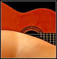
| 12/29/2004 06:03:08 AM | Strings Attachedby artvetComment: This one comes courtesy of the Critique Club :)
This is a very solid capture - even more so when compared to the original. Similar enough to provide the needed reference, but different enough (I like your reversal of the shapes, btw - I preferred the entries with twists rather than the completely identical ones) to provide a degree of interest. Not sure if this is the original or if it was tweaked, but it looks like you may have used some sharpening which gave some jagged edges - I may be wrong about the sharpening, but I do see some jagged eges either way.
Somehow I think that the strings do slightly distract from the original's emphasis on shapes, but that's not necessarily the point. Other than these small things, I don't know what else to say. Good effort and happy holidays :) | | Photographer found comment helpful. |
| 12/29/2004 03:29:03 AM | An act of Giving (Please read after)by NodeComment: great story to accompany the image. i'm sure that if we could include descriptions, this would've catapulted through the rankings (puts it into better perspective). glad you could share this with DPC. | | Photographer found comment helpful. |
|
Showing 411 - 420 of ~664 |
Home -
Challenges -
Community -
League -
Photos -
Cameras -
Lenses -
Learn -
Help -
Terms of Use -
Privacy -
Top ^
DPChallenge, and website content and design, Copyright © 2001-2025 Challenging Technologies, LLC.
All digital photo copyrights belong to the photographers and may not be used without permission.
Current Server Time: 08/05/2025 11:22:30 AM EDT.
|


![[no] Angel](https://images.dpchallenge.com/images_challenge/0-999/288/120/Copyrighted_Image_Reuse_Prohibited_128768.jpg)
![Pianissimo Encore [Soft Focus, Yellow Ribbon]](https://images.dpchallenge.com/images_challenge/0-999/288/120/Copyrighted_Image_Reuse_Prohibited_129333.jpg)