| Image |
Comment |
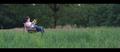
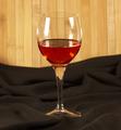
| 08/03/2005 01:24:31 AM |
360 Modena Spiderby wmprkgComment: crisp pic. i wish the car and not the horse was the center of my attention. obviously the wall is reflecting a yellow tint but i'd like to see the car more in its true color, perhaps with some white balance adjustments or saturation adjustments in photoshop. from seeing the horse's reflection in the hood, i'm thinking it would have been cool to shoot just the car and see the horse on the wall as a reflection...if possible. |
 Photographer found comment helpful. Photographer found comment helpful. |
| 08/03/2005 01:19:29 AM |
Religious Goldby sajinComment: very crisp pic. this was very well lit or you used your flash to perfection. wish you had done more with the composition or angle as it just feels like you're piggy backing off of the artist's work. |
| Photographer found comment helpful. |
| 08/02/2005 12:11:21 AM |
. . . To Breathby JeileenComment: i hear birds chirping when i look at this so it must do it's job. good border choice. really like the painterly feel of the background contrasted with the photo realistic foreground. too bad she was wearing such a reflective shirt as the exposure is great everywhere except on it. |
| Photographer found comment helpful. |
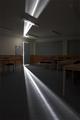
| 08/02/2005 12:03:41 AM |
The Class Room by StagoleeComment: very cool effect. did you consider cropping just after the ceiling light stream hits that first light? having it with the break feels odd to me. overall nice shot. |
| Photographer found comment helpful. |
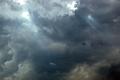
| 08/01/2005 07:48:09 PM |
Lots O'Roomby Fibre OptixComment: very dramatic. the black clouds at the bottom seem almost unfortunate as they throw the balance off a bit. cool shot nonetheless. |
| Photographer found comment helpful. |
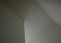
| 08/01/2005 07:42:00 PM |
Defined by Shadowsby hopelessoptimistComment: cool idea. i wish the darks were darker and the lights lighter...i guess that's more contrast. but it's not even that...i think you needed at least a secondary light source to really make your lines more interesting. like the line from the right side to the bottom...that needs to be stronger some how. also the left panel feels a bit heavy in the pic (compared with the upper right), i would have cropped out some of the left, probably to the corner at the top. maybe it's just me as ii think i said that on another pic :) just keep up the interesting ideas. |
| Photographer found comment helpful. |
| 08/01/2005 07:30:17 PM |
Room...for moreby barndogComment: i like how the would panels distort in the glass. i wish you chose an angle to accentuate the wood background and didn't have to use the brown sheet. |
| Photographer found comment helpful. |
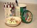
| 08/01/2005 07:26:37 PM |
Always Room!!!!by JeremyFleuryComment: fun shot. i hope you're looking for feedback, if not stop reading. from a product shot perspective...the focus is good. the appeal isn't quite there. that large piece of carmel in the bowl looks a bit awkward. you really needed to pile the ice cream in so the bowl was full, as is it still looks empty. i think you should have stuck with 1 tub, unless your intent was that you ran out and always had room for another, then i would have used 2 of the same brand. but the shot feels cluttered with both as it is. the half frozen, half thawed of the edy's looks strange. the counter isn't a terrible background, but showing as much as you did is. the countertop lines are incredibly distracting. maybe they wouldn't have been so bad with a straight on shot, but the angle you've chosen makes it very noticeable. the coloring is too yellow, adjust the white balance for a more natural look. with the shot you've chosen, might help to have all the logos facing front. hope this long winded commentary helps with your next photo. |
| Photographer found comment helpful. |
| 08/01/2005 07:00:49 PM |
"Just Enough"by tmorninglory96Comment: i think you had an award winning idea. for me you needed to show a fuller view, bring in a another light (it appears as though you're just using window light and it wasn't quite enough), and get a greater depth of field on your focus. you also needed to get all your horizontal lines, horizontal. the hardest part is the idea, the other stuff will come much easier with a bit more time. |
| Photographer found comment helpful. |
| 08/01/2005 06:44:04 PM |
|
| Photographer found comment helpful. |
Home -
Challenges -
Community -
League -
Photos -
Cameras -
Lenses -
Learn -
Help -
Terms of Use -
Privacy -
Top ^
DPChallenge, and website content and design, Copyright © 2001-2025 Challenging Technologies, LLC.
All digital photo copyrights belong to the photographers and may not be used without permission.
Current Server Time: 08/05/2025 04:58:07 AM EDT.