| Image |
Comment |
| 11/24/2005 01:10:00 PM |
Mmmmm, just this once...by YoungerComment: if the steam is real i'm very impressed. I had trouble getting coffee to steam. sorry but it looks like it was dodged in :( I like your composition other than the excess space at the top...especially the choice for the half eaten one. Hope the comments help in some way. |
 Photographer found comment helpful. Photographer found comment helpful. |
| 11/24/2005 01:06:04 PM |
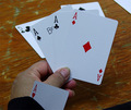
Nothing up my ...by drz01Comment: good focus. would have liked a bit better lighting. not sure if the logo on the first ace meant something, and though i find it interesting that it is the only card with one, i would have hidden it. the white strip at the top left is a bit of a distraction...sorry for being so technically particular, hope it helps in the future. |
| Photographer found comment helpful. |
| 11/24/2005 01:01:01 PM |
Myopiaby CutterComment: clever, i almost became a nearsighted commentator. But I'm still guessing you might have gone a bit over the top by switching the expected focus. |
| Photographer found comment helpful. |
| 11/20/2005 04:08:48 AM |
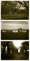
Greenwich Parkby redmoonComment: Fantastic image. The pinhole focusing, sepia toning, and masterfully blown highlights make me feel like I'm wandering the grounds at the turn of the last century. The way you've captured the scenes evokes strong reactions from my senses other than just sight. |
| Photographer found comment helpful. |
| 11/20/2005 03:59:14 AM |
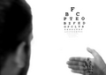
Profile of a Manby Joey LawrenceComment: You've shown size doesn't matter and you don't need alot of screen real estate to put forth an extremely powerful image. The lines in this image are facinating. The contrasts are astounding. After studying it, I'm particularly drawn to the commonality of his collar, between his fingers and under his eyebrow shadowing. Maybe i'm just very odd, maybe this is a masterpiece in everyone's mind. |
| Photographer found comment helpful. |
| 11/20/2005 03:47:28 AM |
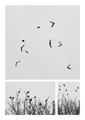
Blown Awayby aznymComment: This is fantastic. I really like how you have all 3 shots at differing focal lengths yet still sharing an almost common background. The movement of the birds in the main frame is mesmerizing |
| Photographer found comment helpful. |
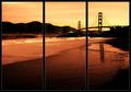
| 11/15/2005 12:13:12 AM |
Golden Gateby bryanbrazilComment: this scene is phenomenal...i can only imagine what you saved for the the free study. As a tryptic...i think it only breaks the beauty of its natural lines |
| Photographer found comment helpful. |
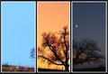
| 11/15/2005 12:07:26 AM |
Fading Into Nightby JunieMoonComment: well thought out. the moon is an exceptional addition. your camera seems to be the only thing that let this shot down. |
| Photographer found comment helpful. |
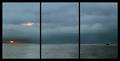
| 11/15/2005 12:00:20 AM |
Heading Eastby GermaineComment: i bet this shot is fantastic undivided. As a viewer, dealing with the seperation between main components is difficult as it is (though in this case i believe very powerful), but adding the dividing lines makes it hard to enjoy the shot's full beauty. |
| Photographer found comment helpful. |
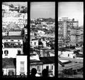
| 11/14/2005 11:39:23 PM |
Neapolitan Viewsby ManicComment: at first glance i found this shot exceptionally interesting. further inspection maintains the feeling with the exception of the varying levels. perhaps that was how the landscape was naturally defined, but bringing down your top margin would have removed the uncomfortable horizon differences and betterhighlighted the 2 characters at the bottom. But it is your art, so keep up the arty work. |
| Photographer found comment helpful. |
Home -
Challenges -
Community -
League -
Photos -
Cameras -
Lenses -
Learn -
Help -
Terms of Use -
Privacy -
Top ^
DPChallenge, and website content and design, Copyright © 2001-2025 Challenging Technologies, LLC.
All digital photo copyrights belong to the photographers and may not be used without permission.
Current Server Time: 08/06/2025 12:09:09 AM EDT.