| Image |
Comment |
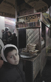
| 01/04/2006 01:33:36 AM |
a new customerby Car54Comment: i like this. i'm interested to see how others will perceive it. The contrast is very low and your main subject (according to your title) is out of focus. But it is a very interesting composition, one strengthened i believe by cropping the top inch or so. |
 Photographer found comment helpful. Photographer found comment helpful. |
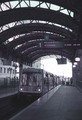
| 01/04/2006 01:26:57 AM |
Double Lateby tjmuellerComment: i'm slow...so i'm glad i hung around this pic for a sec. Very clever. I was initially distracted by the speeding by car...and upon further reflection, i'm still distracted, but overall a cool idea. |
| Photographer found comment helpful. |
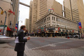
| 01/04/2006 01:22:05 AM |
Hitting the Cityby rapidComment: this is much more city ish than most of the shots, but your focus is a bit soft. Also i'm not sure why there is a purple cast on the shot as straight black and white would have worked fine |
| Photographer found comment helpful. |
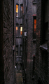
| 01/04/2006 01:14:05 AM |
A Room with a Viewby Herblacklist12Comment: this is very clever...an excellent view of city life. i know it's already about as tight as you can go but i wish you cropped off the extra black on the left. |
| Photographer found comment helpful. |
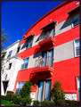
| 01/04/2006 12:58:32 AM |
Urban Livingby JutildaComment: well i guess everyone has their own perspective on what urban is...i used to think 3 stories was tall until i moved to new york. nice vibrant colors. might have done quite well in the color burst challenge. might try a more symetrical angle...perhaps you would need a wider lense. |
| Photographer found comment helpful. |
| 01/04/2006 12:45:02 AM |
Above It Allby adyusComment: nice leading lines to the tall buildings. colors are so muted i would have liked to see this as a high contrast black and white |
| Photographer found comment helpful. |
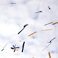
| 12/05/2005 11:05:19 PM |
Falliingby idnicComment: simple, very clever idea. oddly your pattern doesn't look very random as they seem to be congregating toward the bottom and the spoons are all clumbed together. though intresting the whole, looks compositonally awkward. i think this image would have really appealed to me if you cloned out some of the more out of place items (like the knife on the right edge going outside the frame for example). still cool idea |
| Photographer found comment helpful. |
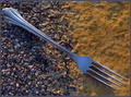
| 12/05/2005 10:53:27 PM |
Another Fork In The Roadby RentrenzComment: nice focus and lighting with interesting textures. composition feels a little boxed in with what I find as another interesting texture, the fork handle, wayat the edge of the image. would have liked to see it w/o the reflection in the tines |
| Photographer found comment helpful. |
| 12/05/2005 10:47:19 PM |
Spanish Forkby GermaineComment: cool fork. would have liked to see it with a less textured and more contrasting back drop |
| Photographer found comment helpful. |
| 12/05/2005 10:45:27 PM |
Silver Circleby JayWalkComment: i like the toning. i wish you had something a bit more with the reflections. the way they show on the other utensils and the mirror in the 2 instances is very intriguing to me. |
| Photographer found comment helpful. |
Home -
Challenges -
Community -
League -
Photos -
Cameras -
Lenses -
Learn -
Help -
Terms of Use -
Privacy -
Top ^
DPChallenge, and website content and design, Copyright © 2001-2025 Challenging Technologies, LLC.
All digital photo copyrights belong to the photographers and may not be used without permission.
Current Server Time: 12/21/2025 01:42:49 PM EST.