| Image |
Comment |
| 06/13/2006 11:28:10 PM |
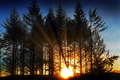
Early morning shadows.by banditComment: i'm starting to see the beginning of the tree shadows right by the sun and i'm left wondering if something prevented you from just capturing the base of the trees with the sun a few degrees higher. I bet that would have been a very interesting image and been more in line with what i believe voters are looking for. |
 Photographer found comment helpful. Photographer found comment helpful. |
| 06/13/2006 11:18:03 PM |
|
| Photographer found comment helpful. |
| 06/13/2006 11:15:00 PM |
|
| Photographer found comment helpful. |
| 06/13/2006 11:11:02 PM |
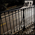
On their wayby jjbeguinComment: interesting capture. I'm having trouble with what feels like to me, most of your leading lines running away from your main point of interest |
| Photographer found comment helpful. |
| 06/13/2006 11:06:45 PM |
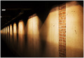
The Wallby MrXpressComment: like the gritty feel. Oddly for this challenge, your point of interest seems to be those bricks and not the shadows, which are far more interesting to me. |
| Photographer found comment helpful. |
| 05/18/2006 12:03:30 AM |
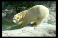
Brrrrrrrrby AryellaComment: i think every photo should have an element that rewards you for taking the time to actually look at an image. your's is the little bird. i also like how the arch of the bear's back mimics the waterline and the smile making for a very pleasing compostion. it's a bit brighter and a little softer than i would like ,though |
| Photographer found comment helpful. |
| 04/11/2006 07:38:15 PM |
|
| Photographer found comment helpful. |
| 04/06/2006 10:09:11 PM |
gloomyby arsenalComment: i like how the 2nd light source has created a shadow on the wall. it really adds interest between the main light and your shoulder. i just wish it wasn't so hot on your temple and ringy under your eye. very interesting rotation choice i think it works well. |
| Photographer found comment helpful. |
| 04/06/2006 09:49:06 PM |
Summer Decadenceby Little KingComment: i could see this on the cover of a sheik gourmet magazine. perhaps that's why you went with a vertical crop. i hope others don't complain about your composition and focus as i find both quite appealing |
| Photographer found comment helpful. |
| 04/06/2006 09:45:23 PM |
yellow on whiteby BowieComment: i really like that your bg is pure black. i wish the flowers were just a bit more crisp and popped off of the bg more. your choice to not have the same negative spacing on the left and right feels odd to me. |
| Photographer found comment helpful. |
Home -
Challenges -
Community -
League -
Photos -
Cameras -
Lenses -
Learn -
Help -
Terms of Use -
Privacy -
Top ^
DPChallenge, and website content and design, Copyright © 2001-2025 Challenging Technologies, LLC.
All digital photo copyrights belong to the photographers and may not be used without permission.
Current Server Time: 08/14/2025 03:36:02 AM EDT.