| Image |
Comment |
| 03/25/2004 06:18:04 PM |
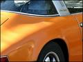
Targa 911Tby justineComment: Nice curves and contrasting colors. A pass at Neatimage to tone down the noise would greatly improve this. But the curves are just delicious. |
 Photographer found comment helpful. Photographer found comment helpful. |
| 03/25/2004 06:14:36 PM |
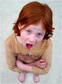
"I Look Fat!"by MarjoComment: Cool stuff!! Clarity of the subject is wonderful. DOF is well handled. Very clever arrangement! A 9! |
| Photographer found comment helpful. |
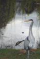
| 03/24/2004 06:57:02 PM |
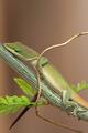
National Geographicby jas0420Comment: The clarity and DOF is remarkable. Background is appropriate. The diagonal composition is very pleasing. Could have had a whole body exposure but not much is lost even without the tail. Space for the title is more than enough. A ten! |
| Photographer found comment helpful. |
| 03/24/2004 06:55:05 PM |
Parentingby sagestudioComment: This is so appropriate for the magazine. Love the the perspective and the DOF. Just needs space for the title. But it's a ten! |
| Photographer found comment helpful. |
| 03/22/2004 07:27:38 PM |
Easy Home Cookingby KonadorComment: Nice artwork. This could have worked also for the mundane challenge. Colors and shadows just grab you. A ten. |
| Photographer found comment helpful. |
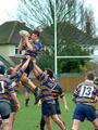
| 03/22/2004 07:26:36 PM |
Rugby Worldby Geo_GriffinComment: Very appropriate. You even left space for the title. And Iove watching rugby. A ten. |
| Photographer found comment helpful. |
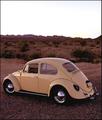
| 03/22/2004 07:21:08 PM |
HotVWby tfarrell23Comment: Nice, I wish you had more color in the sky but it does fit for the title though. |
| Photographer found comment helpful. |
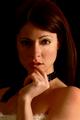
| 03/22/2004 07:16:40 PM |
Wby AleciaComment: It's nice and fitting. I maybe being petty here but the eye under the shadows is so dark that at first glance she looks like she has a black eye. Perhaps lighten her right eye a little bit. But if you wanted it this way, it's your license. |
| Photographer found comment helpful. |
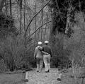
| 03/22/2004 07:14:54 PM |
The Golden Years - Springby zeuszenComment: Also AARP :-). Wow, this is one very well thought of subject matter and composition. You even left space for the title above them. Good job! (I don't know what the format is of your magazine but if you crop it to the usual magazine size, it will even be more fitting, but I am being petty.) |
| Photographer found comment helpful. |
| 03/22/2004 07:12:31 PM |
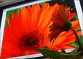
Audubon Magazineby ccraftComment: Yes! Very fitting, even you left space for the title! I would increase the contrast a little (or saturation) as there is a gray cast. I am sure looks good in your version but my experience is that there is a loss of contrast when pictures are uploaded. But composition is good, subject is very fitting, background is wonderful ... I give it a 9. |
| Photographer found comment helpful. |
Home -
Challenges -
Community -
League -
Photos -
Cameras -
Lenses -
Learn -
Help -
Terms of Use -
Privacy -
Top ^
DPChallenge, and website content and design, Copyright © 2001-2025 Challenging Technologies, LLC.
All digital photo copyrights belong to the photographers and may not be used without permission.
Current Server Time: 06/15/2025 04:52:48 PM EDT.