| Image |
Comment |
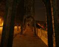
| 10/24/2004 12:22:30 PM |
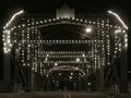
Bridgeby GBServisComment: Very nice. I like the repitition and the sepia toning. Also like the low-to-the-ground angle. Good job. |
 Photographer found comment helpful. Photographer found comment helpful. |
| 10/24/2004 12:20:44 PM |
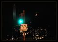
1600 Pennsylvania Ave: no right turns.by MrYuComment: Different approach but not sure it's strong enough for me. I would focus either on the light pole and make that my main subject or focus on the WH and WM as a subject. I don't like the light as your main subject and that we are fighting to see the structures in the bg through the trees. I would focus on one or the other. Good attempt. |
| Photographer found comment helpful. |
| 10/24/2004 12:17:29 PM |
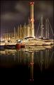
Power-Boatsby marboComment: Always like reflections. Interesting tower adds to this. Nice exposure. |
| Photographer found comment helpful. |
| 10/24/2004 12:14:54 PM |
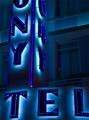
Colony Hotelby PerezDesignGroupComment: I would easily walk by this and miss this shot. I really like the colors and comp. Colors are soothing and the comp. leaves question as to what hotel/motel this is. Good eye. |
| Photographer found comment helpful. |
| 10/24/2004 12:11:54 PM |
Night Curvesby Rando D300Comment: Cool shot. I like the recursion and the exposure. Wish there was a way to clip off the left. It tries to steal my attention from the subject. |
| Photographer found comment helpful. |
| 10/24/2004 12:10:12 PM |
Escapeby DefyTimeComment: First shot so far that I've "wow'd" at. This captures you right away. It's moody and intense. I like the shadowplay, the orange tones and the crack in the wall. Definitely like the hood for added mystery, too. -8- |
| Photographer found comment helpful. |
| 10/24/2004 12:04:17 PM |
No parking at night time!by jmleliiComment: Interesting subject choice and comp. Not a so-called "pretty picture" but I really like this. Good comp. and exposure. The post is actually very pretty itself. Nice job. |
| Photographer found comment helpful. |
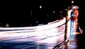
| 10/24/2004 12:02:47 PM |
164th Streetby ssodellComment: Traffic trails are always fun shots. I don't care for the exposure on this one though. The road is too blown out and the bg is too dark for me. How long was the exposure? Did you do it manually or did you use aperture priority and was the road wet? Try this again on dry road and maybe not so close to overhead lighting...? I do like the composition you chose, though. |
| Photographer found comment helpful. |
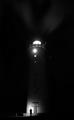
| 10/24/2004 11:58:47 AM |
Untitledby jonrComment: Nice job. I like how you were able to catch the beams of light shooting out from the top. I like the man at the base because it really shows proportion. Was the lighting on the man there or did you use a flashlight or headlights to illuminate him? I would be interested in seeing this in color. I'm usually partial to b&w but I feel this is a little too dark/contrasty for me. Could be my monitor... |
| Photographer found comment helpful. |
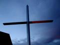
| 10/24/2004 11:55:52 AM |
The Blood of Christby vtruanComment: I like the angle of looking up at the cross, however I would have included more of the base of the cross because this looks more like a plus sign. Maybe a tall comp. and moving (yourself) to the left to get a full shot would work better; not sure I like the roof in the bottom corner. Still a good eye for noticing the 'blood'. I would have missed that. |
| Photographer found comment helpful. |
Home -
Challenges -
Community -
League -
Photos -
Cameras -
Lenses -
Learn -
Help -
Terms of Use -
Privacy -
Top ^
DPChallenge, and website content and design, Copyright © 2001-2025 Challenging Technologies, LLC.
All digital photo copyrights belong to the photographers and may not be used without permission.
Current Server Time: 08/21/2025 08:50:14 PM EDT.