| Image |
Comment |
| 02/08/2003 06:21:36 PM |
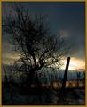
Wish You Were Here....by kretsComment: Very lovely colors and exposure except for the top black. It makes the image look top-heavy. I'd like to see this reworked...perhaps a diff crop. |
 Photographer found comment helpful. Photographer found comment helpful. |
| 02/07/2003 10:11:59 PM |
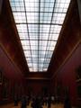
Louve Ceiling Panesby peggyComment: Critique Club Comments by Grayce
This is graphically a strong image. It's a simple composition, which I appreciate, yet strong and solid.
My eye gets drawn in by the perspective. The scale is very interesting, and it's good you included the people to show the scale.
I don't agree with the comment that "there is too much negative space." The neg space works well here.
A little more light on the people probably would be enhance the image, but there is enough to make it out.
Overall I like this and I congratulate you on your vision.
Regards,
Grayce |
| Photographer found comment helpful. |
| 02/06/2003 11:59:12 PM |
|
| Photographer found comment helpful. |
| 02/06/2003 11:54:11 PM |
|
| Photographer found comment helpful. |
| 02/06/2003 11:53:04 PM |
|
| Photographer found comment helpful. |
| 02/06/2003 11:17:12 PM |
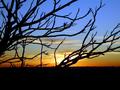
Sunsetby Frank BeckmanComment: Love it except for the bottom black, I'm not crazy about. Overall good.
|
| Photographer found comment helpful. |
| 02/06/2003 09:33:50 PM |
|
| Photographer found comment helpful. |
| 02/06/2003 09:19:46 PM |
|
| Photographer found comment helpful. |
| 02/06/2003 08:51:30 PM |
|
| Photographer found comment helpful. |
| 02/06/2003 05:08:58 PM |
|
| Photographer found comment helpful. |
Home -
Challenges -
Community -
League -
Photos -
Cameras -
Lenses -
Learn -
Help -
Terms of Use -
Privacy -
Top ^
DPChallenge, and website content and design, Copyright © 2001-2025 Challenging Technologies, LLC.
All digital photo copyrights belong to the photographers and may not be used without permission.
Current Server Time: 08/15/2025 08:33:38 PM EDT.