| Image |
Comment |
| 04/14/2003 11:43:25 AM |
Hello from Mexico!by kosmikkreeperComment: Critique Club comments by Grayce
Wow! This is a very interesting capture you've got here. It reminds me of an ad for the cruise line.
The stark contrast between the grey/blue, cold, cloudy portion of sky, and the warm, orange, vibrant part is amazing. And the way the rays seem to envelope the ship is something you just don't see all the time.
The water looks very choppy, and may be a bit over-sharpened? The metallic coloring of it, though, adds more interest to the image.
The composition would benefit from the ship not being so centered. I think I'd crop part of the water on the bottom, to lower the ship to the bottom third.
OVer all I like it. Good eye!
Regards,
Grayce |
 Photographer found comment helpful. Photographer found comment helpful. |
| 04/14/2003 12:48:33 AM |
|
| Photographer found comment helpful. |
| 04/14/2003 12:22:02 AM |
|
| Photographer found comment helpful. |
| 04/13/2003 01:37:49 PM |
|
| Photographer found comment helpful. |
| 04/13/2003 01:30:15 PM |
|
| Photographer found comment helpful. |
| 04/11/2003 11:51:49 PM |
|
| Photographer found comment helpful. |
| 04/11/2003 12:06:52 PM |
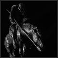
Tabletop Warriorby autoolComment: Critique Club Comments by Grayce
This is a moody kind of shot. I admire your willingness to try something "artsy!"
The lighting you chose shows some interesting texture to this. I see some have suggested a lighter bg to make the subject stand out. That would be a nice alternative, but I think this makes it a little more mysterious. Having backlight could prove interesting though.
You've completely avoided digital noise and artifacts. Great job!! In a picture with this much darkness, that is no easy feat.
Composition is very good with good diagonals and good use of negative space. If I'd change anything, compositionally, it would be to include the entire legs of the horse. Not a major problem though.
Dof is excellent with all the highlighted features clearly focused.
Overall, I like this as it is. Experimenting with lighting suggested by several commenters would also be a worthy endeavor.
Good job Autool!
Regards,
Grayce
|
| Photographer found comment helpful. |
| 04/11/2003 11:42:42 AM |
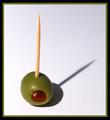
Oliveby JackoComment: Critique CLub Comments by Grayce
Jacko, I like this very much! It is simple and clean and very graphically strong.
The composition works very well with the subject and shadow. It almost reminds me of a sundial. You've left enough negative space to make the subject really pop. The framing here is fine too.
The colors are good and natural looking and exposure is fine. Your choice of white bg is a good idea.
The focus is a wee bit soft, but still within the acceptable range, imo.
Post processing in Clean Image served well.
Overall very good, simple idea, effectively executed.
Regards,
Grayce |
| Photographer found comment helpful. |
| 04/09/2003 05:27:43 PM |
|
| Photographer found comment helpful. |
| 04/09/2003 05:01:32 PM |
Yellow by miracComment: Very good! DOF is good, color good, bg good, comp good. What more could I say??? I like it, in case you didn't know it....lol |
| Photographer found comment helpful. |
Home -
Challenges -
Community -
League -
Photos -
Cameras -
Lenses -
Learn -
Help -
Terms of Use -
Privacy -
Top ^
DPChallenge, and website content and design, Copyright © 2001-2025 Challenging Technologies, LLC.
All digital photo copyrights belong to the photographers and may not be used without permission.
Current Server Time: 08/18/2025 08:05:27 AM EDT.