| Image |
Comment |
| 03/22/2004 02:46:53 PM |
Lighthouse Digestby LtHousLadyComment: I like the sun behinf the lighthouse effect, however, the resulting darkness of the subject takes much away. Increasing your aperature and reducing your exposure time will provide more light on the building. Unfortunately, if you overdo it, it can blow out the sky as well. If you get a chance to shoot again at that location, you may want to mess around with different aperatures to see what you can do. Failing that, there's always dodging in photoshop. ;) |
 Photographer found comment helpful. Photographer found comment helpful. |
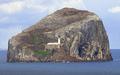
| 03/22/2004 02:40:53 PM |
Lighthouse Digestby browntComment: It' s a beautiful subject. The photo itslef looks a bit washed (and I mean I am nitpicking bit, not a noticable bit), likely the result of the distance between you and the island. A little tweeking of the levels may have pulled more out of it. |
| Photographer found comment helpful. |
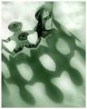
| 03/22/2004 02:36:38 PM |
Fortune Magazineby dsidwellComment: That is a wonderful concept and I could definately see something like this on the cover of Fortune. The only thing I would change is the composition. The main subject (the money guys) would look better on one of the lower corners and their shadows should be heating up to one of the top corners where they will be partly covered by the title. |
| Photographer found comment helpful. |
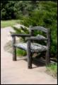
| 03/22/2004 02:30:43 PM |
Country Livingby moodvilleComment: Photographically... very well done. Subject matter, however, is a bit missing. Mostly the lack of texture in the walkway. The large area of blant space below the bench pulls the attention away from the subject and offers little in itself. Maybe if you cropped the photo higher to remove the area under the front left leg and included more of the trees above it would have been more balanced and would have brought the subject lower allowing for space for the magazine title. |
| Photographer found comment helpful. |
| 03/22/2004 02:25:43 PM |
Audobonby qnjtComment: Perfect composition. Nice action shot, plenty of space for text and title, nice colors... Excellent. |
| Photographer found comment helpful. |
| 03/22/2004 02:21:53 PM |
Dirt Track Racingby sherComment: Well, at least somepeople realized that magazine covers need to leave some space for titles and text. Very well composed. Had there been more detail for the drivers, it would have improved a lot. But given the circumstances, it's not easy to meter for light when the subject is zipping past you. |
| Photographer found comment helpful. |
| 03/22/2004 12:28:48 AM |
portre ressami by kiwinessComment: Way to go Kiwi. Truth be told, when I first saw that photograph, I immediately thought of McCurry's National Geographic shot. Very well done. |
| Photographer found comment helpful. |
| 03/15/2004 03:46:14 PM |
|
| Photographer found comment helpful. |
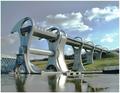
| 03/15/2004 01:30:37 PM |
The Falkirk Wheelby geewhyComment: WOW. Now I see how that works. I love the concept. I was somewhat curious as to how the lift functioned when I saw your challenge entry. The only problem is that one would have to step down the mast on sailboats in order to fit it through the circles. |
| Photographer found comment helpful. |
| 03/13/2004 10:30:22 AM |
Up in Flamesby tyt2000Comment: Very nice use of perspective. At first glance, I actually thought the 'flames' where integral in the building. Excellent. |
| Photographer found comment helpful. |
Home -
Challenges -
Community -
League -
Photos -
Cameras -
Lenses -
Learn -
Help -
Terms of Use -
Privacy -
Top ^
DPChallenge, and website content and design, Copyright © 2001-2025 Challenging Technologies, LLC.
All digital photo copyrights belong to the photographers and may not be used without permission.
Current Server Time: 08/28/2025 10:41:36 AM EDT.