| Image |
Comment |
| 03/24/2004 02:19:33 PM |
Look at my heart!by kinksComment: I have a very similar submission where the 'heart' of the flower is orange. Sadly I am being rated poorly based on the fact that the entire flower isn't orange. I hope it's going better for you. As far as your composition, I think the croping takes away a lot of the context. The center doesn't really stand out on it's own and cropping in the entire flower may have given it more presence. Maybe you chose this crop to emphasize the orange. |
 Photographer found comment helpful. Photographer found comment helpful. |
| 03/24/2004 02:15:47 PM |
Orange Shapes and Texturesby carlacrypticComment: Nice job capturing the different tectures (orange foam on orange wool?). Composition wise, I think angled shaddows (ie, lighting from a corner, not an edge)tend to look more balanced as opposed to the verticle drop. Also, consider centering equally top/bottom vs left/right. |
| Photographer found comment helpful. |
| 03/24/2004 12:18:03 PM |
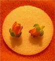
MMMMMMMMMMMMMMMMMMMMMMby GOLNAZZZComment: I don't know if this is meant to be soft focus, but it really looks out of focus. Additionally, if that is an orange, the challenge details clearly stated that no oranges were to be used. |
| Photographer found comment helpful. |
| 03/24/2004 12:00:35 PM |
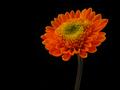
Day Glow Orange Flower: Normal saturation!by NeilComment: Your choice of background really brings out the colors of the flower. I am a bit unsure about the unnatural look of a black stem. If it's the result of messing with the colors too much, then I don't like it. However, if that flower actually has a very dark stem, then it's fine. Alas, I am no botonist, so I will give you the benefit of the doubt. I only mention this so that if the former is the case, I find that it detracts from the image. |
| Photographer found comment helpful. |
| 03/24/2004 11:52:56 AM |
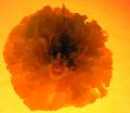
Fiery Marigoldby sfaliceComment: The photo feels like it's exploding off the screen. I think using a gentle light from the top/side would have served better. As is, the texture of the marigold is really lost. Furhter, the yellowish background provides little contrast to the flower. |
| Photographer found comment helpful. |
| 03/24/2004 11:50:52 AM |
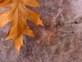
Almost Spring!by ManikzComment: Brown??? Naaa, dark orange. I'll buy that. The photo does captures the essence of the change of seasons. Had there been a bit of green, or even better, a crocus poking it's way through the ice, it would have totally captured spring. Still, nice composition and a serene photo. |
| Photographer found comment helpful. |
| 03/22/2004 04:18:16 PM |
Watercolor Digestby carlacrypticComment: Darn. You have presented me with a conundrum here. On one hand, I really don't like the use of digital filters. On the other hand, the use of such a filter REALLY makes the subject of the magazine. I think I will have to make an exception here. |
| Photographer found comment helpful. |
| 03/22/2004 03:04:46 PM |
National Geographicby jas0420Comment: The composition and aspect ration is perfect for a magazine cover. I also really like the soft colors and the background. My only critique would be your choice of magazine title. "Reptile Hobbyist" or "Reptile & Amphibian" would have been better suited. But the again, this isn't a photo title contest. |
| Photographer found comment helpful. |
| 03/22/2004 03:01:15 PM |
Birder's Worldby jrs915Comment: The DOF (blurred behind the title) works perfectly for a magazine cover. Very well done. |
| Photographer found comment helpful. |
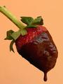
| 03/22/2004 02:59:47 PM |
PHOTOgraphic - February 2004 issue (www.photographic.com)by jealbornComment: I like the idea of using an actual magazine cover as inspiration. My recommendations would be to use better chocolate to provide a smoother surface (I use toll house dark chocolate morsels melted in the microwave under low power when I dip strawberries. Only heat for 10-15 seconds at a time and stir between heatings, it tends to burn quickly). Also, the background is to monotonous. Something with a bit of texture would have added some depth. |
| Photographer found comment helpful. |
Home -
Challenges -
Community -
League -
Photos -
Cameras -
Lenses -
Learn -
Help -
Terms of Use -
Privacy -
Top ^
DPChallenge, and website content and design, Copyright © 2001-2025 Challenging Technologies, LLC.
All digital photo copyrights belong to the photographers and may not be used without permission.
Current Server Time: 08/28/2025 10:42:42 AM EDT.