| Image |
Comment |
| 03/07/2008 10:25:36 PM |
|
 Photographer found comment helpful. Photographer found comment helpful. |
| 09/29/2004 03:15:56 PM |
Routinesby zeuszenComment: I like the point of view of this photo as well as the composition. My only concern is its relation to the theme. The photo composition itself is not complex nor is the subject. I actually consider something routine as being the oposite of something complex. Then again, maybe my life is too simple. However, given the vaqueness of this challenge, I am not scoring based on meeting the challenge. |
| Photographer found comment helpful. |
| 09/28/2004 11:06:01 AM |
Second City by kirbicComment: Speechless. If I lived in Chicago, I'd be buying a print of this. Very nicely done. |
| Photographer found comment helpful. |
| 09/28/2004 10:53:54 AM |
Spokes & Gearsby ArtysteComment: Gears? Complex? Aren't they classified as simple machines? ;) Alright, I'll stop being a geeky engineer and look at this photo as a photographer. The composition is very good and well balanced. The only thing I would change is to give the bottom of the derailleur a bit more room. It's looks somewhat crowded with the close crop. Also, the spokes just left of the derailleur look a tad out of focus and some others (along with parts of the frame) are refelcting too much light. But believe me, I know how hard it is to not get bright reflections when photographing round metalic objects. As far as the color of the grass, I suspect you may get a few comments about it not being green. Personally, I like the desaturation. It gives the grass a metalic feel that ties it in nicely with the subject. |
| Photographer found comment helpful. |
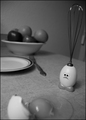
| 09/28/2004 10:43:40 AM |
Design Visionby FirstyComment: That is a very interesting tehnique and, seing that it is validated, I hope you comment on how you did it. I look forward to comming back to see. Overall, it doesn't realy scream complexity to me. Actually, the image would speak more to simplicity as you have taken a 3-D object and simplified it to a line drawing. On the other hand, the technique you used to do this is probably quite complex so I will grant you the challenge topic on that alone. Overall, the only thing that bothers me is the fact that the top right corner of the cartridge is obscured. It's nit-picky, but I am an information junkie, and when their is some information that I can't see, it somewhat bothers me. But aside from my peeves, the composition is very well balanced. Nicely done. |
| Photographer found comment helpful. |
| 09/28/2004 10:34:41 AM |
To upload...by spydrComment: I like the choice in angling the composition. It adds a nice sense of depth to an otherwise flat subject. |
| Photographer found comment helpful. |
| 09/27/2004 11:11:03 AM |
Piano Havenby saintaugustComment: This is a very interesting shot. I love the use of negative space to highlight the pianist. If it's possible to complete the stage circle without introducing other elements, I think it would add more balance to the photo though.
Nice find. |
| Photographer found comment helpful. |
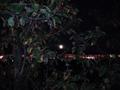
| 09/02/2004 10:26:32 AM |
moon & treeby arnarComment: The red lights in the background suggest that the camera was moved while taking this photograph. Consider using a tripod. |
| Photographer found comment helpful. |
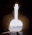
| 09/02/2004 10:25:10 AM |
A bottle in the wall ...by empauloComment: The concept is very nice and it definately meets the challenge, however, this photo could be much better if taken on a different day and at a different time. The hazy sky and the streak of sunlight through the 'bottle' are the only things that detract from it. |
| Photographer found comment helpful. |
| 09/02/2004 10:21:20 AM |
Framedby faidoiComment: Very nicely done and good use of backlighting. I especially like the symmetry of the frame. The only distraction is the pixel on the upper left part of the right column but I commend you on sticking to the rules. |
| Photographer found comment helpful. |
Home -
Challenges -
Community -
League -
Photos -
Cameras -
Lenses -
Learn -
Help -
Terms of Use -
Privacy -
Top ^
DPChallenge, and website content and design, Copyright © 2001-2025 Challenging Technologies, LLC.
All digital photo copyrights belong to the photographers and may not be used without permission.
Current Server Time: 08/28/2025 06:55:05 AM EDT.