| Image |
Comment |
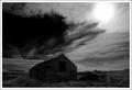
| 04/14/2005 03:15:30 PM |
Once upon a time...by BrinComment: Catch 22 I know, the building would look better lighter but you would loose the moody sky here... Very good image none the less. |
 Photographer found comment helpful. Photographer found comment helpful. |
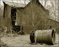
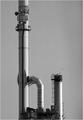
| 04/14/2005 03:08:24 PM |
Pride Cometh...by eqsiteComment: focal point is more on the barrel than the builiding unfortunately and the tree is blocking the shot. I would like to see this shot with you shooting a little more to the left and getting the top of the builing in, if this was the case the building would look ok not being the centre of attention. |
| Photographer found comment helpful. |
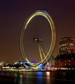
| 04/13/2005 04:26:46 AM |
Eye "Q" by MatthewComment: Worst to First !
Well done...
The colours in this are fantastic |
| Photographer found comment helpful. |
| 04/12/2005 08:07:05 PM |
V/Yby arbil14Comment: Good shot but the frame kills it. |
| Photographer found comment helpful. |
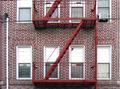
| 04/12/2005 05:06:16 PM |
Hi Everybody!by vasilkovayaComment: Shame its not a Accidental Words challenge, this would sure win... Shame you don't however get double marks for the two letters either :0) Great shot well suited to B&W yet I think I would have cropped lower from the top down to just under the platform. |
| Photographer found comment helpful. |
| 04/11/2005 05:01:40 PM |
Fire Zscapeby Nikolai1024Comment: Personally would have cropped more of the top gangway off to leave only the Z but the colours work great, did you try a polariser on this to reduce glare? Would be interesting to see if you did with another shot! |
| Photographer found comment helpful. |
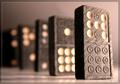
| 04/11/2005 05:00:09 PM |
Domin 'H' Ricksby SimonkasprzakComment: Great title and DOF, Excellent, would also like if you could share your border technique after the challenge too :0) |
| Photographer found comment helpful. |
| 04/11/2005 01:52:57 PM |
turning pointby messerschmittComment: You may have gone a little to harsh on the BG I feel, slightly less contrast would have really helped the image. |
| Photographer found comment helpful. |
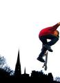
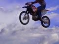
| 04/11/2005 01:51:22 PM |
Outside the Box...by BudComment: Good literalism but may have had more impact had the whole biker been in clear view or cropped at a strange angle. |
| Photographer found comment helpful. |
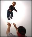
| 04/11/2005 01:50:17 PM |
Flight Simulatorby smoon273Comment: The boys left hand seems strange ( maybe the angle ), could look better with a little dodging and burning as the childs face seems too dark. Slightly out of focus. |
| Photographer found comment helpful. |
Home -
Challenges -
Community -
League -
Photos -
Cameras -
Lenses -
Learn -
Help -
Terms of Use -
Privacy -
Top ^
DPChallenge, and website content and design, Copyright © 2001-2025 Challenging Technologies, LLC.
All digital photo copyrights belong to the photographers and may not be used without permission.
Current Server Time: 08/04/2025 06:05:20 PM EDT.