| Image |
Comment |
| 10/06/2011 11:53:21 PM |
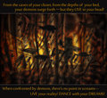
Dance with your Demonsby Bear_MusicComment: Nice shot. This poster does not need the white lines and using a simple font such as the "American typewriter" in a small size would benefit it. |
 Photographer found comment helpful. Photographer found comment helpful. |
| 10/06/2011 11:53:14 PM |
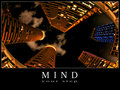
mindby mitalapoComment: Not bad! Well thought.
The lettering should have been more modern, smaller, NOT white, no (white) border. Details that count.
How wrong was I! the formatting is typical for these posters. My ignorance. Your poster is what it should be. |
| Photographer found comment helpful. |
| 10/06/2011 11:52:27 PM |
Resourcefulnessby HipychikComment: Nice tree and , yes, resourceful. It looks though more like a dated calendar page because of the choice of font and borders. The idea begs for a more audacious approach
So much for my ignorance concerning the formatting of these posters. You certainly stayed within the set look. |
| Photographer found comment helpful. |
| 10/06/2011 11:52:18 PM |
|
| Photographer found comment helpful. |
| 10/06/2011 11:52:14 PM |
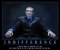
I N D I F F E R E N C Eby njsabsComment: He he, this reminds me of a line from a book:
"he was not talking but one could tell that he entertained stupid thoughts" |
| Photographer found comment helpful. |
| 10/06/2011 11:51:59 PM |
|
| Photographer found comment helpful. |
| 10/06/2011 11:51:41 PM |
|
| Photographer found comment helpful. |
| 10/06/2011 11:51:37 PM |
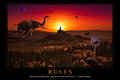
Rules by gyabanComment: This must be Christophe or admirer who made an image to accompany Debussy's "Prélude à l'après-midi des elephants"
or
"Et la lune descend sur le temple qui fut"
Well done illustration, like always; in a book for children would be sheer delight but for a motivational poster the graphic design should have been a touch more ambitious and daring. (No italics in white, for instance; a better marriage between illustration and text.) The thin border gives a dated look for an image that is meant to be timeless.
I have to take back my comment regarding the formatting. Sheer ignorance from my part. You created a true motivational poster, formatting and all. Should have done my homework. Oh boy, who invented this design for motivational posters? Got me thouroughly demotivated. |
| Photographer found comment helpful. |
| 10/06/2011 11:50:29 PM |
Hammer Timeby BrennanOBComment: Ha! The antiseptic blue border is not bad here. Good adage, good image.
No need though for the bigger S and N. It's so deja vu in this challenge that I wonder if it was not required. Also, a plain font (such as even the ubiquitous "Helvetica") would have been so much more appropriate.
I have to take back my comment regarding the formatting. Sheer ignorance on my part. You certainly stayed within the set formatting for these types of posters.
And, (within this mighty boring format that got me so "demotivated") you created a strong image. |
| Photographer found comment helpful. |
| 10/06/2011 11:50:24 PM |
|
| Photographer found comment helpful. |
Home -
Challenges -
Community -
League -
Photos -
Cameras -
Lenses -
Learn -
Help -
Terms of Use -
Privacy -
Top ^
DPChallenge, and website content and design, Copyright © 2001-2025 Challenging Technologies, LLC.
All digital photo copyrights belong to the photographers and may not be used without permission.
Current Server Time: 08/22/2025 03:37:36 PM EDT.