| Image |
Comment |
| 11/20/2003 12:33:03 AM |
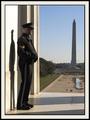
Sacred Watchby ShelleyComment: Greetings from the Critique Club:
This is a very nice shot overall; most of the issues concern the environment you captured, not your technique.
COMPOSITION: I like the composition you chose, with the balance of the monument and this guard. However, I'm not sure whether water in the reflecting pool would make the eye want to see more over to the right as well. But as taken I like this composition. Before fixing the water, you might also want to clone out that crane!
EXPOSURE AND SHARPNESS: The exposure looks good, and it's leveled well too (except maybe the top of the white wall where he's standing might be a bit overexposed.) Sharpness is good, though hard to judge in this small version.
AESTHETICS: This photo has pretty good aesthetics overall The reflecting pool and crane are the major issues; the pool could have been completely dry, or filled, but I don't like it as it is.
Hope this helps a little. It's hard to critically critique something that doesn't need much of a critique!
|
 Photographer found comment helpful. Photographer found comment helpful. |
| 11/19/2003 07:42:08 PM |
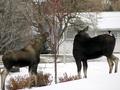
Size doesn't matter!by amazoneeaComment: A very funny capture; wish you had a good shot of just a single animal with the bird on the back. (And one facing sideways or you.) |
| Photographer found comment helpful. |
| 11/19/2003 07:40:37 PM |
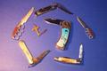
knifesby tolovemoonComment: How is this propaganda? Otherwise, good shot other than a little glare on the lower left table and knife. By the way, knives is plural for Knife. |
| Photographer found comment helpful. |
| 11/19/2003 03:59:36 PM |
|
| Photographer found comment helpful. |
| 11/19/2003 03:32:50 PM |
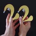
Catch 22 by Joseph Hellerby trainComment: It's hard to see that you are "catching" this without the title. If you could have grabbed a shot with the 22 actually in the air, and your hands waiting below, it would have been more dramatic. And while lighting is good, the brigher light might be better placed on the 22.
BTW - that's one of my favorite books from my youth. |
| Photographer found comment helpful. |
| 11/19/2003 03:00:23 PM |
The Red and The Blackby MichaelsComment: I'm curious: How did you do this within the no-editing rules? 1/20th of a second would not be much time to manually swirl it? |
| Photographer found comment helpful. |
| 11/19/2003 02:55:23 PM |
|
| Photographer found comment helpful. |
| 11/19/2003 01:25:53 PM |
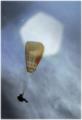
Stranger to the Groundby JPRComment: Since I have not had a chance to comment on this before, and it seems to be the topic for the day, let me do so now. I gave this an above average score for a photo that meets the challenge (I think scores should be anonymous, with maybe exception of those giving 1s, so I try not to tell). I do like the capture of the diver, and the composition and crop is good. I also like the texture given by the noise, and the colors of the sky.
However, the flare doesn't work at all for me. I think it works for some people because they see it as an "object", as if this was the moon with the diver just below. That would indeed be very nice! But it's flare. ;-) There's also some other small defects which detract and influenced my scoring (which was still pretty good): a large white spot or something like that just above it, and the fact that the diver is oversharpened, which is what makes him stand out with contrast (but unnaturally IMHO). |
| Photographer found comment helpful. |
| 11/19/2003 02:00:16 AM |
Stephen King- Firestarterby neenee1999Comment: I think this was a very good attempt to illustrate the book. But you set your JPEG compression ratio too high, and that has degraded the photo. Also, while the effect is nice, the close up, just off center composition isn't as interesting as I think other versions might be. (Actually, it works well as a thumbnail). |
| Photographer found comment helpful. |
| 11/19/2003 01:00:08 AM |
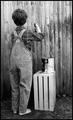
The Adventures Of Tom Sawyerby OneSweetSinComment: Greetings from the Critique Club:
I really liked this image from book titles, and scored it higher than most if not all other images I scored, so there's not a lot I can say to explain why it didn't place higher. I think the composition is excellent, the choice of B&W as well. Though now, thinking about it, it might have worked even better in sepia for an old fashioned look. Other minor details for perfection: the coveralls could have been a bit rattier, or maybe at least "shorter fitting" and the paint brush could have been visible. Of course, at the risk of ruining a good fence, technically, he should have been whitewashing the fence, so a white pain on the brush might have been a good start, and then just show the bristles.
Lastly, the technical capture is excellent, but maybe some directional lighting and shadows might have given it more pop.
But these are just thoughts to improve an already EXCELLENT photo. |
| Photographer found comment helpful. |
Home -
Challenges -
Community -
League -
Photos -
Cameras -
Lenses -
Learn -
Help -
Terms of Use -
Privacy -
Top ^
DPChallenge, and website content and design, Copyright © 2001-2025 Challenging Technologies, LLC.
All digital photo copyrights belong to the photographers and may not be used without permission.
Current Server Time: 08/28/2025 01:18:18 PM EDT.