| Image |
Comment |
| 10/22/2003 10:09:17 AM |
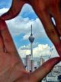
Framedby zerocusaComment: Pos .. Challenge-appropriate, great quality, beautiful city colors.
Neg .. I know this is the main part of your photo, but I just don't like the way the hands are ... Maybe its the position they are in, or even because the fingers aren't tightly closed and is showing some of the sky.
7 |
 Photographer found comment helpful. Photographer found comment helpful. |
| 10/22/2003 10:05:24 AM |
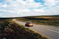
Emptyby groganComment: Pos .. Great contrast and tones, great composition, and its sharp.
Neg .. I kinda wish the land wasn't slanted so much, it kinda takes my eye away from the car. this is minor, but for some reason that rock in the lower left corner keeps bugging me ;) Nice stuff.
7 |
| Photographer found comment helpful. |
| 10/22/2003 10:02:17 AM |
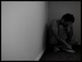
Alone with her thoughtsby tungstenComment: Pos .. Very moody, its great for this challenge. The composition is good. B&W is good .. but I think just a *hint* of neutral tones would work beautifully here.
Neg .. a little grainy, although I'm not too sure if thats a good or bad thing... not "completely" in focus but then again the soft touch is also nice. I'm partial on the negatives!! Great job :)
8 |
| Photographer found comment helpful. |
| 10/22/2003 09:53:29 AM |
Breakdownby TooCoolComment: Pos .. I like the composition here, and this fits the challenge well. B&W works great, nice choice. Nice and sharp - i like that.
Neg .. I would like to see less of that shadow behind his back - its a bit distracting. The subject is a little dark, a step lighter would be great.
7 |
| Photographer found comment helpful. |
| 10/22/2003 09:50:31 AM |
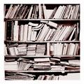
Alone in a Foreign Crowdby CraigDComment: Pros .. sharp, colorful and fits the challenge well.
Cons .. Almost *too* much contrast .. I can see a dull tone working best here. Also it would be great if all the books were aligned perfectly at the top. I am not sure on the blue bottom ... I think all white in the background and black as the bottom would look great :) JMO
7 |
| Photographer found comment helpful. |
| 10/17/2003 06:44:25 PM |
Science on stand byby jjbeguinComment: Interesting photo - I think the sharpness or contrast is a bit too high, the colors are great and composition as well. 8 |
| Photographer found comment helpful. |
| 10/17/2003 06:43:44 PM |
Old Condenserby GeneralEComment: yikes ... way too much grain .. it almost looks like it was taken with a webcam cause you can't pick much out of it .. |
| Photographer found comment helpful. |
| 10/17/2003 06:42:07 PM |
|
| Photographer found comment helpful. |
| 10/17/2003 06:41:33 PM |
|
| Photographer found comment helpful. |
| 10/17/2003 06:39:51 PM |
|
| Photographer found comment helpful. |
Home -
Challenges -
Community -
League -
Photos -
Cameras -
Lenses -
Learn -
Help -
Terms of Use -
Privacy -
Top ^
DPChallenge, and website content and design, Copyright © 2001-2025 Challenging Technologies, LLC.
All digital photo copyrights belong to the photographers and may not be used without permission.
Current Server Time: 08/04/2025 08:12:05 PM EDT.