| Image |
Comment |
| 11/17/2003 09:32:20 AM |
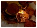
One Red Centby fdpiechComment: I think focusing needs improvement, The red cent should be the main subject, yet its not fully in focus |
 Photographer found comment helpful. Photographer found comment helpful. |
| 11/17/2003 09:30:20 AM |
|
| Photographer found comment helpful. |
| 11/17/2003 09:29:16 AM |
It's Like Money Down The Drainby CatherineComment: Fun idea :D I really think the penny on the top looks great - I would like to see the background brightened up a *little more, but not too much because the contrast between the top penny and the ones underneath does work. DOF nice. |
| Photographer found comment helpful. |
| 11/17/2003 09:27:23 AM |
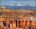
Take the Long Viewby sagestudioComment: awesome geography here, wow, quite amazing. I really like the contrast of colors happening.
I like how the distant mountains are slightly out of focus, it really adds. Great job. |
| Photographer found comment helpful. |
| 11/17/2003 09:24:40 AM |
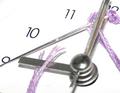
A Stitch in Time...by cbellerComment: this is a great idea, I feel that the photograph could have been a little better
the string and needle look over saturated or contrasted
I think the clock hands would look better in focus rather than out of, perhaps with the numbers out of focus.
what I do like about this photo is the colors, the white space, the composition, and the simpless of it. |
| Photographer found comment helpful. |
| 11/17/2003 09:21:08 AM |
Sticky Subjectby tfaustComment: Very theme-appropriate. Nice angle, colors are vibrant and appealing.
Great job. |
| Photographer found comment helpful. |
| 11/17/2003 09:20:13 AM |
Right Between the Eyesby muckpondComment: Nice! I would have cropped a little bit more off the left side to make the black space equal, other than that ... I can't see anything. Nice job |
| Photographer found comment helpful. |
| 11/17/2003 09:18:46 AM |
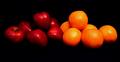
Blood is Thicker Then Waterby Firstrich1Comment: Nice work. Colors are nice, focus, composition and lighting great.
I am not too fond of the background, it seems a bit pixelated or oversaturated - but not to the point of making this unattractive photo, because I think its a great shot. |
| Photographer found comment helpful. |
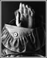
| 11/17/2003 09:16:12 AM |
Handbagby ShelleyComment: hehehe Nice work! Not only is this picture funny, its very good looking! :D |
| Photographer found comment helpful. |
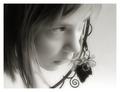
| 11/17/2003 09:15:22 AM |
I heard it through the grapevineby ursulaComment: Excellent capture! A nice clean looking photo. Excellent angle, and soft tones
b&w works well.
I do wish that the vine wasn't behind her face so much. |
| Photographer found comment helpful. |
Home -
Challenges -
Community -
League -
Photos -
Cameras -
Lenses -
Learn -
Help -
Terms of Use -
Privacy -
Top ^
DPChallenge, and website content and design, Copyright © 2001-2025 Challenging Technologies, LLC.
All digital photo copyrights belong to the photographers and may not be used without permission.
Current Server Time: 08/04/2025 11:28:16 PM EDT.