| Image |
Comment |
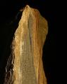
| 10/22/2003 02:34:17 PM |
Sundownby ellamayComment: I'm obtuse sometimes and in this case I don't get the title, but I don't hold that against the piece. I'm very intrigued by this image. The lighting is excellent, I love the warm neutrals against the black. The detail and focus are perfect - the grain is very evident and that texture really adds to the photo for me. Its got very simple lines which lend its rough nature a bit of elegance. Wonderful image, very well accomplished. 9 |
 Photographer found comment helpful. Photographer found comment helpful. |
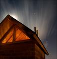
| 10/22/2003 02:30:45 PM |
Dark Industryby KonadorComment: Beautiful colors and the light display is gorgeous. I like the contrast with the colors and the nature vs machine. The border keeps my eyes from wandering out. I do wish the light rays didn't extend onto the buildings on the left so much so they'd be a crisp black, but its hard to tell the sun what to do. ;) A very striking image. 7 |
| Photographer found comment helpful. |
| 10/22/2003 02:28:56 PM |
Humber Bay Princessby timmiComment: Wonderful choice for interesting shapes and dynamics. The lighting is okay, I like how it is just barely lighting up the bridge's upper workings, though I wish it was stronger. The perspective is good, gives the bridge depth and breadth. I think the color could be richer, which would give the contrasting nature of the orangey brown and white a boost. A nice shot. 6 |
| Photographer found comment helpful. |
| 10/22/2003 02:23:19 PM |
"It's a beautiful life"by kengurinnComment: The child certainly looks carefree! I like the silhouette look and I always enjoy seascapes. Great use of space and light is what helps make this image, though the sun's rays are harsh and slightly unappealing. I definitely get a happy go lucky feeling from the image. Well portrayed. 7 |
| Photographer found comment helpful. |
| 10/22/2003 04:04:41 AM |
1:19 AMby QuadrajetComment: Good use of light, I like the rays coming over the building. The difference in colors with the warm orange against the cooler grey/blue adds interest, as does the perspective. There does however seem to be some glare, flares or something.. little white bits in the sky, they don't look like stars (though they may be) but it is rather distracting and detracts from the image. 5 Revising my vote after due to further info from photographer, they are stars and knowing how they came about made a difference. Upgrading to a 6 because I now understand why they look as they do but still find them distracting . |
| Photographer found comment helpful. |
| 10/22/2003 03:12:49 AM |
crestfallenby nbortonComment: I'm not sure where the title comes in play, though it looks kind of like he may be pouting? or sticking out of the tongue.... the crop may have removed that aspect. Great lighting on the jacket, marvelous detail. To be honest, I would suggest cropping out more of the left side, so that pout/tongue whatever isn't in the shot, just the jaw. I am finding my attention is captured very well by the detail of the jacket and his hands - a strong masculine image. 7 |
| Photographer found comment helpful. |
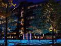
| 10/22/2003 03:09:01 AM |
Gridlines and Glassby ImagineerComment: Wow, where is this?? The colors are outstanding, so are the lights. Great focus, wonderful detail. Everything is crisp and bright. I don't see anything I would suggest changing. Great image! 10 |
| Photographer found comment helpful. |
| 10/22/2003 03:07:22 AM |
Spirits of the Jack-O-Lanternby neenee1999Comment: Woah! We need an old priest and a young priest.. I love the vibrant colors and who can say no to a jack o' lantern? The vision behind the image is good, but I find the choice of manifestation pretty distracting. Mostly because the colors in the image *are* so vivid. A brave strike out into being a little different though! 6 |
| Photographer found comment helpful. |
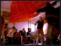
| 10/22/2003 03:03:55 AM |
Finish Lineby sherComment: I like the luminosity of the colors and I find the composition interesting. I wish more of the balloons were in the shot though. That said, it clearly is highlighting the light usage and does so in a clear and lovely way. Good focus and nice subject matter. 7 |
| Photographer found comment helpful. |
| 10/22/2003 02:59:54 AM |
Hula Partyby BobsterLobsterComment: I think this is a fun family shot. Lots of energy, clearly people are having fun. I'm not really fond of the action though, because it is all over the image and so my attention is jumping from one point to another erratically. Plus the action of it, makes portions blurred and because so many areas are blurred my attention then starts to wander. Had there been just one hula hooper, hulahooping, I think the balance wouldn't have tipped. Still it looks like a jumpin' time! 5 |
| Photographer found comment helpful. |
Home -
Challenges -
Community -
League -
Photos -
Cameras -
Lenses -
Learn -
Help -
Terms of Use -
Privacy -
Top ^
DPChallenge, and website content and design, Copyright © 2001-2025 Challenging Technologies, LLC.
All digital photo copyrights belong to the photographers and may not be used without permission.
Current Server Time: 08/16/2025 01:53:29 PM EDT.