| Image |
Comment |
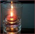
| 10/22/2003 04:12:58 PM |
The Flameby christyrackComment: Good focus and lighting. Fits the challenge well and I like the use of space. Unfortunately I don't find the subject terribly interesting. Its missing a spark of something to take it up to a higher level for me. I think it is technically sound though. 6 due to good technique, would've been higher if that spark was there. |
 Photographer found comment helpful. Photographer found comment helpful. |
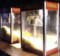
| 10/22/2003 04:07:31 PM |
Popcorn Anyone?by backslashComment: The frenzy of the popcorn machine! I really like the clean aspect of this image. The light makes things nice and crisp and there's good focus for the most part. In fact, the brilliance of the machines caught my eye so well I didn't realize there were people in the image for awhile. This could be a boring image, but I think the perspective and lighting gives it that bit of oomph. Nice job 7 |
| Photographer found comment helpful. |
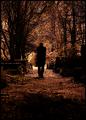
| 10/22/2003 04:05:26 PM |
Nightwalkby heidaComment: Fantastic image! I love the fact that the lighting seems to be the focus rather than the person walking. Its very crisp and clear, particularly where its well light up ahead. The perspective gives the feeling of a long walk ahead. I like the way he/she looks to be emerging from darkness towards the light. Is this using a sepia tone? The colors don't look completely natural but not in a negative way. One of my favorites in this challenge. 10 |
| Photographer found comment helpful. |
| 10/22/2003 03:58:00 PM |
Runestonesby magnetic9999Comment: The composition of this image is great. I love the colors and the way they are playing off the liquid. The lighting is good, but I'm not sure what those things next to the glass is, are they the stones? I admit the title isn't readily apparent to me, but no matter. Good focus, good interest. Solid image. 6 |
| Photographer found comment helpful. |
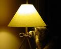
| 10/22/2003 03:41:13 PM |
Turn Out The Lights...by tfaustComment: Ah, how adorable! Great lighting of course! The subject is fun, humorous. I like the fact that the lamp is what's in greater focus rather than the cat. Composition is great and I like the tonal differences between the left and right sides. I do wish it was even on the left, but its not a preference so strong it affects my perception. Very fun photo. 7 |
| Photographer found comment helpful. |
| 10/22/2003 03:34:59 PM |
claireby MadMordegonComment: Beautiful subject, her eyes are wonderful. The lighting is okay, but I'm torn on whether I like it. On one hand I find it a bit detracting because I want more tonal play from the skin and deliniation of all the features. On the other hand I love how it really brings out the eyes and creates a nice foil for the hair (which in turn also highlight the eyes). Beyond that the only other thing that draw my eye negatively was an odd discoloration on her right eyebrow (possibly weird light glare?), doesn't take away from the image, but it did catch my attention. Excellent photo. 9 |
| Photographer found comment helpful. |
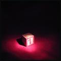
| 10/22/2003 03:30:59 PM |
And Now, The Star Of Our Show ...by GeneralEComment: Nice use of a mundane object and transforming it into something very interesting. The lighting really helps the transformation. The title fits the piece wonderfully which always helps. Could use a little more crispness. I also wonder if a different color underlay may have made for better contrast. Still I like the vision behind this image and the execution. Well done. 7 |
| Photographer found comment helpful. |
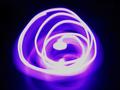
| 10/22/2003 03:28:44 PM |
Cool spiralby Bela45Comment: Very different. Fits lighting well. I like the colors, and while normally I'd find the level of brightness/harsh color to be a detractant, this works. I especially like the pale pink trails. Nice abstract image, well done. 6 |
| Photographer found comment helpful. |
| 10/22/2003 03:21:49 PM |
Autumn Sunby magnusComment: Great color combinations. The colors are very well defined and play off of each other nicely. I wish the lighting aspect of this was a little more vivid - the light seems muted, maybe by a polarizing filter? Keeps out the glare but I think it dulls out the tones just a tad. Still, great focus and the colors are nice. Composition is tight, but I think it works. 6, would've been higher had the brightness been there. |
| Photographer found comment helpful. |
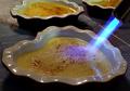
| 10/22/2003 03:18:41 PM |
Finishing the Crème Brûléeby dr rickComment: Mmm creme brulee. I've always liked this part. As a whole, I find the image a little flat - the eye is definitely drawn to the blowtorch thing, and that light blue really gives the image some pop. The overall color though is a tad too dull for my tastes. I like the perspective, and the close up nature is good, very crisp image. Would like to see it with a little more light on it. 5 |
| Photographer found comment helpful. |
Home -
Challenges -
Community -
League -
Photos -
Cameras -
Lenses -
Learn -
Help -
Terms of Use -
Privacy -
Top ^
DPChallenge, and website content and design, Copyright © 2001-2025 Challenging Technologies, LLC.
All digital photo copyrights belong to the photographers and may not be used without permission.
Current Server Time: 08/16/2025 01:41:22 AM EDT.