| Image |
Comment |
| 11/16/2003 02:37:37 PM |
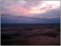
the horizonby darcyComment: Hello from the Critique Club!
You get to be my first official critique! ;)
The range of color tones and contrasts in this image really make it pleasing to the eye, I especially enjoy the way the light is diffused through the clouds. I think the vastness implied by both the ground and the sky help to promote the infinite feeling you were going for with the horizon, but with the titling, I find myself straining to see a bit more sharpness (and thus interest) going out into the distance - assuming the horizon is a focus for the image. That said, the long, lovely, curling cloud across the middle does grab my eye, and keeps it near horizon level creating an interest point in that area.
While I do think the way the color/lighting tones play is an asset to the photo - the overall darkness to it does make me, the viewer, struggle to determine what kind of scene (beyond that of a sunrise/sunset situation) I am looking at. I couldn't tell that this had an ocean aspect until I read the comments you'd left. Its an excellent photo, and were it a little lighter and a little sharper I think it would be even better. Well done. |
 Photographer found comment helpful. Photographer found comment helpful. |
| 11/12/2003 01:05:47 AM |
Tell Me Again About the Night I Was Bornby steinarComment: Aww what a sweetheart. Gorgeous baby, well composed - I like the fact that the clasped hands are in the image, gives another focal point and adds interest. I do wish the white wasn't so stark, really distract for me, perhaps a softer light would have played up the white and created a better foil for the child's skin. Nice work. 6 |
| Photographer found comment helpful. |
| 11/12/2003 01:01:45 AM |
Morning Mistby van9338Comment: Beautiful photo. You've captured some magnificent color and I like the way the contrast so brightly. The droplets are well defined and the focus is excellent. Good composition and the lighting is just right. Very nicely done. 7 |
| Photographer found comment helpful. |
| 11/12/2003 01:00:40 AM |
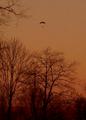
What color is your parachute?by chimeraComment: This is a nice silhouette type image. With the title, I think the focus should be on the parachute, and thus cropping a fair amount of the bottom is a suggestion, so that the trees aren't taking precedence. The colors look a little washed out, probably due to the fading light? Wish they could've been a bit more vivid. An overall sharpness to the image would help tighten up the photo too IMO. 4 |
| Photographer found comment helpful. |
| 11/12/2003 12:55:23 AM |
Preserving the Taste. The Secrets to Great Salsaby vrphotosComment: Excellent colors, lighting is great too. I could easily see this as an actual book cover. The food all looks appetizing and is arranged very well. I do wish there was a little more sharpness throughout the photo - the way the scene is composed all of the food items seem important to the image so I think it would be better if they were all in sharp focus. Well done. 7 |
| Photographer found comment helpful. |
| 11/12/2003 12:43:17 AM |
The Sword in the Stoneby moodvilleComment: Excellent photo. I love the way the sword & stone both pop against the background. Focus is great, lighting is good too. I really like the marbled look of the background, gives it an old-world feel. Very well done. 8 |
| Photographer found comment helpful. |
| 11/08/2003 07:10:38 PM |
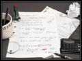
Back to the drawing board: Divide by zero = infiniteby NatatorComment: Great composition. Everything looks in place, I don't know math (ugh) so I don't know how accurate the equations are but they look the part. Nice range of items around, good lighting, the focus is good but I do wish it was a little bit crisper, not sure if that's due to resizing or not. I really like the thought and effort that went into the details of this - the one thing that really does it for me is that ring from the coffee on the paper. Excellent. 9 |
| Photographer found comment helpful. |
| 11/08/2003 07:02:31 PM |
Ah, Finally! Enough of me for the whole world!by NeuferlandComment: Heh, cute title. I like the image, the angles shown are great, works very well in black & white. Has a nice added crispness. Lighting is good, composition is too. I like that the subject isn't looking directly into the camera, gives her an impish look. Really the only thing I'd change is minor - would rather the focus was sharper across the bottom so everything was in focus, but its only a tiny thing. Very well done. 9 |
| Photographer found comment helpful. |
| 11/08/2003 04:45:54 PM |
Through the Wormholeby TooCoolComment: Definitely fits the challenge, looks very science fiction-y. I like the contrast between crisp curving lines and then the blurred black hole. Is this a spring? Or maybe one of those wire whisks? Lighting is great. Well done! 8 |
| Photographer found comment helpful. |
| 11/08/2003 04:44:16 PM |
The Sands Of Time by QuadrajetComment: Great image! I love the composition, the placement of both the time pieces & the sand is excellent. I like the warm tone of the lighting as well. Great use of space and the focus is very nice. You should be very pleased with the results, I would be! 10 |
| Photographer found comment helpful. |
Home -
Challenges -
Community -
League -
Photos -
Cameras -
Lenses -
Learn -
Help -
Terms of Use -
Privacy -
Top ^
DPChallenge, and website content and design, Copyright © 2001-2025 Challenging Technologies, LLC.
All digital photo copyrights belong to the photographers and may not be used without permission.
Current Server Time: 08/08/2025 10:53:31 AM EDT.