| Image |
Comment |
| 08/20/2005 09:06:46 PM |
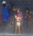
Playful Dropsby milo655321Comment: This certainly brings back memories! I'd love to see one where the youngest girl (who seems to be a main focus because of her placement in the photograph) was looking up. The focus seems to be a bit light but that's probably the way the light is playing off all the water. I gave a 4. |
 Photographer found comment helpful. Photographer found comment helpful. |
| 08/20/2005 09:04:48 PM |
Keeping Dry!by MakkaComment: Adorable model, and great contrastic colors, brings pop to the photo. I wish the young girl's eyes were a bit more in focus as there is quite a bit of personality and life there. I gave a 5. |
| Photographer found comment helpful. |
| 07/04/2005 11:22:55 PM |
Camouflage?by scalvertComment: The contrasting colors are marvelous. Great detail on the butterfly and I'd have to agree that the blurred spot is the biggest drawback. That said, the rest of the photo is wonderful so it isn't a huge distraction. I don't think the background really does anything for the image, perhaps the dull color gives the dynamic of the wings more contrast, but seeing as you couldn't exactly set up for this photo, it wasn't really in your power to change it so the point is kind of moot, no? |
| Photographer found comment helpful. |
| 07/04/2005 09:09:58 PM |
Friends1.jpgby BAMartinComment: I could easily see this as a cover to a greeting card on friendship. The stance is very natural, you can tell that they are good friends. The surroundings are very lovely, great colors with the flowers on the right. The inclusion of the tower at the apex of the arch is perfect, gives yet another area of interest and adds to the atmosphere. If I were to look for one thing I'd like different, it might be to have just a bit more of the top of the arch visible to give it a fullness. Perhaps some kind of light blurring to give it an even softer feel might work as well, that hazy-ish look that Barbara Walters always has.. you know? |
| Photographer found comment helpful. |
| 06/16/2005 07:37:26 PM |
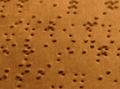
Brailleby manuraoComment: Great idea! I think this meets the challenge very well, after all what's more dark than not being able to see at all? I think greater focus so the image was much sharper would help this quite a bit. Also, perhaps adding in fingers "reading" the braille might give the image another point of interest for the viewer as well as make it that much more personal as it seems to be missing.. something - at least for me. On a personal level for myself, I think it would do well in a black & white image to give it a feeling of loss of sight/color as well, just another layer of darkness so to speak. All in all I gave a 4. |
| Photographer found comment helpful. |
| 06/16/2005 07:34:01 PM |
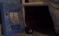
Child's Darkenssby kattywacComment: I can very much identify with the idea behind this image if you're point is the mysterious darkness under the bed. I was certain I had something living under mine when I was younger. Unfortunately I'm finding the image a bit flat in color. The book looks like it has a very nice blue tone but it seems muted out, possibly because there wasn't a strong enough light source. Also, if the under bed aspect IS what you were trying to portray, its a bit difficult to be sure, you might want to try another photo showing more of the bed so it can be easily identified as 'under the bed' and to help tie it in with a child, perhaps some little toes dangling over the edge. The focus is a bit soft - which may be another result of insufficient light. Overall I think the idea is good, meets the challenge well, there's just a few technical aspects that could use a boost - lighting & focus, and perhaps a shift in the composition. I gave a 4. |
| Photographer found comment helpful. |
| 06/16/2005 07:29:52 PM |
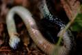
Eternal Darknessby jasm8Comment: It appears that you are going for a death scene with this image (based on the image and title), which of course fits the challenge very well.
Unfortunately I'm finding the focus on the fly to be problematic. The fly seems to blend into the darkness (heh) and loses quite a bit of detail. I can see where the fly eating the snake? shows decay and death, but I really think the whole image should be in focus so the viewer can easily see what is taking place. Also the plant in the foreground draws my eye away from where the action is - at the fly - thus it and its blurred nature is distracting. If the fly is in fact alive and this isn't a staged shot, I can see how it would be difficult to get a good composition, since flies aren't very cooperative, but that's where I think the image needs the most help - composition. The subject is good, death/decay and the fly & snake help give it an even darker tone since many folks don't find them to be the most beautiful of creatures, so I think your idea is quite sound. Just needs a bit of tweaking in the composition department and a little more lighting to help draw out the details of the fly. I gave a 3. |
| Photographer found comment helpful. |
| 06/16/2005 07:15:36 PM |
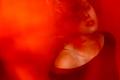
And in the dark she dancedby GoldBerryComment: I think I just lost the huge comment I left about your image by making it a favorite! Boo! Alright here we go again. I'm not seeing a connection to darkness other than the title, so I'm not sure what aspect you're trying to portray. Perhaps she's a dream girl? So someone you see dancing while you're asleep? That's the best I can come up with, but its likely not the interpretation you were looking for. That said, I really enjoy this image. It has a wonderful sultry look to it, which the use of the red and the model's expression helps boost. My one suggestion would be to crop a bit off the left side. While I think the red there does make for some interesting negative space, it just seems a bit too much, a bit too unbalanced. Perhaps cropping right where that dark triangle at the bottom left begins to form.. that way you still have an expanse of red but it isn't quite as much or as overpowering. So all in all I'm giving a 7, but I would've given a point higher if I was able to understand your darkness connection from what I was seeing. Still, very well done, thank you! |
| Photographer found comment helpful. |
| 06/15/2005 08:14:37 PM |
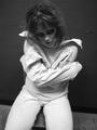
Insanity... Darkness Withinby tmorninglory96Comment: Very gritty, love the black and white. Expression is excellent, she not only looks insane but she looks dangerous and.. well.. kind of zombie-ish. Focus and lighting look good though the focus seems a skosh soft in areas, composition is great. I gave a 6. |
| Photographer found comment helpful. |
| 06/15/2005 08:12:47 PM |
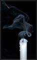
Candle in the windby digitalComment: I think this is beautiful. The only tiiiiny things I don't like about it, is the seemingly small bit off blown out white near the wick of the candle and the border.. not sure why but the image continuing on past the border just makes me wonder why the border is there at all and my eyes are consistently drawn down there. Heh. But those are minor things, I gave an 8. |
| Photographer found comment helpful. |
Home -
Challenges -
Community -
League -
Photos -
Cameras -
Lenses -
Learn -
Help -
Terms of Use -
Privacy -
Top ^
DPChallenge, and website content and design, Copyright © 2001-2025 Challenging Technologies, LLC.
All digital photo copyrights belong to the photographers and may not be used without permission.
Current Server Time: 12/20/2025 08:35:58 PM EST.