| Image |
Comment |
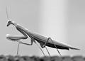
| 09/09/2005 12:54:12 AM |
Alienby bclementsComment: Very cool picture. Can't really go wrong with a praying mantis in general. I'm not seeing a whole lot of high contrast however and I think the subject, knowing that it is usually a gorgeous vivid green, is not being displayed to its best advantage in a black/white tone. The lighting is good, fairly even for the most part, composition works to show off the body very well. The focus is a bit sketchy, I wish the whole insect was in sharp focus instead of the middle part of its body. I definitely think the high contrast is missing here though as the whole image seems to be a wash of grey for the most part. I gave a 5. |
 Photographer found comment helpful. Photographer found comment helpful. |
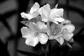
| 09/09/2005 12:51:41 AM |
Flowersby LKMoteComment: Certainly meets the challenge in my mind, and the way the flowers pop out from the darker background adds interest. I also like the fact that you didn't go for a flat, pitch black background. The shadows of the leaves/stems give some nice texture and pattern which boosts the interest factor. If I were to change some things I'd rather there was a little more luminocity to the white petals, its almost there but in my mind if the.. 'glowed' just a bit more then I think the "wow" would be a bit bigger. I gave a 6. |
| Photographer found comment helpful. |
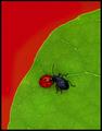
| 09/09/2005 12:49:13 AM |
"Red Dot, meet Black Dot"by DrAchooComment: Great colors and obvious contrasts among them. Subject is interesting in its brilliance of color though the bugs themselves aren't that keen to me. I'm not sure what it is about the image though that is slightly offputting. It feels.. dull.. even though the colors clearly stand out. Almost flat I guess, I'm not sure what lighting you used but it seems to lack a luminosity that I'm expecting I guess. I also wish there was just a bit crisper focus. Still it is a solid image, I gave a 5. |
| Photographer found comment helpful. |
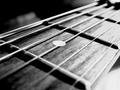
| 09/09/2005 12:44:02 AM |
Intense Frettingby RanklesComment: Definitely a nice black-white tonal range, though the blown out white is a tad distracting. The subject has some good lines which help add interest and it seems to meet the challenge to me. I'm not entirely inspired by the subject matter, and I would personally prefer a wider focal range. That said I think its a good example of high contrast. I gave a 6. |
| Photographer found comment helpful. |
| 09/09/2005 12:41:45 AM |
Amusedby DreamerdollComment: Nice, heartwarming portrait. I do not see a whole lot of contrast however, perhaps your contrast focus was between the boy and his shadow? I can't really tell. That said, your model has a wonderful expression, the lighting looks pretty good, the focus looks a bit soft, but I'm not sure if that's intentional or not. Either way I don't think it takes away from the image. I'm not sure whether black & white was the best tone for this picture - perhaps a choice brought on by the challenge? Black & white does seem to be the option of choice when going for a high contrast. All in all I gave it a 5. |
| Photographer found comment helpful. |
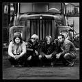
| 09/06/2005 02:53:26 AM |
Band: Ask The Slaveby egillbjarkiComment: Great composition, very nice and crisp black and white. Focus is excellent as is lighting. Quite a bit of interest with the band and the truck. Nice use of contrasts. I gave a 7. |
| Photographer found comment helpful. |
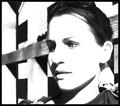
| 09/06/2005 02:47:14 AM |
Miss Brownby anthonyczajaComment: I'm not sure high contrast such as this really plays to the strength of this image. Much of the woman's facial details are lost to the blanketing white and I feel that is to the detriment. Facial expressions can bring so much to an image and its hard to determine what expression she is wearing. It does of course have quite a bit of contrast but I think conforming this image to the challenge makes it miss out on being something better. The face seems to have good focus and the positioning is nice. I gave it a 5, but I think it may have done better in another challenge using a different technique. |
| Photographer found comment helpful. |
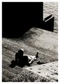
| 09/06/2005 02:38:01 AM |
Thinkingby twm122Comment: I'm not sure what contrasts you are going for with this image - it appears to have a grittiness to it that may be attributed to actually boosting the contrast on the photo though. I think its a decent photojournalistic type image, it can definitely tell a story. The colors are a bit muted but the composition is good. I gave a 5. |
| Photographer found comment helpful. |
| 09/06/2005 02:26:22 AM |
City Sunby e301Comment: Almost overwhelming in its contrasts. I think you've captured the entire range from black to white. Nice use of the light and great focus, I do find the intensity of the contrast in this image to be a bit off-putting, though I know that was the point of the challenge. I gave a 6 |
| Photographer found comment helpful. |
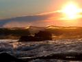
| 09/06/2005 02:13:56 AM |
Lightwaveby owenComment: Hm.. I'm not sure what contrast you are going for here..? Light and dark perhaps? Movement of water vs the unmoveable rocks? I think it has beautiful colors and really captures the feeling of the sea, but the purpose of it in relation to contrasts isn't clear to me. I do see that there are contrasts in it, but they aren't what I find myself immediately recognizing. I gave a 6. |
| Photographer found comment helpful. |
Home -
Challenges -
Community -
League -
Photos -
Cameras -
Lenses -
Learn -
Help -
Terms of Use -
Privacy -
Top ^
DPChallenge, and website content and design, Copyright © 2001-2025 Challenging Technologies, LLC.
All digital photo copyrights belong to the photographers and may not be used without permission.
Current Server Time: 08/07/2025 10:30:26 PM EDT.