| Image |
Comment |
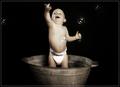
| 09/25/2005 09:40:49 PM |
Bubblefunby olimarComment: Absolutely adorable. Fantastic lighting, great expression. I love the texture of the tub and the way its tones can be found in the shadows on the baby's skin. There are a few areas where the skin looks a bit plastic-y/wonky focus which is distracting (particularly on the right side near the diaper) but for the most part it is just perfect. I gave an 8. |
 Photographer found comment helpful. Photographer found comment helpful. |
| 09/25/2005 09:38:41 PM |
bubblanby tugglaComment: I love this image. I like the simplicity of it and the use of color. Wonderful vivid contrasts and good use of light. Bubble is present and easily seen. The one thing I don't like, which I'm sure has been mentioned, is that extremely bright hot spot of white near the bubble. If that wasn't there I'd probably have voted it higher, but as simple and clean as the rest of the image is, that one issue is glaring and really brings the rest down. I gave a 6. |
| Photographer found comment helpful. |
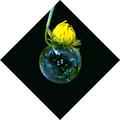
| 09/25/2005 09:33:36 PM |
Fallenby tenfrozentoesComment: Cute image. I like the uniqueness of it. Good color and the bubble is nicely deliniated. I like the composition as far as using the curved flower coming from out of the top of the image, but I'm afraid the choice of bordering ruins it for me. The white totally overwhelms the image and the sharp contrast draws me out of what should be the focal point of the photograph (the flower/bubble) and instead thrusts me into the play of the black and white against each other. I gave a 4. |
| Photographer found comment helpful. |
| 09/25/2005 09:30:48 PM |
Red, White and Blue are Good for Youby RootsComment: Ha, I used to do this as a kid, drove my mother bonkers.
This has some real potential. Nice strong line with the straw, which also provides a definite contrast. The blue and white of course make for some nice crispness and the bubbles give it a lighthearted feel. Unfortunately, these positives are nearly hidden by the blown out white and the soft focus. Had all the lines (bubbles, straw, curve of cup) been nice and crisp I could see this really having a "wow" factor to it. As it stands it seems a bit snapshotty to me. Still it meets the challenge and has a good idea behind it and the composition in general is very nice. I gave a 4. |
| Photographer found comment helpful. |
| 09/25/2005 09:27:49 PM |
How Dirty Boys Get Clean.......by madison461Comment: Bubbly indeed. Doesn't draw me in as a viewer. The lighting is faded and its making the image a bit dulled out - I can't tell if the browner bubbles are because of dirt (as referenced by the title) or because of use of flash/lighting that's browned them out. Also its muting some of the details of the bubbles, focus is a bit soft too but that can work for you here. Border.. not a fan, the light grey/purple only enhances the washed out nature.
I think this could have had some real pop and impact if you used the body's natural form to your advantage. Highlight the curvature of the back and/or shoulders with a sheen of foamy bubbles and let the light trace that curve. Heck, could even get humorous and make a bubble diaper. Give the viewer something to take a second look at, right now its a bit flat and I have no inclination to lose myself in the image. I gave a 3. |
| Photographer found comment helpful. |
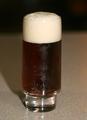
| 09/25/2005 09:22:46 PM |
Beer Bubblesby smjbmwComment: Certainly foamy and bubbly. The lighting is okay (some detail loss there) and the focus is decent. The composition however really brings the potential of this image down. The background used is uninspired and makes me as the viewer think "snapshot". I would recommend a single colored cloth to help isolate the focus of the image - black would be good ONLY if you decided to use the lighting to its advantage and play off the amber colors of the beer. If you're mostly wanting to highlight the foam, I'd say a much tighter crop so only a part of the glass was showing and lighting.. maybe from a bottom up sort of direction? Not sure how that'd look in practice. Also the subject being so centered is a bit boring, maybe create some negative space and more interest by pushing it to the left or right, so only half the glass is showing. Might be an idea. I gave a 4. |
| Photographer found comment helpful. |
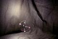
| 09/25/2005 09:19:04 PM |
A Momentary Existenceby LongComment: Hm.. this certainly meets the challenge but I'm afraid that is all it has going for it at the moment. Clearly the bubble is meant to be the focus of the image and I think this could be a great idea if a few things were changed:
Background: Rumpled and grey and doesn't do much for the image. I would recommend a black for this type of photograph.
Focus: is GREAT.. unfortunately.. its on the wrong thing - the background. The focus should be centered on the bubble and thus let the background fuzz away, this I can see is difficult due to the nature of bubbles, cameras tend to have a problem finding them to center on.
Lighting: The lighting is actually pretty good, if there was a way to center it more spotlight-esque only on the bubble, that *might* give the camera more help in focusing there too. I can't be sure though. Still your use of light was good.
Composition: Here's a biggie. Right now you simply have a bubble with nothing too exciting going on. This CAN work, but the other elements of the image (background, focus, etc) are working against you and so the simplistic approach didn't really fly. I do like the idea behind the image immensely, I can envision a simple, classicly beautiful perfectly rounded glowing bubble suspended against a black background of some sort.. simple and lovely. So the idea and intent is there, it just didn't manifest itself this time around and led to a fairly dull image.
You have a good eye and vision, just need to work on the technique a bit to bring those up to match. I gave a 3. |
| Photographer found comment helpful. |
| 09/25/2005 09:09:28 PM |
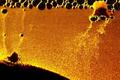
War of the worldsby pepitoidComment: Gorgeous color, good focus. I love the graininess of the image, gives it some very nice texture. Is this one of those sand/water things that you turn upside down and the sand slowly sifts its way down to make neat landscape shapes? Lighting is great and of course bubbles are present. Nicely done, I gave a 7. |
| Photographer found comment helpful. |
| 09/25/2005 11:31:05 AM |
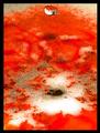
Blood IS thicker than waterby TroutbearComment: Very rich colors, interesting textures showing. The lighting is good but the blown out white is a bit distracting. I like the water droplet but I wish it was a bit closer to where all the interesting action is.. that mess of bubbly crunchy looking stuff at the bottom of the image. Focus looks pretty good. I gave a 6. |
| Photographer found comment helpful. |
| 09/25/2005 11:29:13 AM |
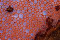
Islandby DiscraftComment: Wow, this has so many interesting features. I love the contrast in color and materials. The bubbles are perfect and interesting and the focus looks good. I think this could have been SO much better though if there was just more light. Enough to capture and let that orange color glow and get those bubbles glistening. The dull nature of the lighting really lets this image down. I gave a 5 for its potential and meeting the challenge but if the lighting were different and the whole image more vibrant I probably would've given a 7. |
| Photographer found comment helpful. |
Home -
Challenges -
Community -
League -
Photos -
Cameras -
Lenses -
Learn -
Help -
Terms of Use -
Privacy -
Top ^
DPChallenge, and website content and design, Copyright © 2001-2025 Challenging Technologies, LLC.
All digital photo copyrights belong to the photographers and may not be used without permission.
Current Server Time: 08/07/2025 05:41:49 PM EDT.