| Image |
Comment |
| 04/03/2006 12:56:27 AM |
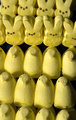
Invasion of the Peepsby jfwolpertComment: These have to be the nastiest things ever made. Lighting is fairly harsh, but that may have been your intent since it gives the Peeps a rigid (soldierly?) look. Composition is okay, but with the title, I expect a little more drama. Focus is a tad bit soft but that may be due to compression issues. Some of those rabbit Peeps look kind of evil. 4. |
 Photographer found comment helpful. Photographer found comment helpful. |
| 04/03/2006 12:53:50 AM |
Early Morning Fishingby philupComment: Looks like your subject is the fisherman but he's in competition with that yellow toned sunrise and losing. The colors are bright and the composition & idea are good but there's a flat feeling to the image overall. 5. |
| Photographer found comment helpful. |
| 04/03/2006 12:51:22 AM |
Alstroemeriaby ladyhawk22Comment: Gorgeous color choices. The purple highlights the yellow nicely. You have great focus on some of the petals but I wish it extended further into the flowers. The lighting is good however I wonder if more pronounced petal backlighting would enhance the image? 5. |
| Photographer found comment helpful. |
| 04/03/2006 12:49:05 AM |
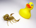
Versusby glodaComment: An odd combination. Doesn't do anything for me really. The color is nice and bright on the duck and the focus looks good too. I think it would be a bit better if the entire white background was well lit, a fair amount of drop off/shadow is seen behind the duck. 4. |
| Photographer found comment helpful. |
| 04/03/2006 12:47:37 AM |
A Bitter End - Murdered!!!by NigelComment: I bet Colonel Mustard did it, he's yellow enough. Good concept, nice clear colors and contrasts. Seems a smidge soft on focus but that could be upload compression. Immediately reminded me of Sin City.. if you know what part I mean. 6. |
| Photographer found comment helpful. |
| 04/03/2006 12:44:29 AM |
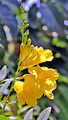
Yellow Esparanza Flowerby eaglebeckComment: The direct sunlight looks too harsh and blots out some fine details of the petals. I'm not sure if there may be too much contrast or sharpening too but there's odd stuff going on in the background. 4. |
| Photographer found comment helpful. |
| 04/03/2006 12:43:10 AM |
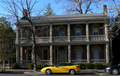
CLASH!by rayg544Comment: It looks slightly tilted to me. I do like the contrast of flashy colorful car to old, stately colorless house. 5. |
| Photographer found comment helpful. |
| 04/03/2006 12:42:09 AM |
|
| Photographer found comment helpful. |
| 03/16/2006 07:40:48 PM |
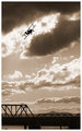
DPC2719.jpgby mpetersComment: I like the tones in this image, as well as how the light on the clouds help to give the sky a nice dramatic flair. I do find my attention drawn to both silhouettes (bridge vs bi-plane) and I think it would be a stronger piece if the bridge portion weren't there. The play between the bi-plane silhouette and those wonderful clouds is excellent, the bridge just ends up drawing my attention away from the action up above. |
| Photographer found comment helpful. |
| 03/14/2006 11:52:03 PM |
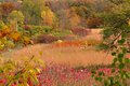
IMG_9834.jpgby strangeghostComment: Wow, this has such warmth to it. All those vibrant colors though very "fall foliage" actually make me think of summer because of the warm tones. Almost gets me to forget how darn cold it is right now! I'd love to have the opportunity to walk in a brilliant, crayola-land such as this. Very lovely. |
| Photographer found comment helpful. |
Home -
Challenges -
Community -
League -
Photos -
Cameras -
Lenses -
Learn -
Help -
Terms of Use -
Privacy -
Top ^
DPChallenge, and website content and design, Copyright © 2001-2025 Challenging Technologies, LLC.
All digital photo copyrights belong to the photographers and may not be used without permission.
Current Server Time: 08/06/2025 03:54:10 PM EDT.