| Image |
Comment |
| 04/07/2006 07:56:31 PM |
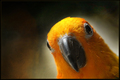
"I thwat I saw a puddy cat ... !"by banditComment: Ha, I love it. Great colors, nice presentation. Its simple but very impactful. Lighting is well done, good sharpness and focus. Wonderful emotive feel, has a coyness or tongue-in-cheek aspect that I love. Very nicely rendered. 7 |
 Photographer found comment helpful. Photographer found comment helpful. |
| 04/07/2006 07:55:14 PM |
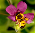
Bzzzzzzzzzzby SandyPComment: Excellent colors, nice and vibrant and not too busy. I like the composition and the subject matter. Very nice macro feel. The use of natural light is good, only a few minor issues on the wings but really nothing too distracting. I think the one thing this image needs to really pop would be very sharp focus. I don't know that sharpening it more would help, but the initial focus being sharper would help give the bee even more definition and with the brilliant colors shown really make the whole image leap out at the viewer. 6 |
| Photographer found comment helpful. |
| 04/07/2006 07:52:45 PM |
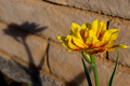
Me and My Shadowby ginjerComment: I like the duality of the image. The color is vibrant and the use of natural light is well done - the light doesn't look overly harsh nor overwhelm the subject. I think the sharpness is a little lacking, if the focus were tack sharp this would have an even greater impact. The composition is good, nice title and over all its a good rendering of "Yellow". I would probably score higher if the focus/sharpness were better. 5 |
| Photographer found comment helpful. |
| 04/07/2006 07:48:23 PM |
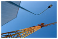
Mr Yellow, please lift me upby andriComment: Nice lines, I enjoy the angular feel of the image. I like the twin aspect, the repetition adds interest. The yellow is nice and contrasts well with the blue sky. The focus looks good and use of natural light is well done. A solid image. 6 |
| Photographer found comment helpful. |
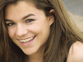
| 04/07/2006 06:53:26 PM |
4 More Days!by BlownAwayComment: The title is a bit obscure, I'm guessing (finally, hehe) that the title means she'll be getting the braces off in 4 more days. Could be wrong though! This is a very nice portrait shot. She has a great, expressive, and lovely face. The lighting looks good, though I wish there was a bit more luminescence to the skin. Not sure how to go about that so I can't offer a suggestion. The yellow in the image is very understated, which is a nice change, but if I'm right about what the title references and that coupled with the challenge being yellow, I think a bit more focus on the yellow portion of the image (the bands on the braces) would be beneficial. 6 |
| Photographer found comment helpful. |
| 04/07/2006 06:50:45 PM |
The Mustard Fieldby FotoMunkiComment: I love it! The coloring is great (though I wish the light on the floral aspects was a smidge brighter), great composition, nice concept. I think the umbrella is a bit too busy and it seems to be competing too much with the busy-ness of the mustard blossoms. I really like how you've made your little model stand out so well from the background with the very crisp focus. How did you manage that while having a uniform soft focus everywhere else? I do wish there was a bit of fill light on the girl's face, but that's not a huge deal. 7 |
| Photographer found comment helpful. |
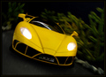
| 04/07/2006 06:47:36 PM |
Yellow Goes Fasterby seebrownComment: Great image. I like the feeling of movement, the understated tones that really let the headlights and yellow of the car stand out. Background is great. Looks like a model rather than a real-size car but even that suspicion doesn't take away from the image. It has a real 3D-ish effect, like the car is ready to leap out of the photo at you and go barrelling away. Very nice. 7 |
| Photographer found comment helpful. |
| 04/07/2006 06:45:38 PM |
Playtime in the Daffodilsby dwterryComment: A very well framed image. I love the contrasts between the brilliant yellow daffodils and the dark statuary - they look almost silhouetted. The building in the background brings more interest and a nice tonality as well. The focus is excellent on the yellow flowers, which I think is key due to the subject of the challenge. Nice use of the light available. Only thing I can think of that might be a detriment is the fact that there is so much going on in the image. In many cases that would be a downfall but I think for the most part the number of different elements is well balanced. 8 |
| Photographer found comment helpful. |
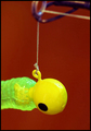
| 04/06/2006 09:02:47 PM |
Properous Alianceby NstiG8trComment: Very yellow, has a nice contrast with the background behind it. I'm not sure I understand the title.. is this a lure and the thing at the time a fishing pole? I don't know fishing.. heh. The subject isn't too intriguing to me so I am not finding myself drawn to the image, it is rendered in a fine way, but the impact isn't there for me. Lighting looks good and focus is good. Maybe a difference in the composition would help bring the fishing pole more into play and thus add more elements and drama that would connect with the viewers (or at least with me). 4 |
| Photographer found comment helpful. |
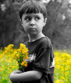
| 04/06/2006 08:58:24 PM |
These Are For My Momby PhotoRynoComment: What an adorable little guy. I think the focus is excellent on your model and the flowers he's carrying. The color is bright and sunny, the composition is good for the most part. Lighting is excellent in my opinion. I like the selective desaturation where the held flowers and your model are concerned. I do not however like the meadow in the background. I think it really draws the emphasis off of the flowers the child is holding and that is to the detriment of the image IMO. If the background were greyed out as well and the punch of color came only from the held flowers I think this image would be MUCH more impactful. Maybe the same image but with a different background? Somewhere without so much yellow. :D Even though I do not like the yellow meadow at all I can see the potential without that distraction. I gave an 8 |
| Photographer found comment helpful. |
Home -
Challenges -
Community -
League -
Photos -
Cameras -
Lenses -
Learn -
Help -
Terms of Use -
Privacy -
Top ^
DPChallenge, and website content and design, Copyright © 2001-2025 Challenging Technologies, LLC.
All digital photo copyrights belong to the photographers and may not be used without permission.
Current Server Time: 08/05/2025 04:15:01 AM EDT.