| Image |
Comment |
| 07/14/2006 07:26:41 PM |
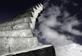
Ten steps to heavenby BrinComment: I like this image. Very nice use of light, great composition. The sky is very moody and works with the tones of the steps. It isn't overly busy either which is good because it doesn't compete with the texture of the stone stairs. Tones are very nice. Focus looks like it could be a bit sharper. I gave a 6. |
 Photographer found comment helpful. Photographer found comment helpful. |
| 07/14/2006 07:21:29 PM |
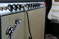
Crank it all the way upby igoofryComment: Meets the challenge well. I like the title. The lighting looks good and the focus is nice. I'm not sure about the composition for a couple of reasons. First the guitar in the background does further the story a bit and compliments the idea of the image but the fact that it is background and blurred out distracts me. Seeing it makes me wish it were more in focus which would defeat the purpose of it being background and a supporting role so I can't decide if it works for me or not. Also, I can't really read the name of the amp or whatever this thingie is (I don't know musical equipment!) and that's due to the way the camera is facing. I'd much prefer to be able to read the name easily - especially since it has much of the crisp focus on it. A slight turn in perspective would achieve that as well as maybe make the 10s just a bit more obvious. Still you'd lose the guitar in the background so its a tough call. Overall I gave a 6 |
| Photographer found comment helpful. |
| 07/11/2006 02:17:06 AM |
10 Butterfliesby PanoComment: I love the light, the pose and the use of the butterflies. In some parts it looks as if it may be a tattooed line. I think playing that up and then as it went up having the butterflies look as if they were flying off her back would've been interesting. That said I like the lines of the spine and the lovely butterfly colors contrasting to the glowing skin. I wish the side of the face were more shadowed so the attention would be competely on the back and butterflies (as is the light catching the face draws my attention away). Finally, I'm not really liking the way the ribs show, it has a horizontal line to it that takes away from the curved vertical line of the back in a displeasing manner. Overall I gave a 7 |
| Photographer found comment helpful. |
| 07/11/2006 02:11:41 AM |
watercolor brushesby dragonladyComment: Meets the challenge very well. I think the lighting is perfect but I don't like the use of soft focus (not sure if it was purposeful or not). I think in this case I'd prefer something sharper. I also wish there were more paintbrushes to fill in the area with the grey tray thingie in the bottom left corner or that it was cropped out. I find myself scrolling the page to remove it from the image I see and definitely liking that better. Nicely done. 5. |
| Photographer found comment helpful. |
| 07/11/2006 02:08:32 AM |
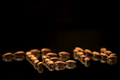
Nuts to Tenby heathenComment: Fun idea. I like the lighting even though it may be a bit too bright on the front most almonds. I like the use of the mirror which gives it more depth. Focus looks good and composition is nice. I wish the perspective were different, if it was from just a smidge higher so you could get the full impact of the top line of the "E". I think a fuller view of the word would add more interest and give greater impact. I gave a 6. |
| Photographer found comment helpful. |
| 07/11/2006 02:04:31 AM |
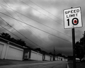
Bright Spot in a Dreary Dayby RebeccaComment: Interesting image. The flower does add just the right amount of fun. I like how the speed limit sign is brighter than the rest of the image, it helps play up the dreariness. I do think it might be a bit more powerful if the image was cropped more on the left. Cropping out that left most home/garage thingie would compact the image a bit more and give just that much more emphasis on the sign. Focus looks good. I gave a 6. |
| Photographer found comment helpful. |
| 07/11/2006 02:00:36 AM |
Locking away my emotions behind these ten bars...by acrotideComment: Great underexposed image. Lots of emotive qualities. I like the tones, the use of black & white. I like the feeling it is portraying. Its a simple image in composition but brings a good deal of interest to the viewer to delve into. I do wish that all the fingers were visible since they are referenced to as "ten" bars and this is the 10 challenge. Still disregarding the challenge title I think this is an excellent entry. 8 |
| Photographer found comment helpful. |
| 07/11/2006 01:58:06 AM |
Gooaaaaal!by BoltiComment: Great image. Has a very surreal feel to it. The colors are very vibrant and the lighting in the front is interesting. The cloud background has a lot of interest to it which adds to the surreal effect for me. I wish the man was a bit more in focus, or at least the 10 on the shirt was more in focus or highlighted by the light to really give it prominence. Overall I think its a good image. 6. |
| Photographer found comment helpful. |
| 07/11/2006 01:56:01 AM |
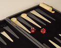
Come on! Six and a four! Six and a four!by TonyTComment: Nice contrasting colors and simple composition. I wish the lighting were a little brighter. The tones - though the red does stand out - seem very muted and sort of drab. I wish it was a nice sharp black/white to help make that red pop out even more. Focus is decent but seems sharpest on the board where the black token thingies are rather than on the dice where I'd expect it. There is also a slight yellow haze to the image in the main portion of the image which might be due to lighting issues. Still I like the image, I think its fun and it works well for the challenge. 5. |
| Photographer found comment helpful. |
| 07/11/2006 01:52:51 AM |
one too manyby saintaugustComment: Good lines and perspective useage. I like the way the colors work together but I'm not sure I like the shadowed tone of the table/counter so maybe an additional fill light would be better or going through the beer bottles to give an amber glow. Focus is a little soft too. I'm not sure if the appropriate white balance has been used (the color of the white/offwhite seems a tad strange). Composition is interesting but there isn't anything that really draws me in, no pop or wow factor for me. 4. |
| Photographer found comment helpful. |
Home -
Challenges -
Community -
League -
Photos -
Cameras -
Lenses -
Learn -
Help -
Terms of Use -
Privacy -
Top ^
DPChallenge, and website content and design, Copyright © 2001-2025 Challenging Technologies, LLC.
All digital photo copyrights belong to the photographers and may not be used without permission.
Current Server Time: 08/05/2025 03:49:52 AM EDT.