| Image |
Comment |
| 06/22/2002 11:56:00 AM |
wrong address...by MagsCoyoteComment: You definitely got a picture of a shadow here, a few actually, but there is too much going on in this photo. Capture of the bee is good but for it to be interesting you have to get real close... without getting stung. :) |
 Photographer found comment helpful. Photographer found comment helpful. |
| 06/11/2002 10:51:00 PM |
Moving, Againby GotchaComment: Good photo. LIke the subject. Need to touch up contrast just a bit for my tastes. keep up the good work. |
| Photographer found comment helpful. |
| 06/10/2002 03:54:00 PM |
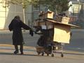
Country Crossroadsby David EyComment: Yup. Look at them. Alll the way down there. And where are you? Above them. Try getting a little closer to your subject. At least get someone to drive down that road so you can take picutre of them. |
| Photographer found comment helpful. |
| 06/10/2002 03:58:00 PM |
Westbound Readerby ClubJuggleComment: Great title. Great choice for the book as well. I wonder how it would look if you just cropped off the bottom and some of the right, and maybe have the reader hold the book a little higher, about 75% the distance to their head now. Then all you need is a little front light to fill in some of those dark spots and you've got a great picture. :) Overall very clever. |
| Photographer found comment helpful. |
| 06/10/2002 03:47:00 PM |
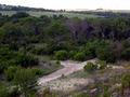
Back Roadsby SonifoComment: something in the lower left blurring the frame. I don't like it. It doesn't add anything to the photo. I really like this photo but I probably would have prefered a lower angle with a little bit of space in front of the truck to give me a feeling that its going somwhere. |
| Photographer found comment helpful. |
| 06/03/2002 01:07:00 AM |
|
| Photographer found comment helpful. |
| 06/05/2002 10:33:00 PM |
Photo-opp Babesby David EyComment: I don't care for the inverted look. There is too much going on in this picture, background is very noisy. |
| Photographer found comment helpful. |
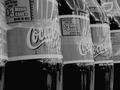
| 06/05/2002 10:45:00 PM |
Have a Drinkby karmatComment: This is a subject that really isn't helped by being black and white. That coca-cola bottle is really known for its red and you are subdueing it. Did you just take this at a supermarket? I think this could be a good picture in color and with a little better setup. For example, get rid of the $3 coupons, and the plastic holders. |
| Photographer found comment helpful. |
| 06/03/2002 11:57:00 AM |
|
| Photographer found comment helpful. |
| 05/31/2002 06:13:00 AM |
...by ReubenComment: This is a cool photo, but I don't like it for this challenge. This might be something that would work well for an ad with some copy in your dead space. The flash is a bit to hard on the face, it seems to drown out the color. |
| Photographer found comment helpful. |
Home -
Challenges -
Community -
League -
Photos -
Cameras -
Lenses -
Learn -
Help -
Terms of Use -
Privacy -
Top ^
DPChallenge, and website content and design, Copyright © 2001-2025 Challenging Technologies, LLC.
All digital photo copyrights belong to the photographers and may not be used without permission.
Current Server Time: 08/19/2025 08:56:25 PM EDT.