| Image |
Comment |
| 01/30/2004 06:47:48 AM |
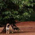
Dogby GinaRothfelsComment: This should have finished higher. The crop you selected really puts emphasis on the pug's size. Don't mind the comments about the bush being too important in the shot. The eye is drawn to the dog, which is what should be happening to pull this shot off. Good work. Keep it up! |
 Photographer found comment helpful. Photographer found comment helpful. |
| 01/30/2004 06:43:48 AM |
|
| Photographer found comment helpful. |
| 01/30/2004 06:41:14 AM |
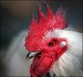
Four of a Kind by KonadorComment: Great work Konador. I had this image pegged for first place. Congrats on another ribbon. Keep it up, buddy! |
| Photographer found comment helpful. |
| 01/28/2004 02:11:18 PM |
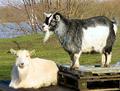
Capricorn in Ascensionby ciaranComment: Funky little goats. Many white spots in their fur are overexposed. Goat on left seems a bit out of focus |
| Photographer found comment helpful. |
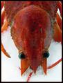
| 01/28/2004 02:05:12 PM |
Cancerby MonaComment: Top of the crawfish's seems out of focus. Interesting subject matter. Not too crazy about that thin red line in the border: loses its intensity along quite a few spots around the edge of the image.. Plain black would have been better. |
| Photographer found comment helpful. |
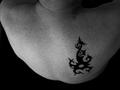
| 01/28/2004 02:03:00 PM |
Bornean Scorpioby flip89Comment: Way cool tatoo. I love the use of negative balck space, but I find the angle of this shot too steep. Creates a weird effect and makes the left shoulder blade look abnormal. |
| Photographer found comment helpful. |
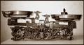
| 01/28/2004 02:00:39 PM |
libraby HeidieComment: This is an very nice old scale: very nice subject matter. However, I |
| Photographer found comment helpful. |
| 01/28/2004 01:58:36 PM |
The Water Bearerby CatherineComment: The skin tone on this shot seems to be off: too orange. What seems to be the kitche sink in the background is also a bit distracting. The upper right corner is quite blown out. Good idea of using coloured water to give this shot mor impact. |
| Photographer found comment helpful. |
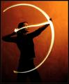
| 01/28/2004 01:53:00 PM |
Setting A Heart On Fireby ndsComment: Excellent idea! Your title bugs me though since you seem to be referring to Cupid, and not Sagitarrius. Too bad about those two spots on the wall, but I understand that classical rules were in place for this shot. Too bad that the "arrow light" is so high on her face. I would have preferred it at chin level or a little lower. Love the background colour |
| Photographer found comment helpful. |
| 01/28/2004 01:48:00 PM |
In the darkness of Sagittariusby DsealeComment: Too bad you had to crop the arrow point. Very nice idea. Lighting is good but I find too dark in the left lower corner. The overall image could have been lightened just a tad, even considering your title. |
| Photographer found comment helpful. |
Home -
Challenges -
Community -
League -
Photos -
Cameras -
Lenses -
Learn -
Help -
Terms of Use -
Privacy -
Top ^
DPChallenge, and website content and design, Copyright © 2001-2025 Challenging Technologies, LLC.
All digital photo copyrights belong to the photographers and may not be used without permission.
Current Server Time: 08/05/2025 01:10:30 AM EDT.