| Image |
Comment |
| 10/15/2003 06:25:25 AM |
|
 Photographer found comment helpful. Photographer found comment helpful. |
| 10/14/2003 10:18:36 PM |
Debuggingby C-FoxComment: Too bad this is so out of focus. This might have been more interesting if the shot hadn't been made so head-on. Good idea though. I've always been amazed where you can find these guys! |
| Photographer found comment helpful. |
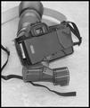
| 10/14/2003 10:11:23 PM |
Exposedby JasonComment: Damn camera straps! I am very happy to say that this has never happened to me. Good idea. |
| Photographer found comment helpful. |
| 10/14/2003 10:10:20 PM |
Colour of Fallby tommy_tComment: Beautiful leaf shot. The white background makes it jump out. I also think I understand the exposed aspect: the red color is exposed now that the chlorophyll has degraded. I also like that you shot this off center as well. Nicely done. |
| Photographer found comment helpful. |
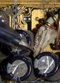
| 10/14/2003 10:06:44 PM |
a cone exposed in a single shotby ursulaComment: It took me a while to figure out this was an incense cone, or was an incense cone. Too bad it was not directly centered with the top's bellybutton. Nice idea and very well lit. |
| Photographer found comment helpful. |
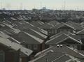
| 10/09/2003 08:39:15 AM |
A Farmer's New Cash Cropby mcraelComment: This photo would have had more impact if you had cropped out the sky and only concentrated on the house tops. The pale sky gives it a washed-out effect. Great idea! I hope you're not afraid of heights. |
| Photographer found comment helpful. |
| 10/08/2003 08:55:31 PM |
|
| Photographer found comment helpful. |
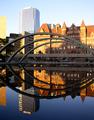
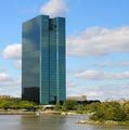
| 10/08/2003 04:44:37 PM |
Alone in Toledoby vonautschComment: Nice shot! I like how you show how this big hunk of steel and glass is surrounded by much smaller buildings and greenery.
I always wonder what pushes city councils to accept the building of such large structures that look soooo out of place with their surroundings. These people should read up on Post Modernism. Adapt new buildings to the existing man-mande and natural landscape. It doesn't look as goofy.
Keep up the nice work. |
| Photographer found comment helpful. |
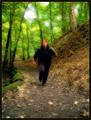
| 10/06/2003 08:37:26 AM |
A Mother's Worst Nightmareby ShannonComment: A good idea but too dark, even for a nightmare submission. You might have wanted to play with levels here, lightening just a bit to give just a hint more detail. |
| Photographer found comment helpful. |
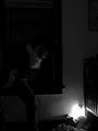
| 10/06/2003 08:32:57 AM |
Panicby JenHallComment: Great idea. Too bad that window was not a little bit longer. I love how you framed this shot. |
| Photographer found comment helpful. |
Home -
Challenges -
Community -
League -
Photos -
Cameras -
Lenses -
Learn -
Help -
Terms of Use -
Privacy -
Top ^
DPChallenge, and website content and design, Copyright © 2001-2025 Challenging Technologies, LLC.
All digital photo copyrights belong to the photographers and may not be used without permission.
Current Server Time: 08/02/2025 02:53:37 AM EDT.