| Image |
Comment |
| 12/03/2003 08:49:06 PM |
Body for saleby kinksComment: Beautiful model with killer figure. I like the way she is draped over the couch/chair. Her head does seem out of focus though. Lighting is quite good except again for the head. Probably the best photo with the sex for cash theme. Good work. |
 Photographer found comment helpful. Photographer found comment helpful. |
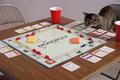
| 12/03/2003 08:43:54 PM |
Catopolyby Ram21Comment: Now that is one smart cat. And I see he's winning... little cheat! Look at him strategizing. Today Monopoly, tomorrow THE WORLD!!
Nice capture. Light is a little flat. Too bad other players not in shot with kitty. |
| Photographer found comment helpful. |
| 12/03/2003 08:32:51 PM |
The Bankers Houseby vtruanComment: Nice image but the columns at the entrance of the walkway are overexposed. I get tricked like by stone all the time. Who would think that such a material could be so relective. Maybe this could have been slightly corrected with a polarzing fiter. It would have helped the sky too. Nice composition |
| Photographer found comment helpful. |
| 11/30/2003 11:19:43 PM |
|
| Photographer found comment helpful. |
| 11/30/2003 11:19:11 PM |
|
| Photographer found comment helpful. |
| 11/20/2003 07:29:43 AM |
|
| Photographer found comment helpful. |
| 11/20/2003 07:27:09 AM |
|
| Photographer found comment helpful. |
| 11/19/2003 08:23:41 PM |
All You Needby byshenComment: Too bad about that reflection at the bottom part of the photo. A ring I presume. I would have also used a slightly greater depth of field. Guy is in great shape. |
| Photographer found comment helpful. |
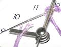
| 11/19/2003 08:07:29 PM |
A Stitch in Time...by cbellerComment: Not a bad idea but this photo is overexposed. I like the colour thread you used, but the colour's richness is washed out by by the overbearing whitness of the background. The clock hands are out of focus: you may want to try increasing the depth of field next time. I also find the crop is just a tad too tight. |
| Photographer found comment helpful. |
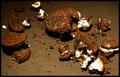
| 11/19/2003 08:04:21 PM |
That's the Way the Cookie Crumblesby DiamondPeteComment: A good idea, but the execution could use some more work. Image seems out of focus and the cookie cream in the lower right-hand corner is blown out (too bright). This might have been avoided by repositioning your light source to a different angle. |
| Photographer found comment helpful. |
Home -
Challenges -
Community -
League -
Photos -
Cameras -
Lenses -
Learn -
Help -
Terms of Use -
Privacy -
Top ^
DPChallenge, and website content and design, Copyright © 2001-2025 Challenging Technologies, LLC.
All digital photo copyrights belong to the photographers and may not be used without permission.
Current Server Time: 08/04/2025 08:22:32 PM EDT.