| Image |
Comment |
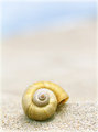
| 04/26/2010 09:12:38 PM |
Edge of Nirvanaby JuliBocComment: This is what I initially thought of when I considered zen: high key, mostly monochromatic, with one focal point. This is a very well-done shot with a lovely focus, lovely tone, and lovely feel. The only thing I'd say is that it would work even better if the shell were slightly off center, to the left. |
 Photographer found comment helpful. Photographer found comment helpful. |
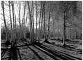
| 04/26/2010 01:28:07 PM |
Through the Treesby artvetComment: The right side of the frame is great and the shadows of the trees are lovely, but the blown out sky on the left side takes away from the overall image. |
| Photographer found comment helpful. |
| 04/21/2010 01:31:59 AM |
The Lady in Yellowby NeilComment: The model could have engaged more with the camera, but she fills the image well and you used nice light. |
| Photographer found comment helpful. |
| 04/21/2010 01:23:48 AM |
|
| Photographer found comment helpful. |
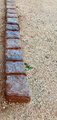
| 04/21/2010 01:08:29 AM |
Zenby jnenvirComment: If you had crouched down more for a stronger angle on the rocks, this would have been a pretty strong picture, especially if you had chosen an aperture between 1.4 and 5.6. That said, the square rocks trip up my traditional notion of 'zen' but still work very well. |
| Photographer found comment helpful. |
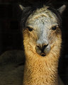
| 04/21/2010 01:04:05 AM |
At Peaceby robinssongComment: Great light, depth of field, and texture, but s/he looks pretty angry. |
| Photographer found comment helpful. |
| 04/21/2010 12:54:31 AM |
Still Zenby GiorgioComment: Nice use of muted colors, including the fruit. The many textures of the image work pretty well together - the only one that seems to clash is the tablecloth. |
| Photographer found comment helpful. |
| 04/21/2010 12:49:24 AM |
Quietby SiggavComment: This image tricked my eye for a few seconds, which gave me pause. I like this image, but there's too much of the cat's body in frame on the right and it distracts from the dramatic light you captured so well on the front of its body. |
| Photographer found comment helpful. |
| 04/21/2010 12:46:03 AM |
Chi - Tohsby Art RoflmaoComment: A smaller aperture would have been better, but the overall concept is well executed. |
| Photographer found comment helpful. |
| 04/21/2010 12:44:33 AM |
Balanceby essayComment: I really like this image; the color is gorgeous and the silhouette is nice, but you might have been better off cutting off the ground or minimizing it somehow. |
| Photographer found comment helpful. |
Home -
Challenges -
Community -
League -
Photos -
Cameras -
Lenses -
Learn -
Help -
Terms of Use -
Privacy -
Top ^
DPChallenge, and website content and design, Copyright © 2001-2025 Challenging Technologies, LLC.
All digital photo copyrights belong to the photographers and may not be used without permission.
Current Server Time: 08/04/2025 07:00:35 PM EDT.