| Image |
Comment |
| 11/08/2015 11:21:48 PM |
frou-frouby tnunComment: Bumping and bestowing some meaningless bling. Lovely fluidity of thought and execution. Join the POLM.
 Message edited by author 2015-11-09 00:44:11. Message edited by author 2015-11-09 00:44:11. |
 Photographer found comment helpful. Photographer found comment helpful. |
| 11/08/2015 11:14:18 PM |
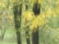
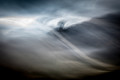
mind youby mitalapoComment: I imagine you'll take a beating score-wise on this. But it's a bold entry in my book. Thanks for making me smile and see yellow in an unorthodox manner. I hereby grant you the monochrome version of the POLM - Pointless Order of the Liquid Mind. Take it FWIW.
|
| Photographer found comment helpful. |
| 11/08/2015 11:09:27 PM |
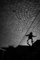
Hey, Look up !!!by clickodakComment: Back to comment and bump. A clever composition and subject. More importantly, it's not oozing with unnatural color processing. Nice. |
| Photographer found comment helpful. |
| 11/08/2015 11:07:17 PM |
|
| Photographer found comment helpful. |
| 11/08/2015 12:31:59 PM |
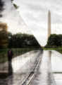
r e f l e c t i o n s by Ja-9Comment: Joining the "shoulda done better" club. What I really, really like is the choice of including only the reflection of the woman observing the monument. That makes the image for me.
BTW, the monument, which was met with intense controversy at the time of its creation, has become for me THE most powerful, evocative place in Washington to stand and contemplate history. The "ghost" of a woman reading the wall reflects much more than captured light on granite. |
| Photographer found comment helpful. |
| 11/08/2015 12:03:29 PM |
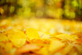
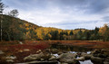
Autumn is a second spring when every leaf is a flowerby ArnaMarieComment: In response to your post-challenge comment request:
I gave this a 5. In my scoring, this means a decent entry that just doesn't resonate for me. Specifically I'd agree with earlier comments about lack of central subject. I'd add support for cropping the tree on the left, but not sure I'd put the foreground log back in - it's lying at too much of a horizontal angle to lead into the scene.
For me the positives includes the restraint in your color processing. It's perfectly saturated for my taste, which tends to eschew the current preferences for exaggerated color and vibrance.
The biggest negative for me is the band of darker exposure and empty content that sits along the critical horizontal line defining the bottom third of the image. In particular, the pond which reflects the tree line above it is dark enough to lose some possibly interesting detail. You might consider reworking it with increased exposure and attention to the yellows in the reflection (which is sitting at a well-placed rule of thirds intersection). |
| Photographer found comment helpful. |
| 11/02/2015 12:24:13 AM |
l'arbre noirby Ecce_SignumComment: This was my hands down favorite for the challenge. A terrific blending of fluid movement and compositional strength. Not to mention a wonderfully subtle color palette. Bravo! |
| Photographer found comment helpful. |
| 11/01/2015 06:26:19 PM |
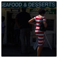
Forgotten Summer of 2015by instepsComment: Although, a bit late to the party, please count my admiration for the cover photo and the essay itself. I'm delighted to have discovered this corner of DPC and the captivating essays on display. I hope to find time to explore earlier postings. In the meantime, about the Maine Avenue Fish Market - Forgotten Summer of 2015 ...
For me, the essay combines text and image to tell parallel stories. The soon to be forgotten summer and the encroaching gentrification. As we've seen in San Diego, San Francisco and Portland, the fish markets can remain and continue to thrive, but never in the pure form from which they first came. I suspect the same will be true at Maine Avenue. You've documented a critical summer, I suspect.
Beyond the powerful cover, I also enjoyed the full set of photos - there's not one I don't want to linger upon. |
| Photographer found comment helpful. |
| 10/28/2015 07:12:35 AM |
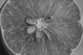
The face you make whenby jgirl57Comment: Hi  jgirl57 jgirl57:
I'm a cat lover so I find this appealing as a subject. A clever juxtaposition. I, too think a square crop of the left portion would improve the overall composition. the expressions are engaging, but there's too much els going on. The crop might focus the subject better. Given the light the way it is, I would have tried to amplify the white values. As it is there's an overall greyness that dulls the impact.
I didn't vote in this challenge (traveling and purposefully disconnected for a while), but think it would have been a 5 from me. I do think the raw material for a stronger image is here, though and could see different processing choices improving the impact and score. |
| Photographer found comment helpful. |
| 10/27/2015 10:34:31 AM |
equilibrium by jagarComment: Bravo, John.
Clearly the best of an overall strong set. Delightful composition to boot! |
| Photographer found comment helpful. |
Home -
Challenges -
Community -
League -
Photos -
Cameras -
Lenses -
Learn -
Help -
Terms of Use -
Privacy -
Top ^
DPChallenge, and website content and design, Copyright © 2001-2025 Challenging Technologies, LLC.
All digital photo copyrights belong to the photographers and may not be used without permission.
Current Server Time: 06/25/2025 07:18:16 PM EDT.