|
|
|
Showing 431 - 440 of ~1620 |
| Image |
Comment |
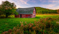
| 11/05/2016 05:32:24 PM | The Historic Keene Barnby NeilComment: This is really lovely, Neil. I was one of your modal votes of 6. An interesting tableau that's well composed and provide a great sense of place. I wish the barn was more isolated as the subject somehow. Perhaps by selective lightening use of the radial filter in LR. The greens also appear to be a bit strongly saturated for my eyes. I'm curious, too, if your POV was purposeful to have the outline of the roof arc on the right side of the barn align with the arc of the hills beyond it. |  Photographer found comment helpful. Photographer found comment helpful. |
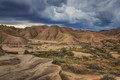
| 11/05/2016 02:01:28 PM | Geology by namComment: Congrats on the Blue, Nikki. I'm commenting here as part of the Post Challenge Volunteer thread activities.
I'm generally not a fan of extreme HDR images that go beyond tone-mapping to stylized processing. For me, this shot sits right on the edge of enough vs. too much. I scored it in the top 3rd of entries, but not among my favorites. Here's why:
The lines and subject matter are terrific - nature verging on abstract. The tonal range is good with details at every level of bright/dark, but as a result, the image lacks contrast. The brightest spot on the image is on the left side between the dark clouds and the hills. My eye is drawn to a hole in the sky. I'm also not a fan of the blue/indigo cast in the clouds, I'd be curious what warming up the tones in the skies would do.
This is obviously a minority opinion based on the blue ribbon and terrific score. If I were you, I'd completely ignore my comment and revel in the accolades. It's a lovely image that I might have processed a bit differently. I pretty certain it would have scored lower, too! | | Photographer found comment helpful. |
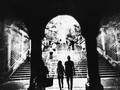
| 11/05/2016 01:42:13 PM | Nero's nightmareby NeatComment: Hmm. I didn't vote on this challenge, but had I done so, I suspect your bell curve might have been more perfect with the addition of a 9.
So, what's the distraction? The wing? In my eyes, the wing provides a context and form that defines the composition. The texture overlay? The texture is effective in creating mood, but not sure it's distracting? The deep blacks at the bottom of the image obscure the landform below allowing conjecture... I'm not the only one who saw Rome below - likely due to the title. I'm with  pixelpig pixelpig about the distraction. The title's the most distracting part. Lovely work! | | Photographer found comment helpful. |
| 11/05/2016 01:01:43 PM | underpassby NiallOTuamaComment: This style is so immediately identifiable, even for someone like me who is notoriously bad at guessing who's work I'm looking at. I'm noting this because not only is is recognizable, it's quite appealing to me. I gotta agree with Georges about the woman with the bag. Frankly the tilt isn't a problem - the problems you'd create by eliminating it would include creation of a not-really-symmetrical, symmetrical image. Lovely work! | | Photographer found comment helpful. |
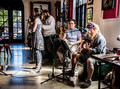
| 11/05/2016 12:46:13 PM | The Bandby NikonJebComment: Having recently tried my hand at shooting a 4-piece rockability band in a similarly tight, small environment, I completely get the challenge of creating a well-composed photo without the distraction of clutter from audio equipment, etc. Frankly, I think this is an appropriate entry for the challenge. It's full of distracting elements, yet it works well in highlighting the four musicians in the context of their venue. Actually, these kind of performances are most successful when the musicians create sounds that transcend the visual environment, when the music overwhelms all the other senses.
So... in a perfect visual world this image wouldn't have: a table intruding on the right, a microphone bumping into the forehead of the seated acoustic player, a music stand hiding the bongo player's right hand, a mic boom with green wire cutting her torso in two, the backgound bass(?) player's hands and instrrument covered by the singer, a disembodied head about the bassist and singer, a dark picture frame as the background to the singer's profile, a bright reflection on the floor that draws the eye away from the subject(s), a high contrast paned door wth a parking lot through it, distracting elements on the left border (red chair, table, water bottles, boom stand base, etc.).
And... despite all the distraction, this photo provides a sense of place and a sense of purpose - to make engaging music that makes anything visual completely irrelevant. I like it. I want to hear it. | | Photographer found comment helpful. |
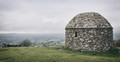
| 11/05/2016 12:19:41 PM | Culmstock Beaconby P-A-U-LComment: I like the muted color palette, which perfectly reflects the grey weather and represents the "landmark" without idealizing the the scene, There's a sense of place and surrounding space that's quite effective. I'm conflicted about the large amount of space to the left of the subject. While it does emphasize the expanse of the valley below, it also reveals the slightly distracting dark foliage and rectangular blocks on the near horizon - I wonder if it might be better to crop the left side in to the point of losing the darker objects. | | Photographer found comment helpful. |
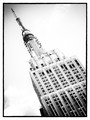
| 11/05/2016 03:29:08 AM | The Chrysler Buildingby PennyStreetComment: This was a 7 from me, Penny. Had I looked more carefully, I'd have seen the title mix-up, but it played no part in my scoring. I love the processing in general, but admit to being among those in opposition to borders. I also think the vignettes in upper left and lower right might be toned down a bit, but this is all largely irrelevant personal preferences. The overall impact of this shot is powerful and makes effective use of tilting. | | Photographer found comment helpful. |
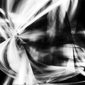
| 11/05/2016 03:17:20 AM | Everyone has Dreamsby pixelpigComment: These monotone, flip and bend abstracts that you've been doing are really evocative. I've messed with this technique and had nothing like this come from it. Going to have to give it another try. Your work is inspiring for me. | | Photographer found comment helpful. |
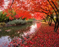
| 11/05/2016 03:11:03 AM | Under the red roofby primabarbaraComment: Barbara - I was one of your 4's on this image - obviously out of sync with the masses, but here's why I landed low on it:
There are certainly attractive elements here (graceful arcs of the river bank and the bridge echoed by the dark tree trunks to the right; the red/black contrast of foliage and tree are nice elements). The reds of the leaves at the bottom of the image are deep and opaque by virtue of having no backlighting. But the backlit reds at the top of the frame the are way oversaturated to me, to the point that they overwhelm everything else in the image.
But clearly my assessment doesn't align with the photo's scoring and ranking... and my tastes tend to be with monochrome or more subtly saturated scenes. That's what I like about DPC - there's room for all of us. Congrats on the 6+ score and excellent placing. | | Photographer found comment helpful. |
| 11/05/2016 02:44:16 AM | leaves fall. a page turns.by tangueraComment: The minimalist approach intersects with the complementary color palette and quirky story (original and interpreted by Don and Mita) come together so well. | | Photographer found comment helpful. |
|
Showing 431 - 440 of ~1620 |
Home -
Challenges -
Community -
League -
Photos -
Cameras -
Lenses -
Learn -
Help -
Terms of Use -
Privacy -
Top ^
DPChallenge, and website content and design, Copyright © 2001-2025 Challenging Technologies, LLC.
All digital photo copyrights belong to the photographers and may not be used without permission.
Current Server Time: 06/26/2025 03:59:14 PM EDT.
|