| Image |
Comment |
| 08/26/2014 10:57:18 PM |
Regalby Ja-9Comment: Now that's PURPLE. Yowza! |
 Photographer found comment helpful. Photographer found comment helpful. |
| 08/26/2014 10:55:49 PM |
|
| Photographer found comment helpful. |
| 08/26/2014 10:54:26 PM |
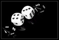
Dice Rollerby adriano74Comment: Hi Adrian,
I'm new to the DPC Critique Club and your image popped up for me to critique...
What strikes me at first impression is the overall sharpness of the image and the care that was taken in its set-up. The high contrast B&W is effective and the pure white dice have retained detail in the highlights. There's even detail in the concave indentation of the pips on each die. The shiny paper is a nice addition and adds a bit of depth to the scene. The black dice are well exposed, too. Their background approaches the pure black of the background with the shape implied only by corners, edges, and shadows. Lots of excellent technical work here from my perspective - there's no question that this catches the eye on first glance. In addition to the first glance technical work, I like the care in placement and faces of the dice. The white dice showing a 7 from the top and an 11 from the side implies you may be a craps player. I'm less certain of the 8 sided dice's purpose in gaming, but did notice the care to show all 8 faces between the two black dice. Nice details.
That said... the things I find distracting, or not as effective as the excellent technical work, are primarily in the composition and perhaps the subject itself. You have a strong diagonal line, but in my eye it's weakened by the empty space to the right. Although we're often warned against centered subjects, I'm thinking this might have been better with the right side cropped. The bottom left also feels a bit tightly cropped to me... made more apparent by the presence of the white hairline border. Without the boarder the tight crop on the lower right might have opened up a bit.
All in all, it's a solid image with wonderful attention to detail and care in execution. Lots of excellent work on this! Message edited by author 2014-08-28 19:45:50. |
| Photographer found comment helpful. |
| 08/26/2014 08:12:19 PM |
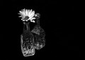
You don't bring me flowers...anymore.by KMcCComment: Hi Kimberly!
I'm here as a new Critique Club member... Your image popped up as my first opportunity to do a critique. Here goes:
First off, I'm always drawn to B&W images of flowers, as they can, at times surprisingly, depict the inherent beauty of a subject that typically uses color as a primary component of attraction, as this photo does. It presents a strong first impression. The dramatic contrast and abundant use of negative space really draws me in as a viewer. The off-center composition is effective as well and creates a powerful isolation of the subject - which is amplified by your choice of title. The patterns and contrast of the cut glass create a combined balance and tension for me. I like the mirroring of the flower with the radial pattern on the bottle directly below it, although, I'm struggling a bit with splitting my attention between the two - not really sure where to focus.
The amount of grain/noise is interesting, too. While it adds an interesting dimension to the texture of the flower, it also draws my attention to the portions of the petals that are blown out to pure white. This texture in the flowers, and to a lesser degree in the glass, also contrasts with the smooth noiseless background black in a way that separates the subject from the background.
Let me finish by going back to that all important first impression. My voting typically starts with a separation of entries that immediately catch my attention and those that don't (6's vs 5's). I then revisit the 6's for a closer look and boost the score when a more detailed observation draws me in further to the image. I did vote in this challenge and gave your photo a 6. It caught my eye as a strong entry and I remain impressed with the overall dramatic impact.
Bill Banning
Critique Club |
| Photographer found comment helpful. |
| 08/26/2014 06:55:10 PM |
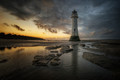
After the Storm by vawendyComment: This was my absolute, far and away favorite. The aspect ratio is SO right for the image. Plus the (as usual) excellent technical and color detail. Bravo! |
| Photographer found comment helpful. |
| 08/22/2014 01:50:14 AM |
August Lightby hesitantComment: Spectacular! A beautiful example of tone-mapped HDR. Well deserved blue! |
| Photographer found comment helpful. |
| 08/13/2014 12:38:40 AM |
|
| Photographer found comment helpful. |
| 08/13/2014 12:34:44 AM |
Biros by DistantColoursComment: Congrats on the ribbon. I really like that the composition isn't centered. The variance in how much of the pens you see at the bottom, top and sides adds interest. Very nice and well deserved. |
| Photographer found comment helpful. |
| 08/13/2014 12:30:11 AM |
|
| Photographer found comment helpful. |
| 08/11/2014 02:00:12 AM |
|
| Photographer found comment helpful. |
Home -
Challenges -
Community -
League -
Photos -
Cameras -
Lenses -
Learn -
Help -
Terms of Use -
Privacy -
Top ^
DPChallenge, and website content and design, Copyright © 2001-2025 Challenging Technologies, LLC.
All digital photo copyrights belong to the photographers and may not be used without permission.
Current Server Time: 06/21/2025 12:44:53 AM EDT.