| Image |
Comment |
| 03/30/2010 01:17:30 PM |
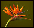
Bird Of Paradiseby ThingFishComment: Nice crisp flower and a nice even background. I am not sure that the colored border is really necessary. |
 Photographer found comment helpful. Photographer found comment helpful. |
| 03/30/2010 01:16:07 PM |
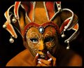
Maskedby IvoryComment: Very interesting photo! I especially like the contrast between the blue eyes and everything else. The mask is interesting, and the fingers provide expression that the hidden face cannot otherwise shot.
I wish the right side of her body (especially her eye!) was brighter though. The darkness there kind of detracts for me.
Just put your hand up to the screen and take turns covering up half of the picture. It becomes incredibly obvious how much better the left side is. It is to the point that I would almost suggest cropping the image at the midline of her face (though I suppose that would not be dpc friendly) |
| Photographer found comment helpful. |
| 03/30/2010 01:10:54 PM |
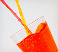
mixologyby klkitchensComment: Nice colors here, and I especially like the bubble texture in the glass.
Did you ever try shooting with a slightly darker background? I think that might have helped this shot by lowering the difficulty of it. Right now, it is very hard to achieve the proper exposure for all aspects of this photo, and to me this shows in the two streams of liquid before they enter the glass. |
| Photographer found comment helpful. |
| 03/30/2010 01:08:00 PM |
A new kind of basketballby hajekaComment: While this picture is in clear focus and is certainly interesting, I suspect that it is not doing that great in this challenge. The reason for this is because:
A, DPC doesn't have a sense of humor :-P
but more importantly
B, This image appears like it has been hurriedly thrown together with little planning. Kind of like "ooooh, I have a basketball hoop, and oooooh I have an orange lion. I am going to place the lion in the basketball hoop and submit it"
Such shots tend to be punished by voters, especially by participants of the same challenge, as they feel like they personally put in more effort.
I am not trying to insult this photo or your preparation for it, I am just trying to explain why you are getting the votes that I suspect you are getting. |
| Photographer found comment helpful. |
| 03/30/2010 01:01:43 PM |
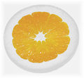
Sunny Side Upby MollyComment: Clever title and I think the centered composition works well here. However, I do think this image is a little overexposed. Just a little darker would have made this more pleasing to the eye, because right now it has a washed out feel. |
| Photographer found comment helpful. |
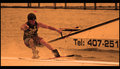
| 03/30/2010 01:00:34 PM |
Back to the grind.by Eagle40Fox2Comment: Nice action shot. The orange floating thing (I forget the name) in the background becomes very distracting in this challenge particularly, because it is the most orange thing in the picture so the eye is naturally drawn away from the main subject to it.
I really like the composition here. In action shots that can be hard to obtain, so well done. |
| Photographer found comment helpful. |
| 03/30/2010 12:57:43 PM |
On Sunflower Pondby J-MeComment: Quirky, vibrant and cute! :-)
I love the colors here, and the reflection has a really nice effect. I also love the positioning of everything.
I wish the left flower wasn't cut off though, I would have loved to see the whole thing. There also seems to be a wood fault on the woody's face that I think could have easily been cloned out. |
| Photographer found comment helpful. |
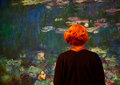
| 03/30/2010 12:53:29 PM |
At the Museumby PennyStreetComment: I love this! It is almost as if this museum watcher has entered the piece of art to become one herself!
Was the clothing she was wearing actually this orange? I can't help but think that her hair would stand out even better if her clothing didn't have the orange tinge. Selecting and changing the curves of just the clothing probably would have done the trick. |
| Photographer found comment helpful. |
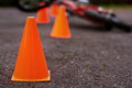
| 03/30/2010 12:50:39 PM |
Training Courseby glad2badadComment: When I look at this image, I find myself wanting to see more of it. The fallen bike in the background is interesting, but we don't get to see much of it. I think a slightly wider shot would have been more effective. The orange in this picture is so obvious that it does not need to be zoomed in so closely.
I love the DoF you used, especially with the effect on the road. The orange color is also very nice. |
| Photographer found comment helpful. |
| 03/30/2010 12:47:52 PM |
Orange Rustby kentbristowComment: I think some will dock you here, because they don't see the orange as vibrant enough. But I actually quite like this shot! You have achieved a great mood here, and that would not be possible without the drab color tone. I also love the contrasting green in the background, it has a nice effect.
I think lowering the camera angle would put a little more emphasis on the the rust, and I think there is a little too much horizon tilt. |
| Photographer found comment helpful. |
Home -
Challenges -
Community -
League -
Photos -
Cameras -
Lenses -
Learn -
Help -
Terms of Use -
Privacy -
Top ^
DPChallenge, and website content and design, Copyright © 2001-2025 Challenging Technologies, LLC.
All digital photo copyrights belong to the photographers and may not be used without permission.
Current Server Time: 08/01/2025 11:37:41 AM EDT.