| Image |
Comment |
| 04/02/2012 09:14:59 PM |
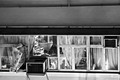
Breeze Through the Windowby TiberiusComment: Nice how you got the action in the corner here, but the real focal point seems to be on the back of the man which is pretty much in the third. |
 Photographer found comment helpful. Photographer found comment helpful. |
| 04/02/2012 09:13:44 PM |
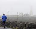
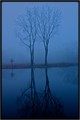
Blue.by EgillPComment: I love how you used the leading lines here to take me into the corner with the rock wall then out into the horizon to the lighthouse with the poles! A great composition with zig zag!! |
| Photographer found comment helpful. |
| 04/01/2012 08:50:34 PM |
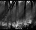
Early one morning .........by sulamkComment: Peaceful, calm and emotive! A nice job capturing the light! I would suggest cropping some off the top to get rid of the bright sky which draws the eye away from the dappled light you captured on the log. |
| Photographer found comment helpful. |
| 04/01/2012 08:47:48 PM |
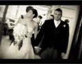
Wedding glowby NeatComment: I like the tones here giving a slight vintage feel. The composition is good. Slight twist is not bad and probably could be twisted more. I think the action in the shot was missed, with one looking away and one looking directly in camera. There is some definite artifacting on the grooms suit... in the vest and in the pants. It just doesn't look natural. It is digitized looking. It may be noise in the shadows brought out from sharpening or something like that. |
| Photographer found comment helpful. |
| 03/28/2012 02:27:26 PM |
My girlsby cabaComment: Too much space around the subjects. Nice composition using the triangular shape. |
| Photographer found comment helpful. |
| 03/28/2012 02:25:50 PM |
|
| Photographer found comment helpful. |
| 03/27/2012 12:05:21 PM |
Sweet gazeby Alex_PetriniComment: Great portrait. I like the shallow depth of field and the darker background. Red was a nice choice. I do find the glare on the upper lip somewhat distracting. Perhaps you could have done some cloning or something to remove that. You did a very nice job controlling the light on the glasses. |
| Photographer found comment helpful. |
| 03/26/2012 08:30:41 PM |
|
| Photographer found comment helpful. |
| 03/26/2012 08:29:07 PM |
|
| Photographer found comment helpful. |
| 03/26/2012 08:19:37 PM |
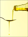
Extra Virginby DistantColoursComment: I think the background is a little pale and there is a yellow color cast reflecting on all the surfaces through out the image. Did you light this with a flash with a yellow gel on it?? |
| Photographer found comment helpful. |
Home -
Challenges -
Community -
League -
Photos -
Cameras -
Lenses -
Learn -
Help -
Terms of Use -
Privacy -
Top ^
DPChallenge, and website content and design, Copyright © 2001-2025 Challenging Technologies, LLC.
All digital photo copyrights belong to the photographers and may not be used without permission.
Current Server Time: 09/01/2025 10:23:42 AM EDT.