|
|
|
Showing 201 - 210 of ~820 |
| Image |
Comment |
| 10/24/2005 03:09:29 AM | |  Photographer found comment helpful. Photographer found comment helpful. |
| 10/24/2005 03:08:20 AM | | | Photographer found comment helpful. |
| 10/24/2005 03:07:50 AM | | | Photographer found comment helpful. |
| 10/24/2005 03:05:57 AM | | | Photographer found comment helpful. |
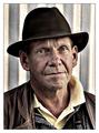
| 10/19/2005 02:32:28 PM | To life!by InnaNComment: Greetings from the Critique Club
First off, let me say that I like the general concept of this shot, but I feel there are certainly some things that could be do differently to make this a stronger shot.
I think the warm tone of the lighting is great and works well to set the mood. The exposure seems to be accurate the lighting is generally well done and the model fits with the overall tone of the shot.
The most noticable thing that strikes me as unappealing, and you received several comments about this during the challenge, is the up-the-nose angle of the shot. shooting from eye level or slightly higher would really help here.
Of less concern to me, but still important is a lack of contrast. The image just doesn't "pop" and it really should. It doesn't need much, but to me, it's really noticable.
The only other thing, and this is really not a major concern, is that the wine looks black. If there were some way to light it a bit from behind, give it a reddish glow, it would add quite a bit to the image.
As far as the challenge goes, this certainly fits and wine can be a celebration in itself.
Keep up the good work! | | Photographer found comment helpful. |
| 10/05/2005 09:40:48 PM | Have A Nice Dayby librodoComment: Greetings from the Critique Club
Wow, I'm not sure I can find much to improve on here, but I'll just give you whatever I have.
Generally, I find your work to be wonderful and full of emotion though usually it seems a bit more melancholy than the image here.
As for this particular image, I think it's a wonderful, bright and happy shot. The pose, the colors, the hat and everything add to the cheery mood. It's evident that the model is enjoying her work and I would imagine the photographer is too. She's a lovely girl and that really comes through here. Well done.
I have a few suggestions. Please keep in mind that they are only minor and you may have deliberately chosen otherwise, but I have my opinions. I love her smiling expression, but I think I'd like to see a version with her looking right at the camera, engaging the viewer. Her face seems just a bit bright, especially on her forehead, maybe a bit more diffusion of the light would have helped there. Also, I'm guessing that you composed it with all the space on the right side for some text, but I think I'd like it a lot more as a vertical without all that space.
I enjoy seeing your work, keep it up! | | Photographer found comment helpful. |
| 09/21/2005 08:28:07 PM | Train is a comin'...by DrAchooComment: Sheesh.........
From some of the lame comments, you would think people had never heard of listening to the rails.........
| | Photographer found comment helpful. |
| 09/20/2005 01:33:34 AM | | | Photographer found comment helpful. |
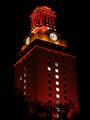
| 09/17/2005 12:11:04 PM | Light The Tower Orange- A University of Texas Winning Traditionby HornOUBetComment: Hello and greetings from the Critique Club
First, I have to admit that I know very little of UT and its traditions, this one included. I think there are some things in this shot that are well done and also some areas where some improvements could be made. Let's start with the good.
Without having seen the actual tower, I would have to say that the exposure here is right on, the image seems crisply focused and the colors are certainly vibrant and eye-catching. I also like how you have included some foreground elements to add depth and anchor the shot.
There are a few things that could be done to enhance this shot. The tower seems to be leaning to the left and that, combined with the perspective, give the sense that the building is falling over. Both are easily corrected in photo editing software.
As far as how this shot fits into the challenge, I would say it does just fine, there is certainly a high degree of contrast here.
I would venture to say that seeing this particular building illuminated this way is a lot more meaningful to someone familiar with the tradition. I don�t know anything about the buildings surrounding this one, but my feeling is that if you were to show the tower in context with its neighbors that are lit normally, it would have a wider appeal.
Keep up the good work!
| | Photographer found comment helpful. |
| 09/12/2005 10:50:27 AM | corinneby parrotheadComment: lovely. maybe a bit tight top to bottom, but oh well. This has such a nice intimate feel to it. | | Photographer found comment helpful. |
|
Showing 201 - 210 of ~820 |
Home -
Challenges -
Community -
League -
Photos -
Cameras -
Lenses -
Learn -
Help -
Terms of Use -
Privacy -
Top ^
DPChallenge, and website content and design, Copyright © 2001-2025 Challenging Technologies, LLC.
All digital photo copyrights belong to the photographers and may not be used without permission.
Current Server Time: 08/27/2025 01:48:45 AM EDT.
|