|
|
|
Showing 171 - 180 of ~553 |
| Image |
Comment |
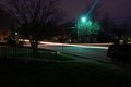
| 02/08/2010 03:55:28 PM | The Lodgeby SenayComment: Hi Andrew, greetings from the Critique Club!
First of all, congrats on your new Personal Best :) You're reaching that 6 in no time :)
Composition
For the subject you chose the composition is well balanced. You managed to handle distortion quite well, the shot is very balanced.
The three at the left does seem a bit distracting, but not too much.
Technique
The HDR is well done, but the right side is a bit dark, you could have brightened it a bit.
Also, the high ISO and the small aperture of f/22 really led to some loss of detail on your photo.
Processing
The alignment of both pictures is very good, but it's noticeable in the brickwork that some artefacts are happening, so it was either the compression, or the lining up, but nothing too serious (but still must have been noticeable to some voters).
Overall
A very nice idea to mix both pictures, and next time just try to get some low ISO and medium apertures. If you have a tripod, sacrifice aperture and ISO flexibility for longer exposure times.
Still, you've gone up from your previous scores, and in a Free Study, so it's no small matter.
Congratulations!
If you have any questions feel free to contact me.
Regards,
Joao |  Photographer found comment helpful. Photographer found comment helpful. |
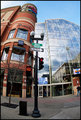
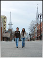
| 02/08/2010 06:52:26 AM | Main Street, Spokane Washingtonby jhess77Comment: Hi Joshua, greetings from the Critique Club!
Regarding your photo:
Composition
First of all, good usage of a fisheye lens. It's difficult to take advantage of the distortion factor of such a lens, but in this case you made it revolve around the post, where the Main Str. sign was. You got it all to fit in the photo, with a lot of breathing space.
The man at the right was not totally in the photo, and this just makes it a bit awkward.
Technique / Processing
Very nicely done on the reflections on the windows, it adds a new point of focus to the shot.
Good exposure, the toning is great.
Overall
A photo that has probably too much going on, since you've got a lot of details that in the end don't add to the purpose of the challenge.
Although it's a Main Street challenge, people were expecting to see the actual street.
Still, a 5.64 score and 26th place is not a bad place to be :)
If you have any questions feel free to contact me.
Regards,
Joao | | Photographer found comment helpful. |
| 02/08/2010 04:10:06 AM | Remains of the Day by hotpastaComment: Way to go, Enzo, GREAT fisheye photo, you used it to the best of its possibilities.
Congrats!! | | Photographer found comment helpful. |
| 02/04/2010 08:30:36 AM | Rue Principaleby OmanOtterComment: Hi Sean, greetings from the Critique Club!
Well, for first impression, I must say it's a hell of a great way to use negative space...with being negative indeed!
Composition
The best part of this shot. I scored it a 7 because the way you framed the street is so well done. You used the trees to divert the attention of the viewers, and making them look down.
Processing
I can see you understand the tools you used and also the usage for them, it really adds a lot to the image.
The passage from greens to reds, with the mixture in the lower half is really great.
The detail on the leaves is very good and the mixture of all colours adds so much life to this photo.
Overall
A 6+ shot, that unfortunately did not score higher because maybe viewers were expecting big cities, but a great photo nonetheless.
Congratulations!
If you have any questions feel free to contact me.
Regards,
Joao | | Photographer found comment helpful. |
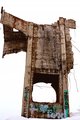
| 02/04/2010 06:10:09 AM | "Tag" On I-15by jayzundelComment: Hi Jay, greetings from the Critique Club!
Welcome to DPC, I'm sure you'll get a lot of good things from our community!
First of all, regarding your shot, it is a very good attempt, that I'll try to explain why it probably didn't meet with your expectations regarding score and placing.
Composition
The first thing that you have to consider, is that this was a Graffiti challenge. And as impressive as the structure in the photo is (because it is), it does not do the graffiti much justice. Also, the angle is very tight, which means that you didn't focus exactly on the graffiti, but you didn't also leave enough room around the cement plant to isolate it. So you were kind of stuck in this middle.
Lighting / technique
It's perfectly exposed, and the white balance is great. Very good tonal range.
Processing
Very good contrast, very good texture. The separation from background is very well done.
Overall
A good choice for a first challenge, and next time you can elaborate what is the part of the picture that you are trying to focus, and what are you trying to convey, and then have your photo / work around it.
Welcome, and I'll look forward for more challenges!
If you have any questions feel free to contact me.
Regards,
Joao
| | Photographer found comment helpful. |
| 02/03/2010 01:59:27 PM | trapped in his artby posthumousComment: Critique Club
Jesus, your 14th brown ribbon?? You're consistent, I'll tell you that much...
And it's your third (or should I say turd) worse entry ever :)
A photo with no redeeming features, but still meets the challenge. Your title help it link.
You where shooting for the last place, and the voters where behind you.
Composition
Perfect rule of thirds, the lines in the back make it more dynamic.
Colour
My retinas are still trying to recover, as they tried to run in horror, but I managed to keep them in. I like the green though.
Processing
The inversion is really the key here, making this a real ribbon winner :)
Great work on your posthumous ribbons, btw!
Cheers,
Joao
| | Photographer found comment helpful. |
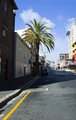
| 02/03/2010 01:44:38 PM | Long Streetby LonnieDComment: Hello Lonnie, greetings from the Critique Club!
Welcome to DPC, you joined quite recently!
Regarding your shot, some points:
Composition
There isn't really a focus on which to capture the viewer. The palmtree seems to be dominating the image, but not as a feature rather than an obstacle.
If the street was deserted the shot could be taken from the middle of the road (of course if it was safe, I never suggest DPCers to injure themselves :)
Lighting / settings
The harsh shadow in front really is hard to overcome. A street shot at high noon with people would have cut it better, since the street would be all lit, without shadows.
Also, at an aperture of f/22 you loose a lot of detail, as lenses tend to get softer at these apertures (diffraction). You could go to f/9ish and get a faster shutter speed.
Processing
A bit more of contrast could be good. The white balance is very good, and tonal range is perfect.
Overall
A not so interesting shot, as you couldn't convey exactly the feeling of main street.
In this case, if possible, some days before shooting you should walk the streets, write down possible shooting locations and then run them all, and pick your best one.
If you have any questions feel free to contact me.
Regards,
Joao | | Photographer found comment helpful. |
| 02/03/2010 01:18:16 PM | South Clintonby DariePComment: Hi Darie, greetings from the Critique Club!
First of all, welcome to DPC, I saw that you joined recently.
Regarding your shot:
It feels that you couldn't quite convey what the purpose of the photo was.
There are too many distracting elements, the tree, the parked car, the excessive law.
If your focus is the street, then move closer to the street, go on the sidewalk, get a long perspective of the street. longer trails, etc.
Processing / settings
The ISO 800 left some noise on your sky, for night shots try to go to the lowest ISO setting in your camera (200).
The light from the lamp is blue / greenish, and you should adjust your white balance to get a much whiter (or yellow) tone.
It needs to be brighter as well, so that viewers can distinguish the objects on the photo.
Before you take a photo, look at the scene in front of you and think what are you trying to communicate. What can I use in this photo to appeal to people. And then try the same photo in different angles, you could like ones better than the others.
If you have any questions feel free to contact me.
Regards,
Joao | | Photographer found comment helpful. |
| 02/03/2010 01:00:31 PM | Unwin's Bridge Roadby CrazyDiamondComment: Hello Elle, greetings from the Critique Club!
First impression of your shot is that, comparing to other entries in the same challenge, most of the viewers could not relate it to their notion of main street.
As you can see, a 6.8 score from commentators shows that you could appeal much more to some selective group, and that they liked it very much.
Composition
The post that you said shouldn't be there is actually the thing that gives a 3D feeling to the image. You feel tempted to shift your head sideways to try and see behind it. It is a bit too much in the middle, so you should move it to the left or the right (depending on what was the best alternative, considering the background).
Technique
It's amazing, but I think nobody realized it was a night shot, it looks like a golden hour, roundabout 6'ish.
Good lighting and the high ISO doesn't show up in the photo.
Processing
Much to my taste, very warm, very moody. A bit of Highlights could have spiced it up a bit.
Overall
A shot that did not appeal to voters, which in itself is not bad, it's just not popular.
Most of the thinking could have been because the people didn't relate to main street.
If you have any questions feel free to contact me.
Regards,
Joao
| | Photographer found comment helpful. |
| 02/03/2010 12:43:30 PM | Down on Main Streetby Luci11eComment: Hi Lorie, greetings from the Critique Club!
I've read your profile page, and I'll try to give a comment that can help you :)
Also, don't be discouraged by the low score on Hot, the best photographers on this site have some photos that are absolutely terrible, but it's normal that this happens once in a while.
Your photo:
Composition
Vertically speaking, the shot is well balanced.You got them in a level that is appealing regarding street level. Sideways however, the lamppost on the right seems a bit off, as well as the leading lines on the sidewalk.
I would have liked to see this shot if you moved a bit to your left, to take the post out of the equation, allowing as well for the white tower on the back to be seen.
And as difficult as it is to get your son to appear in a photo :) it would be better if they both were looking at the camera, or alternatively at each other.
Processing
Since the day was a bit cloudy, more contrast was needed, to make a stronger point.
Boosting just a tad the reds would also have created a warmer feeling.
Overall
A 5+ score, so actually above / in-line with the average, and a good start for DPC. Next try to create a real focus point to grab viewers. If the point is to enhance the people, make them "act" for the camera, or wait for a great pose. If it is the architecture, shot from below upwards.
If you have any questions feel free to contact me.
Regards,
Joao
| | Photographer found comment helpful. |
|
Showing 171 - 180 of ~553 |
Home -
Challenges -
Community -
League -
Photos -
Cameras -
Lenses -
Learn -
Help -
Terms of Use -
Privacy -
Top ^
DPChallenge, and website content and design, Copyright © 2001-2025 Challenging Technologies, LLC.
All digital photo copyrights belong to the photographers and may not be used without permission.
Current Server Time: 08/26/2025 10:16:32 AM EDT.
|