|
|
|
Showing 151 - 160 of ~553 |
| Image |
Comment |
| 02/12/2010 11:56:08 AM | I Guess We're Doneby MinsoPhotoComment: Hi Joshua, greetings from the Critique Club!
As to your photo:
Composition
The crop is just a little tight, you could have left a bit more space below the ring, so you could really feel the emptiness you tried to convey in your photo / title.
Still, I love the angle and the fact that you can still see your face.
Lighting / Technique
The lighting and texture of the shot is very balanced, and the work that you did with the sheet, etc really paid off, you removed all distractions that could have been there and just kept it to the photo.
If you already where considering doing this in black and white, I would have increased the ISO a lot, so you could sacrifice aperture. The f/2.8 is really too open to get both the hand and the ring in focus, and I think this was the main reason people did not vote higher, as they were connecting the ring with the hand.
Processing
The conversion to b&w is very well done, great contrast and great blacks. No noise here, and a very smooth photo. Something funky is going on in the top of the hand, seems like CA but in b&w, probably due to the clarity enhance in Topaz.
Overall
A very meaningful shot, that goes beyond the photo and has a deeper meaning, that could be improved with some minor tweaks.
If you have any questions feel free to contact me.
Regards,
Joao |  Photographer found comment helpful. Photographer found comment helpful. |
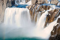
| 02/12/2010 11:44:47 AM | Winter Flowsby NewGuyComment: Hi Jeff, greetings from the Critique Club!
Regarding your shot:
Composition
It's amazing how with 7 bracketed exposures the merging is so clear, they lined up very nicely.
The crop is a bit too tight, and you put the waterfalls in the middle of the picture, without much of a context around it. I would have liked to see a shot from a lower angel, just to get more from the surroundings, to integrate the photo.
Technique
Great take on the bracketed mode to get the flow of water, it's really great to see a long exposure during the day, it's uncommon to see it.
I can't quite figure out the aperture, if it is what you wrote, probably f/2.8 is too open, I would stop down to f/6 or something.
Processing
Good tones, great colours. If it was me, I would use some burning and dodging to enhance the waterfalls, and get a better separation.
If you have any questions feel free to contact me.
Regards,
Joao | | Photographer found comment helpful. |
| 02/12/2010 11:34:20 AM | Motherly Loveby rmezzoComment: Hi Ryan, greetings from the Critique Club!
Well, it's hard to say something about this portrait, I gave it a 7 during voting, I was really impressed by the sharpness and the quality of the lighting.
Composition
The only point here is that I would have liked to see more space on top, so we could see the whole person. Other than that, perfect placing, very good facial expressions and family portrait.
Technique / Lighting
Superb technique on the coloured background, it really adds a very professional studio look, and the light is very soft, very even throughout the whole frame (with a tiny bit of light falloff in the corners.
Processing
Maybe the border was a distraction for some voters, we do know that some people will not vote higher if an excessive border is used, and it's very noticeable on this photo.
Still, a 7.57 from commentators and an almost 6 score is very good, independent of the placing.
If you have any questions feel free to contact me.
Regards,
Joao | | Photographer found comment helpful. |
| 02/11/2010 03:12:01 PM | Twenty Nine Weeksby rooumComment: Hi Clive, greetings from the Critique Club!
It's really great to be able to comment on one of your photos, you have a very unique style of photo that escapes from the trendy DPC-friendly world, it's very interesting to see your shots!
Regarding this photo:
Composition
The above water tummy and leg really balance the whole photo.
I probably would like to see another hand on the other side just to give a more comfortable feeling. The nail does not distract me, it adds a human touch.
Lighting / Technique
I was really hoping for some shadow, just to get a more perspective of dimension, it could really help to have some shadows on the right places, it would "un-flatten" a bit the shot (the tummy seems a bit at the same level as the water, and not so much rising out of it).
I like the grain in this, gives it a vintage look.
Processing
Great tones on the skin, and the blue is very soothing for this picture. Great deep contrast and colour.
Overall
A 7.5 score from commentators really means that your photo had an impact on an emotional as well as visual level.
All the best for you both (three in this case) :-)
If you have any questions feel free to contact me.
Regards,
Joao | | Photographer found comment helpful. |
| 02/11/2010 02:40:53 PM | A Gold Winter Sunsetby bs-photosComment: Hello again Brandi :)
First, your question :-)
If you type about:admin at the address bar, you'll get a lot of functions that are not available in the menus. Since I'm not sure what the problem is, I cannot check with setting could be the correct one :P But you can look for anything filtering by quality, image, etc, until you find it.
If this doesn't work, try and reset your FF.
As for the photo:
Composition
I like the silhouette, I like the way you can still see the ground, but I think it was cut a little short on the left side, as you can't see the whole tree. It would make this photo much more robust if the entire tree was there, then it could be like "A tree and a sunset". Like this, it feels a little more like a sunset and the tree is a bit in the way. Not too much, but still a bit.
Lighting / Technique
The colours are just fabulous, your sky gradient is just so smooth and warm that you really feel you were there. Probably could have lowered the ISO just to reduce the noise in the sky, and make it even smoother.
Processing
As you said, the shot didn't need much PP, since it's all there. If it was me, just to make viewers a little more directed at the sunset, I would have used a little vignetting, to close the perspective.
Take care,
Joao | | Photographer found comment helpful. |
| 02/11/2010 02:28:03 PM | DUCK IN THE LIGHTby diverssComment: Hi Saethor, greetings from the Critique Club!
Regarding your shot:
Composition
The subject of your photo is not the most interesting one. I think that you could have tried to work with this and probably frame it in a way that would make the viewer think about it. For example: Two ducks side by side facing the other, in a sort of confrontation. Or a pyramid. Something that could make a not so interesting subject into a thing that had a purpose behind hit.
Just shooting the ducks is not by itself a statement, as they're really normal subjects.
Lighting / Technique
I really like the tones you got around the ducks, since the light spilled a bit to the sides, so you have a blue tone below, a yellow on the right, etc. Probably you could use a greater aperture (like f/6) and just 5 seconds, because at f/16 diffraction starts to make your photo softer and softer, and that is noticeable on the edges of the ducks.
Processing
Nothing to be said here. Probably a bit underexposed, but since they had lights from within they're still very visible, and this shot didn't need much processing.
Overall
I think that you tried to use a subject just for the sake of the subject. A little imagination can really improve a photo, and when you don't have interesting material, a little play with the objects can help a lot.
If you have any questions feel free to contact me.
Regards,
Joao | | Photographer found comment helpful. |
| 02/11/2010 01:32:56 PM | Hotter Than Hellby De SousaComment: Whatever the placing and decision may be, it's a fantastic shot nonetheless.
Still proves that you have what it takes (not that there was any doubt:)
| | Photographer found comment helpful. |
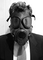
| 02/11/2010 01:24:44 PM | Risky Businessby yakatmeComment: Hi Robert, greetings from the Critique Club!
It's very cool that you went for a self-portrait, having done these myself I realize that there's a lot more than just to press the shutter.
Regarding this shot:
Composition
Great portrait, very frontal and in-your-face. The fact that you used such a sterile environment helps people concentrate on the main subject, and draw all attention there.
Lighting / Technique
There are just 3 things (in my opinion) that kept from a higher score:
- the shadow on the left, from the overhead light, is a bit noticeable on your neck/shoulder. Some kind of bouncing from below would help to minimize this
- The blown highlights at high right
- the reflections on the eyes of the mask don't allow for the eyes to be completely visible. Don't know if a polarized filter would do the trick, since the reflection is not straight ahead, but maybe you could see a little bit more look with this.
Processing
Very good job on the monochrome, the contrast is very effective and well done, an almost b&w shot and a lot of detail in the mask.
Overall
Although it placed where it did, it's a very interesting and out of the box photo, and with just a few improvements could be really a stronger picture.
If you have any questions feel free to contact me.
Regards,
Joao | | Photographer found comment helpful. |
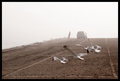
| 02/10/2010 12:51:41 PM | Close to the Edge, Down by a River...by mgsmith53Comment: Hi Michael, greetings from the Critique Club!
Overall, regarding your photo, I think it was a bit too personal and obscure to gain much attraction from the majority of DPC voters. It doesn't necessarily mean that in better or worse, just not trendy in the sort of way people are used to see and vote.
Having said that, I'll try and look at it from a objective point of view.
Composition
I see the person in the back and the car to be the main subject, and the seagulls were there unplanned. I would liked to see the seagulls not in front of the person, but leaving the picture, as it would add to the feeling of quietness.
Lighting / Technique
The f/29 really makes this image a bit soft, and the slow shutter speed has caused a bit of blurring (unless that was your intention), and this does retract from the scenery.
I like the motion blurred seagulls, but not the blurred ground. Also, the whole sky is blown, and the details of it and of the sea were lost.
Processing
It looks desaturated, and I like this look. I would bump the contrast, even if it was selectively, so you'd still get the person in a foggy mode.
Hope that was helpful, and hope I did understood your intentions correctly.
If you have any questions feel free to contact me.
Regards,
Joao | | Photographer found comment helpful. |
| 02/10/2010 12:02:03 PM | On the Other End of the Lensby InsomniacComment: I can't believe I had a Canon camera on my hand...it took all my willpower not to drop it :)
Just joking, it was very nice to help Insomniac doing this shot, it was a great idea from him, and really hope it will be understood by the voters (not voting). | | Photographer found comment helpful. |
|
Showing 151 - 160 of ~553 |
Home -
Challenges -
Community -
League -
Photos -
Cameras -
Lenses -
Learn -
Help -
Terms of Use -
Privacy -
Top ^
DPChallenge, and website content and design, Copyright © 2001-2025 Challenging Technologies, LLC.
All digital photo copyrights belong to the photographers and may not be used without permission.
Current Server Time: 08/26/2025 10:19:38 AM EDT.
|