DPChallenge: A Digital Photography Contest You are not logged in. (log in or register
 
Browse Settings
Currently viewing:
MemberClubJuggle

Show comments:

Per page:

Order:

Comments:


Comments Made by ClubJuggle
Pages:   ... ... [62]
Showing 321 - 330 of ~620
Image Comment
Christmas Crystals
12/18/2005 12:24:19 PM
Christmas Crystals
by o2bskating

Comment:
I'd like to see a little more DOF on this. I know that's a challenge in the dark. Good composition.
Photographer found comment helpful.
"CUDDLE" me this hols for $10.99!
12/18/2005 12:23:03 PM
"CUDDLE" me this hols for $10.99!
by elee3009

Comment:
I'd like this better if it stood out more from the background. Focus also seems a little soft.
Photographer found comment helpful.
Polar Bear Figurine Set - Collector's Edition
12/18/2005 12:22:06 PM
Polar Bear Figurine Set - Collector's Edition
by Marjo

Comment:
Excellent composition. Great execution but to my eye the gold seems a bit oversaturated to the point of unnatural. Still a very good entry.
Photographer found comment helpful.
Naughty or Nice!
12/18/2005 12:19:32 PM
Naughty or Nice!2nd Place
by Sonifo

Comment:
Why can't it be both? ;-)
Flawless execution. The lights-as-clothesline add that something extra to put this over the top. 10.
Photographer found comment helpful.
L.L. Bean - Flannel and Santa Cookie Gift Set
12/18/2005 12:15:39 PM
L.L. Bean - Flannel and Santa Cookie Gift Set
by notesinstones

Comment:
Cute photo, and I love the boy's experession. Some crumbs on the plate would have been a nice extra touch.
Photographer found comment helpful.
 Song and Dance Supplies
12/18/2005 12:11:25 PM
Song and Dance Supplies
by vtruan

Comment:
The yellow rail behind the dancer is a bit distracting, and the softness (motion blur?) takes away from this entry as well. I'm left wondering if this is a shot from a holiday show that just happened to fit the challenge. For this to pass as a catalog shot, I believe you would need to have more control if your background and lighting.
Photographer found comment helpful.
Opal Dreams
12/18/2005 12:09:13 PM
Opal Dreams
by OdysseyF22

Comment:
Nice composition, but on my monitor the hotspots on the opal pendant seem blown out, as does much of the white background. A more diffuse light source may have helped you here.
Photographer found comment helpful.
a wrench in the system
12/11/2005 02:20:04 AM
a wrench in the system
by autohuff

Comment:
Greetings from the Critique Club!

When requesting a critique, we recommend that you fill out the Photographer's Comments. By describing what types of suggestions you are looking for and/or telling us what you were trying to accomplish with your photograph, we are able to provide you with the most useful critique possible. When this is not provided, we still do the best we can. I apologize in advance if any assumptions I make on this photograph are incorrect.

This photograph clearly meets the challenge, but could use some improvements to give it an extra edge in the scoring.

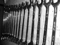
Photographs of tools are typically about form and texture, so black and white was a good choice for this entry.

Your light source seems very harsh and falls off quickly as it gets away from the camera. This suggests that perhaps an on-camera flash was used? On-camera flashes typically perform poorly as a primary light source, and at most are useful as a fill flash to fill in shadow areas in daylight shooting. You will typically get better results by using an off-camera light source, using a tripod if necessary to facilitate a longer exposure.

The natural flow of your image is from right to left. This can be unappealing to some viewers as human nature is to want to "read" a photograph, and for most people that means they want to scan the photograph from left to right.

Also, the photograph appears to be a bit crooked. It looks, in fact, like it was rotated counter-clockwise (the wrenches were actually lying on a table or the floor). In any case, the wrenches are at a very noticeable angle relative to the edge of the photograph, so this probably should have been rotated a bit further. Of course, it is best to get the photograph as close to level as possible when shooting.

The wrenches in the foreground are out of focus. Since the wrenches are your main subject matter, they should typically be in focus in the foreground (it is probably ok if they fall off toward the background). You could resolve this either by using a smaller aperture (higher f/number) or by focusing on the wrenches in the front.

A tighter crop in the background may have added a sense of infinity to this photograph, creating the illusion that the wrenches go on forever. This might even be strengthened by rotating the entry back clockwise so the wrenches were parallel with the bottom edge. Both of these are a matter of personal preference. Feel free to try them and see what you think.

In all, this is a good concept that could benefit from some additional attention to the details outlined above. Feel free to try any of the suggestions above and see if you think they improve the photograph. Of course, you are 100% welcome to disagree with any of the suggestions as well, that's what makes art what it is!
Photographer found comment helpful.
Underground Mining
12/10/2005 03:00:18 AM
Underground Mining
by Judi

Comment:
Greetings from the Critique Club!

This entry is quite well done. The simple composition and minimal use of color add to the photograph's appeal.

While this photograph clearly meets the challenge, it seems to lack that extra "something" that puts it over the ribbon-winning edge. Perhaps if he were doing something other than reading, or if the title gave us some insight as to how the reading tied in with mining, it might have fared even better than the respectable 5.8 score you received.

The composition on this photograph is strong. My first impression was that it could stand to be cropped a bit on the left, but when I actually tried that myself I found the results came up short. The subtle light and shadow on the left side adds a sense of depth that would be lost with cropping.

Your exposure is perfect and makes the best of some very challenging lighting conditions.

Post-processing is well-done as nothing seems needed or missing from that perspective.

It appears your focus probably locked on either the miner's right hand or the tip of his helmet. This is not surprising as these are the areas of greatest contrast in the photo. Unfortunately, this results in the subject's face being slightly out of focus. Focusing manually for this type of photograph may benefit you.

In all, this is a very good photograph. Probably the main reasons it did not score higher is that even though it met the challenge, it was probably not "industrial enough" to get that extra edge in the voting. The focus issue may have troubled some voters as well.
Photographer found comment helpful.
Bridge
08/27/2005 11:28:25 PM
Bridge
by Keith Maniac

Comment:
Black and white was a great choice for this photograph as it has strong tones and texture. The unconventional angle works well here.
Photographer found comment helpful.
Pages:   ... ... [62]
Showing 321 - 330 of ~620


Home - Challenges - Community - League - Photos - Cameras - Lenses - Learn - Help - Terms of Use - Privacy - Top ^
DPChallenge, and website content and design, Copyright © 2001-2025 Challenging Technologies, LLC.
All digital photo copyrights belong to the photographers and may not be used without permission.
Current Server Time: 06/18/2025 11:35:04 AM EDT.