| Image |
Comment |
| 08/27/2004 06:26:37 PM |
...for a medical miracleby aaronb532Comment: Finally a great idea for this challenge, good pose, I would like to see the hands in sharper focus and maybe better color all over the photo, a little color correction is needed imo, there's a little too much light-yellow-orange color on the robe.
Very good motive for this theme, I like it! |
 Photographer found comment helpful. Photographer found comment helpful. |
| 08/26/2004 09:08:43 AM |
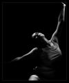
Joyfulby heidaComment: Hi, you are definately on the right track with your use of the lights, you have a good eye for lighting conditions overall.
For this photo, I think there are some improvements that can be done and this could have been done differently to get a better outcome. I like the pose and lighting condition and the composition is good, but could be a little better imo. I agree with others on the cropped hand at the top.
I took your photo and worked a little with it (hope you don't mind, just tell me), I rotated it a little, cropped your "distracting" leg out 'cause it shouldn't be shown that you're sitting imo, made a little more contrast to it and faded your left hand out to black (not the best work) to have it more equal to your other hand. But imo it would be better to see at least an outline of both your hands, but I can't do anything about that in the version I posted here.
//www.dpchallenge.com/image.php?IMAGE_ID=100379
What do you think about this? Message edited by author 2004-08-26 09:21:12. |
| Photographer found comment helpful. |
| 08/26/2004 08:19:41 AM |
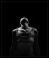
Confuzedby heidaComment: This one is not bad, but could be much better imo. There's to bright light on your right hand and it is drawing to much attention from your face that should be the central point and in better light. Also I don't like the composition in it, there's to much emptyness at the top to the left and you are slightly facing out of the frame that doesn't work for me. With more of your left hand in the frame and with your eyes placed higher to the left facing the same direction would be much better. Or tighter crop would be even better idea. Maybe you should have your eyes open to make this photo more personal to get more connection for the photo to the viewer, I'm not sure you should look directly into the lens, but I think having your eyes open would make a better outcome.
I hope you don't mind, but I cropped your photo (and used the dodge tool a little on the face) to make a composition that IMO is much better. What do you think?
//www.dpchallenge.com/image.php?IMAGE_ID=100377
Message edited by author 2004-08-26 08:34:14. |
| Photographer found comment helpful. |
| 08/26/2004 07:53:44 AM |
Graceful IIby heidaComment: Much better version cropped like that. I think this is the best of this series of your self portraits. The use of light and the pose is very good. Nice work. |
| Photographer found comment helpful. |
| 08/25/2004 02:20:52 PM |
|
| Photographer found comment helpful. |
| 08/25/2004 12:15:03 AM |
|
| Photographer found comment helpful. |
| 08/24/2004 12:58:41 AM |
A subtle patience by heidaComment: Very good photo, I like the background a lot and how you've burned it, good use of lights, well done. Maybe if the model would have looked a bit more towards to the light, bringing more light to the face of the model, would have improved it, but I'm not sure, it could then maybe just take to much of attention to the face. This is definately one of the best in this challenge, maybe even a ribbon photo imo. |
| Photographer found comment helpful. |
| 08/24/2004 12:51:28 AM |
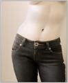
Denim Dreamsby lizzyc3Comment: I like this shot a lot, I think it will be in top ten and should have a ribbon imo. Very good composition, great use of toning. Some people might say that they wanted to see more flesh, but imo the jeans add a lot to it, the large button especially. |
| Photographer found comment helpful. |
| 08/24/2004 12:47:31 AM |
Serenity by grigrigirlComment: The best photo in this challenge imo, great composition, the model is very well positoned and the light is good. Congrats on your ribbon in advance... |
| Photographer found comment helpful. |
| 08/21/2004 12:42:26 PM |
|
| Photographer found comment helpful. |
Home -
Challenges -
Community -
League -
Photos -
Cameras -
Lenses -
Learn -
Help -
Terms of Use -
Privacy -
Top ^
DPChallenge, and website content and design, Copyright © 2001-2025 Challenging Technologies, LLC.
All digital photo copyrights belong to the photographers and may not be used without permission.
Current Server Time: 08/01/2025 06:08:57 PM EDT.