| Image |
Comment |
| 12/06/2005 03:50:42 AM |
Finally Freeby UNCLEBROComment: Very good idea. the framing of the subject is too tight for my taste but the light is good. |
 Photographer found comment helpful. Photographer found comment helpful. |
| 12/06/2005 03:49:02 AM |
|
| Photographer found comment helpful. |
| 12/04/2005 03:56:13 PM |
Time of Lightby Dax-Comment: Great use of light. You have a unique style making many interesting photos with your special touch. I hope to see more from you in the near future.. |
| Photographer found comment helpful. |
| 12/04/2005 03:42:14 PM |
Loneliness...by QartComment: the snow on the ground is a bit too much dodged for my tastes, otherwise a nice sky and good photo. |
| Photographer found comment helpful. |
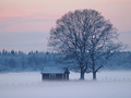
| 12/04/2005 03:40:31 PM |
Mystic Morningby Kaja LundComment: Great photo, maybe a little bit wider shot would have made it even better. You could also try to add more contrast to it. Otherwise it's just great! Best of luck. |
| Photographer found comment helpful. |
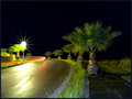
| 12/04/2005 03:38:28 PM |
Peninsula Tracerby dj_MComment: try crop off a 4/5 from the bottom up to the tree at front so the bright grass in the bottom would be out, then I think you would have a much better photo, it's not bad as it is, it's nice, but it could be better. |
| Photographer found comment helpful. |
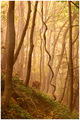
| 12/04/2005 03:34:05 PM |
Viney.by TranquilComment: Intersting to watch without being very interesting, but then again it must be a interesting photo, hehe. Nice colors, a person sitting in the forground looking to the right side at the photo would make this an outstanding photo, a woman in a white dress would make it awesome. |
| Photographer found comment helpful. |
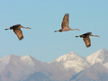
| 12/04/2005 03:30:48 PM |
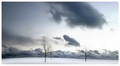
Journeyby SammieComment: A little bit over sharpened, nice to see the mountain peaks in the background, maybe you should add more contrast to them. |
| Photographer found comment helpful. |
| 12/04/2005 03:28:08 PM |
Lilyby janrussComment: Nice clarity and colors, maybe a little bit wider shot would make it even better, some might say tighter, but then it would loose it's originality, I like the blue background. |
| Photographer found comment helpful. |
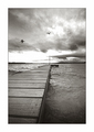
| 12/04/2005 03:25:32 PM |
Spiritsby ubiqueComment: The sky is too much burnt out to white and if it wasn't this photo would be great. It's not bad, but this burnt out sky is dragging the photo down. Maybe you should have pointed your camera more down, so the horizon line wouldn't be cutting the photo in half as it is. I like how the pier is placed in it and the birds are adding very much. I like the big white frame, no matter what others may say about it. |
| Photographer found comment helpful. |
Home -
Challenges -
Community -
League -
Photos -
Cameras -
Lenses -
Learn -
Help -
Terms of Use -
Privacy -
Top ^
DPChallenge, and website content and design, Copyright © 2001-2025 Challenging Technologies, LLC.
All digital photo copyrights belong to the photographers and may not be used without permission.
Current Server Time: 08/06/2025 08:18:42 PM EDT.