| Image |
Comment |
| 04/13/2003 12:31:29 PM |
Pidialby helgihelgiComment: I really like this photo. Great DOF, great composition, and really nice, rich colours. The textures are lovely too. |
 Photographer found comment helpful. Photographer found comment helpful. |
| 04/13/2003 12:19:35 PM |
|
| Photographer found comment helpful. |
| 04/13/2003 12:14:21 PM |
Play doh Piby CreativeFlyPhotoComment: I like the bright colours and the high contrast in this. It's better than a lot of similar photos in the challenge. The camera angle adds depth, and the white background keeps it clean and simple.
Yet, it isn't a highly artistic image. It still seems more like a photo that was designed to meet the challenge rather than be a work of art. |
| Photographer found comment helpful. |
| 04/13/2003 12:10:37 PM |
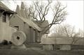
3 Signs of Piby dg02Comment: I can see 2... what's the third sign?
The tonal depth of this is a bit low... ie, it seems washed out to me. the sky is very pale. The composition seems very static, except for that tree. |
| Photographer found comment helpful. |
| 04/13/2003 11:49:31 AM |
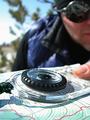
(1)3.(0) 14(0) 15(0)by dacrazyrnComment: Interesting. I enjoyed orienteering as a kid :). An obscure concept I'm sure a lot of people won't understand. I like the shallow DOF. Nicely done. |
| Photographer found comment helpful. |
| 04/13/2003 11:43:45 AM |
Quarterby AnnidaComment: I love the colours in this SO MUCH! Especially after rating most of the other photos. I think you did really well. |
| Photographer found comment helpful. |
| 04/13/2003 11:39:50 AM |
Spring Stormby DennisFComment: I like this... it's a really cool idea. That calendar is nifty! The lighting seems a bit off to me though. The photo could also do with a bit more tonal depth. |
| Photographer found comment helpful. |
| 04/13/2003 11:20:13 AM |
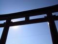
Gateway to Enlightenmentby AntithesisComment: Looks like one of those japanese sun gates. I like the composition of this, but I think it could do with some processing to bring out the tonal depth a bit more. It just feels a bit washed out. |
| Photographer found comment helpful. |
| 04/13/2003 11:18:52 AM |
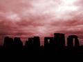
Stonehengeby KonadorComment: Gorgeous. I won't be surprised if this wins, unless people judge it to be off-topic for some reason. I love the cloud textures and the colours. Great composition and perfect silhouette. 10 from me. |
| Photographer found comment helpful. |
| 04/13/2003 11:17:32 AM |
Alpha, Pi, Omegaby EJComment: I don't understand the reference in the title. Is it religious? The composition is very loose. It's just a collection of objects, not very aesthetically arranged, and with a lot of empty space around them that doesn't make any impact. |
| Photographer found comment helpful. |
Home -
Challenges -
Community -
League -
Photos -
Cameras -
Lenses -
Learn -
Help -
Terms of Use -
Privacy -
Top ^
DPChallenge, and website content and design, Copyright © 2001-2025 Challenging Technologies, LLC.
All digital photo copyrights belong to the photographers and may not be used without permission.
Current Server Time: 08/25/2025 08:25:57 PM EDT.