| Image |
Comment |
| 06/27/2002 03:12:00 AM |
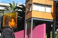
Drowningby drewmediaComment: Very cool performance art kind of idea. I don't know about the background elements though, it could have been a more exciting photo. The palm fronds right behind his head are the most distracting part, for me. I like the geometry and colours of the pink wall and the little building there, but if it was all a bit tighter it would be more effective. |
 Photographer found comment helpful. Photographer found comment helpful. |
| 06/28/2002 05:56:00 AM |
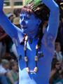
Lady in Blueby pjangelComment: I really like this one. Great colour, nice action shot. Very expressive of the kinds of characters and events you'll only find in a city. |
| Photographer found comment helpful. |
| 06/19/2002 04:03:00 AM |
|
| Photographer found comment helpful. |
| 06/20/2002 01:35:00 AM |
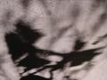
Dancing Elvesby SwashbucklerComment: Wow, this is really cool! The distortion of the shadows gives the elves so much life and lightness. I'm not sure how you created this, but nice work :) |
| Photographer found comment helpful. |
| 06/20/2002 08:55:00 AM |
Bad Hair Day by FranziskaLangComment: Great idea, beautifully composed. The "hair" is a nice element that creates a very interesting shadow. |
| Photographer found comment helpful. |
| 06/20/2002 08:53:00 AM |
|
| Photographer found comment helpful. |
| 06/20/2002 07:34:00 AM |
Strung Outby millerComment: Beautiful lighting and composition, rich black and white. The shadows add a lot of depth. I can't believe how many 10s I'm giving, but here goes another one! |
| Photographer found comment helpful. |
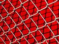
| 06/19/2002 03:18:00 AM |
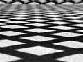
LINKS by DigipixerComment: The colours here are very vivid, and the texture of the metal stands out nicely. The shadow is almost reptillian, very cool. I think I'd like a different camera angle or something though, because the flatness of it doesn't work for me. The lines of the fence converge a little bit towards the bottom left hand corner, I think I'd like that to have been stronger. |
| Photographer found comment helpful. |
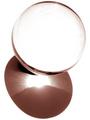
| 06/20/2002 08:09:00 AM |
Champagne for my Shadowby FrooberComment: Very nice, rich colours and lighting. The composition seems a bit blocky though, with the glass, bottle, corkscrew and shadow all forming a rectangle of sorts. |
| Photographer found comment helpful. |
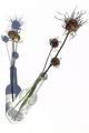
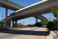
| 06/14/2002 11:14:00 PM |
Spaghetti Junctionby elemessComment: Very nice composition. The signs add a nice element of colour and further enhance the curvy theme of the photo. |
| Photographer found comment helpful. |
Home -
Challenges -
Community -
League -
Photos -
Cameras -
Lenses -
Learn -
Help -
Terms of Use -
Privacy -
Top ^
DPChallenge, and website content and design, Copyright © 2001-2025 Challenging Technologies, LLC.
All digital photo copyrights belong to the photographers and may not be used without permission.
Current Server Time: 08/25/2025 11:27:44 PM EDT.