| Image |
Comment |
| 03/17/2007 04:00:50 PM |
|
 Photographer found comment helpful. Photographer found comment helpful. |
| 03/14/2007 12:13:11 PM |
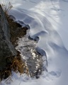
The Essence of Winterby JunieMoonComment: Maybe there's "too much" going on here, with the viewer's attention divided between the rock, ice, and snow. It's a little hard to get "oriented" since different elements seem to slant in different directions, which may cause the viewer to feel uncomfortable or off-balance. |
| Photographer found comment helpful. |
| 03/14/2007 12:08:10 PM |
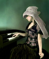
Low key hobbyby MelethiaComment: I think the double-meaning of "low-key" in your title adds to the meaning of the shot. I like the composition, and personally I think it's "dark enough" for the topic. |
| Photographer found comment helpful. |
| 03/14/2007 12:04:27 PM |
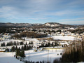
A view from St Sauveur in Canadaby albc28Comment: This is a lovely Winter pastorale, but it seems that the subject is more the overall landscape, with the trees dividing the snowfields into geometric shapes; I think the voters were looking for the trees to form the main subject themselves. |
| Photographer found comment helpful. |
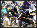
| 03/14/2007 12:00:38 PM |
Revoltingby howzitComment: I haven't been to an SCA event for a long time -- good looking armor! I think you did a pretty good job of showing the fury and confusion of battle, though I'm not sure that soldiers in battle "hate" the enemy in the same way an individual might; that might have influenced the score you got. |
| Photographer found comment helpful. |
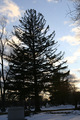
| 03/14/2007 11:54:20 AM |
Companionsby pamelasueComment: I think your silhouette may have been more effective if there was less "stuff" in the background, which now fill the spaces between the branches where the sunset could show through. Perhaps moving a bit to the left from where you took this might have shown the main tree against a more open area. Also, lack of a clear horizon makes this look as though it's tilted counter-clockwise, even though the man-made structures(?) seem to show that you had the camera level. |
| Photographer found comment helpful. |
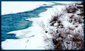
| 03/10/2007 06:59:44 PM |
Eau Claire - The Bow Riverby CitadelComment: You've definitely captured the feeling of "cold" -- I can imagine a lot of people being picky because -- between the running water, plants, and snow -- there's only a little actual ice showing.
Also, to me, the way you've cropped at/below the horizon makes it look as though the image is tilted a bit to the right (clockwise). |
| Photographer found comment helpful. |
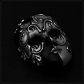
| 03/10/2007 06:54:12 PM |
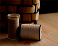
Arabesqueby anotherdayComment: I'm not sure you needed quite as much surrounding black area (or maybe more?). There's good detail in the mid-tones; maybe that and the brightness of the highlghts combine to make the subject itself not as low-key as it could be, but really, I don't see much problem with this photo myself -- I like geometric patterns and odd objects. |
| Photographer found comment helpful. |
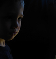
| 03/10/2007 06:16:44 PM |
Boyby kashiComment: Well, I like this -- I think the lighting is fine and the crop/negative space composition work well.
I wonder if the purplish tone to the highlights disturbed some people as perhaps being a bit out of place -- suitable for an actor or musician on stage, but a little odd for a children's portrait studio.
I'm interested in trying out the step "reduce to 80% opacity" -- above what color BG did you have this as a layer? |
| Photographer found comment helpful. |
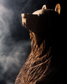
| 03/10/2007 06:07:50 PM |
Stoic Resignationby fotomann_foreverComment: In a way, this is almost a high-key photo in feeling -- the way the face of the bear and the smoke/fog are so brightly-lit I get the impression of a lot of light present with the subject hiding in a shadowed area, rather than an overall dimness. It looks kind of like a shot on a stage, with a spotlit performer. I guess I'd describe the lighting as rather harsh, and I think most people have an expectation of softer lighting, with smoother gradients and more rounded shapes when they are looking for a low-key image.
I'm not sure if the smoke adds or is a distraction, though it makes an interesting contrast with the sharper textures and angularity of the bear's skin. |
| Photographer found comment helpful. |
Home -
Challenges -
Community -
League -
Photos -
Cameras -
Lenses -
Learn -
Help -
Terms of Use -
Privacy -
Top ^
DPChallenge, and website content and design, Copyright © 2001-2025 Challenging Technologies, LLC.
All digital photo copyrights belong to the photographers and may not be used without permission.
Current Server Time: 09/03/2025 10:22:09 PM EDT.