| Image |
Comment |
| 10/10/2003 03:30:10 AM |
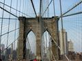
I Love New York...by tolyanchikComment: Great viewpoint. Don't like the people in the shot though. I think without them the image would be simpler and more striking. Very good sharpness and dof. |
 Photographer found comment helpful. Photographer found comment helpful. |
| 10/10/2003 03:27:35 AM |
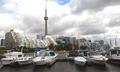
Torontoby MorganComment: Fellow Torontonian, this is a great shot. You have a good detail and sharpness. I would have included more on the right to make it even better off-centre composition. And also a tiny bit more sky above the CN Tower. Well done. |
| Photographer found comment helpful. |
| 10/10/2003 03:25:34 AM |
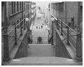
stairwayby nomoreschiComment: Great view and perspective. It needs a bit more contrast in the dark areas, but that would probably blow up the whites. The center composition in this case works OK. |
| Photographer found comment helpful. |
| 10/10/2003 03:24:49 AM |
Capitol At Sunsetby rickhd13Comment: This is simple, yet very beautiful. Lovely silluette and subtle sunset colours. Did you consider boosting the blue just a tiny bit? Still well done. |
| Photographer found comment helpful. |
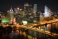
| 10/10/2003 03:23:00 AM |
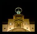
Metropolisby BobsterLobsterComment: Very striking building. Lovely night shot. Too bad more of the building is not visible. Also IMO the thick black border around the whole image is not neccessary - there is anough blackness here as it is (unless this is a funeral hall). |
| Photographer found comment helpful. |
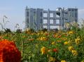
| 10/10/2003 03:20:41 AM |
Taking overby ccjpComment: Very interesting shot. Too bad the big orange flower in the forefront is not in focus as it distracts a bit, but it is needed for balance of the off-centre shot. |
| Photographer found comment helpful. |
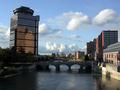
| 10/10/2003 03:19:00 AM |
Colors of the Nightby alanfreedComment: Wow, great colours. The sky is a bit grainy and could have been darker, but you pulled it off OK. Great composition - the bridge leads you into the city. |
| Photographer found comment helpful. |
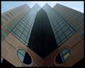
| 10/10/2003 03:14:55 AM |
Eyes to the Skyby dsidwellComment: Beautiful clean symetry. Centre composition works well with this photo. It could use a bit of colour boost with saturation. Stil pretty strong image in this challenge. |
| Photographer found comment helpful. |
| 10/10/2003 03:14:06 AM |
Urban Shoppingby backslashComment: Very interesting image. It has nice symetry to it, but it should be even more to the right to make it off centre. It would also be better with a bit more sky above the tip of the building - this is too tight. Lovely colour. |
| Photographer found comment helpful. |
| 10/10/2003 03:12:44 AM |
The City Withinby wdebeau1Comment: This almost looks like a postcard. You lost a bit of detail in the dark areas, but you kept the lights without overexposing - that\'s good. Love the colours, could be bit sharper, but that\'s probably limitation of your camera. |
| Photographer found comment helpful. |
Home -
Challenges -
Community -
League -
Photos -
Cameras -
Lenses -
Learn -
Help -
Terms of Use -
Privacy -
Top ^
DPChallenge, and website content and design, Copyright © 2001-2025 Challenging Technologies, LLC.
All digital photo copyrights belong to the photographers and may not be used without permission.
Current Server Time: 06/17/2025 05:58:49 PM EDT.